Free Webinar: International SEO & Localization with Gianluca Fiorelli, Raquel Gonzalez & Zeph Snapp. Sign up now!


Free Webinar: International SEO & Localization with Gianluca Fiorelli, Raquel Gonzalez & Zeph Snapp. Sign up now!
Sitebulb's Looker Studio Connector allows you to access Sitebulb audit data directly in online dashboards - all data is pulled in live, meaning that as recurring weekly/monthly audits are completed, all your Looker Studio dashboards will automatically update.
This allows you to centralize and automate your weekly/monthly reporting, set up monitoring dashboards, and easily share data with clients or colleagues (even if they do not normally use Sitebulb).
This article explains how to set up the Looker Studio Connector and how to use Sitebulb's pre-built templates.
Note that only Sitebulb Cloud users can make use of the Looker Studio Connector. Desktop users instead need to set up Looker Studio reports via the Google Sheets integration.
The connector works by pulling data from your cloud server, and as such you need to give it access to the server to get the data, which is done via a secret key. This is effectively the same as the secret key you use to connect to Sitebulb Cloud through the desktop application.
However, secret keys are also tied to user access, and since users may eventually leave your organization (and have their permissions revoked), it makes sense to future-proof the Looker Studio access by setting up a secret key specifically for this use-case.
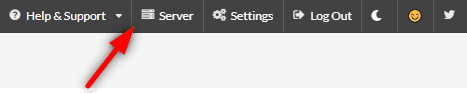
Only the admin user can add secret keys, which is done by going to 'Server' in the top right hand menu (only the logged-in Admin user will see this):
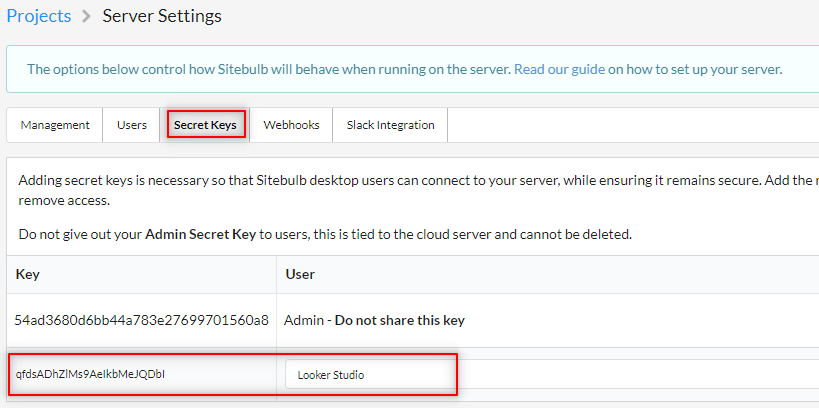
Then navigate to the Secret Keys tab and add a new one for Looker Studio.
Sitebulb data is synced with Google Looker Studio at the audit level, and access is granted at the project level. This allows you to select specific projects to pull into Looker Studio.
To get going, click through into the project you wish to enable for Looker Studio:
This will bring you to the Project details screen. On here, click the Enable Looker Studio Access button:
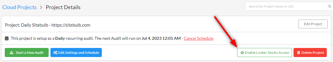
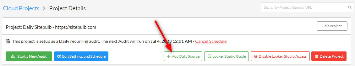
This will then refresh the screen, and a new button will appear to allow you to add a data source. Click to add this:
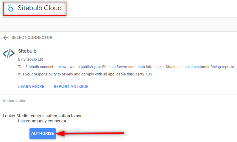
You'll then be taken off to Looker Studio in order to authorise the connector, and give it a meaningful name:
Then add in connection details, the same way as you do when connecting to Sitebulb Cloud through the desktop application. Make sure to use the Looker Studio secret key that you set up earlier.
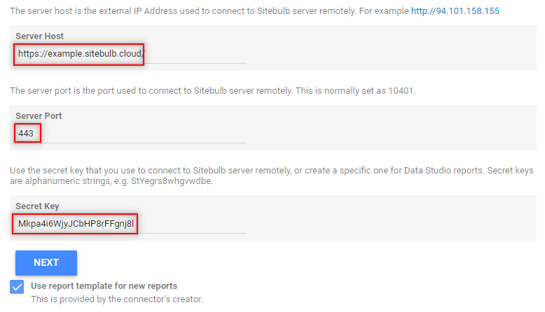
Hit Next, and the page will reload after connecting to your server.
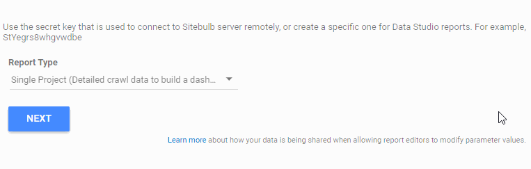
Then, select the 'Report Type' from the dropdown at the bottom. For this example we need the 'Single Project' option:
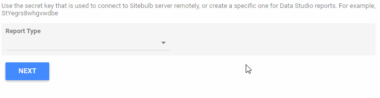
To explain these options a bit further:
We have set up different Looker Studio templates for each of these options. As you continue reading below, we cover initially the Single Project template, and then underneath we cover the Multiple Project monitoring template.
Once you have selected 'Single Project', hit Next again, and the page will reload with a dropdown of Projects for you to choose from.
Click on the Project you need for your dashboard;
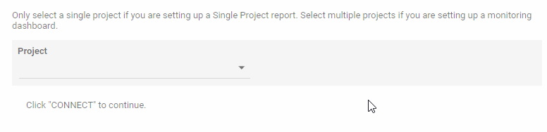
Note: this list will only contain projects you opted-in to Looker Studio on your cloud server. If the project you need is not there, go back to the previous step and press the 'Enable Looker Studio' button on the projects you wish to include, then come back and follow the connector steps again.
Now all you need to do is click the blue Connect button in the top right:
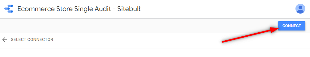
Once you have connected, you can navigate back to the template copy and start exploring the data.
We have built a couple of templates populated with Sitebulb data, which illustrate the sort of thing you can do with the data. The templates are intended to be a starting point for you to build your own customised dashboards, so you can take the bits you need, remove the bits you don't, and integrate Sitebulb data with other data sources (e.g. Google Analytics).
To get you started, we've built two Looker Studio templates:
Head to Sitebulb's template page.
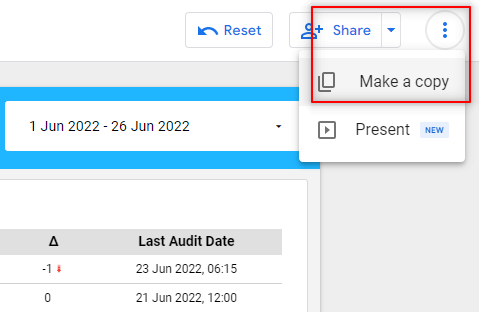
In the top right hand corner, hit the burger menu and choose 'Make a copy':
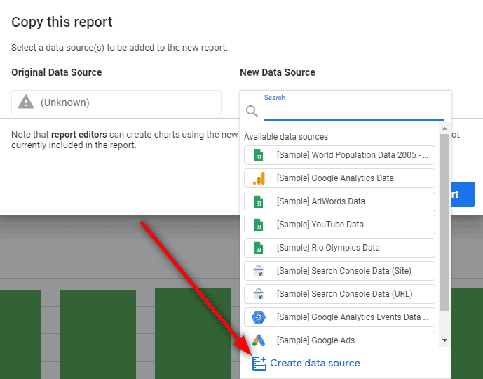
This will open a modal window entitled 'Copy this report', and it will take a minute to check the data sources - which will both show as '(Unknown)'. Don't worry about this, just click the 'New Data Source' dropdown on the right, and select 'Create data source' at the bottom:
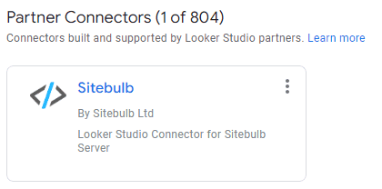
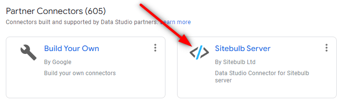
Search or scroll down and locate 'Sitebulb' in the Partner Connectors section.
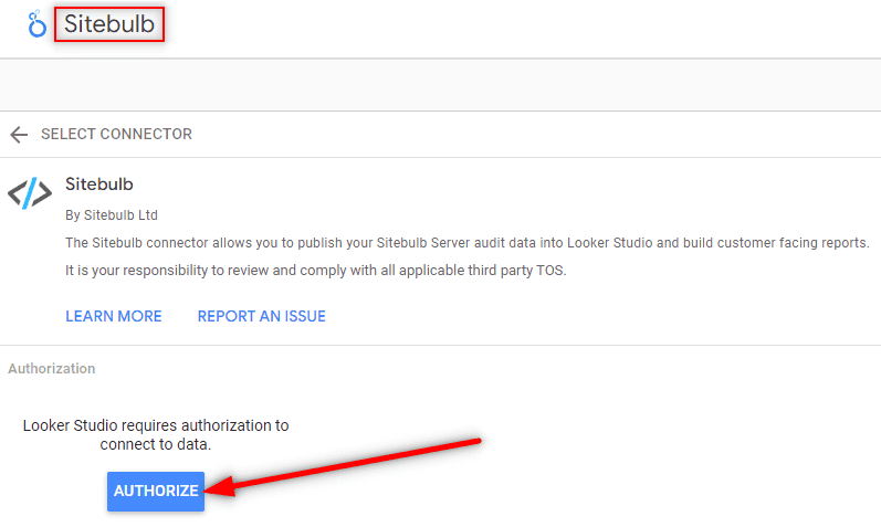
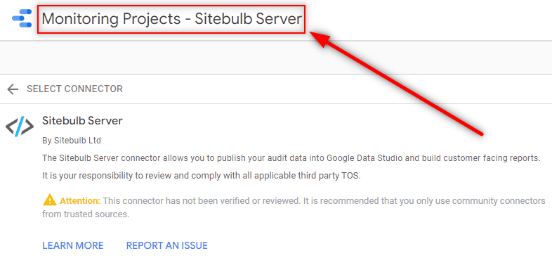
This will take you directly to the Connector page, which will allow you to set up your Sitebulb Server instance as a data source for Google Looker Studio.
Start by naming your connector - since you are building out a dashboard for a single project, it makes sense to name the connector accordingly (this will make it easier to locate later on).
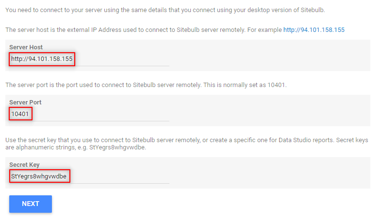
The next step is to add your server details to the connector, to build the connection to your server. These are basically the same details you use to connect to your server from your desktop machines:
Note: It may be worth setting up a separate Secret Key specifically for Google Looker Studio.
Hit Next, and the page will reload after connecting to your server.
Then, select the 'Report Type' from the dropdown at the bottom. For this template we need the 'Single Project' option:
To explain these options a bit further:
We have set up different Looker Studio templates for each of these options. As you continue reading below, we cover initially the Single Project template, and then underneath we cover the Multiple Project monitoring template.
Once you have selected 'Single Project', hit Next again, and the page will reload with a dropdown of Projects for you to choose from.
Click on the Project you need for your dashboard;
Note: this list will only contain projects you opted-in to Looker Studio on the server. If the project you need is not there, go back to the previous step and authorise the project on the server, then come back and follow the connector steps again.
Now all you need to do is click the blue Connect button in the top right:
Once you have connected, you can navigate back to the template copy and start exploring the data.
This is what the template looks like:
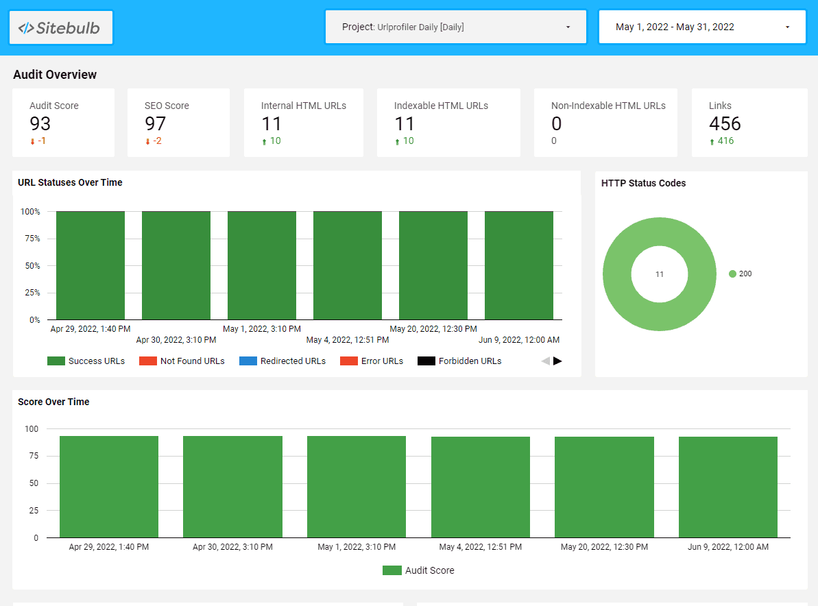
As you can see, it roughly reflects the type of data you see in Sitebulb reports, showing crawl data for the most recent audit, plus the historical changes over time.
Unless you are plotting 'over time' graphs, the data returned will be from the latest audit.
For example, if you have the time-frame in the top right set as 'last month', e.g. 1st to 30th June, and you have 4 audits across that month:
The data will be returned for the 25th June audit. This will be the case for scorecards and pie-charts, and anything else where you are not plotting data change over time.
The template includes a range of different ways to display the data, so we'll run through the different types and how they can be used.
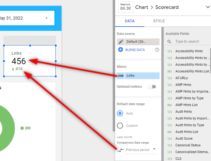
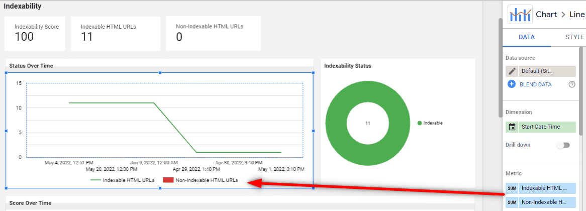
Scorecards offer a really straightforward way to display simple, single-value datapoints, like 'number of URLs.'
All of the fields on the right hand side are dimensions, but they can be used as metrics. So set the metric you wish to see in the scorecard (in this example, 'Links'). This will show the total number of links from the most recent audit in the timeframe set in the top right.
You can also optionally add the comparison date range as 'Previous period' to see the change from the audit before.
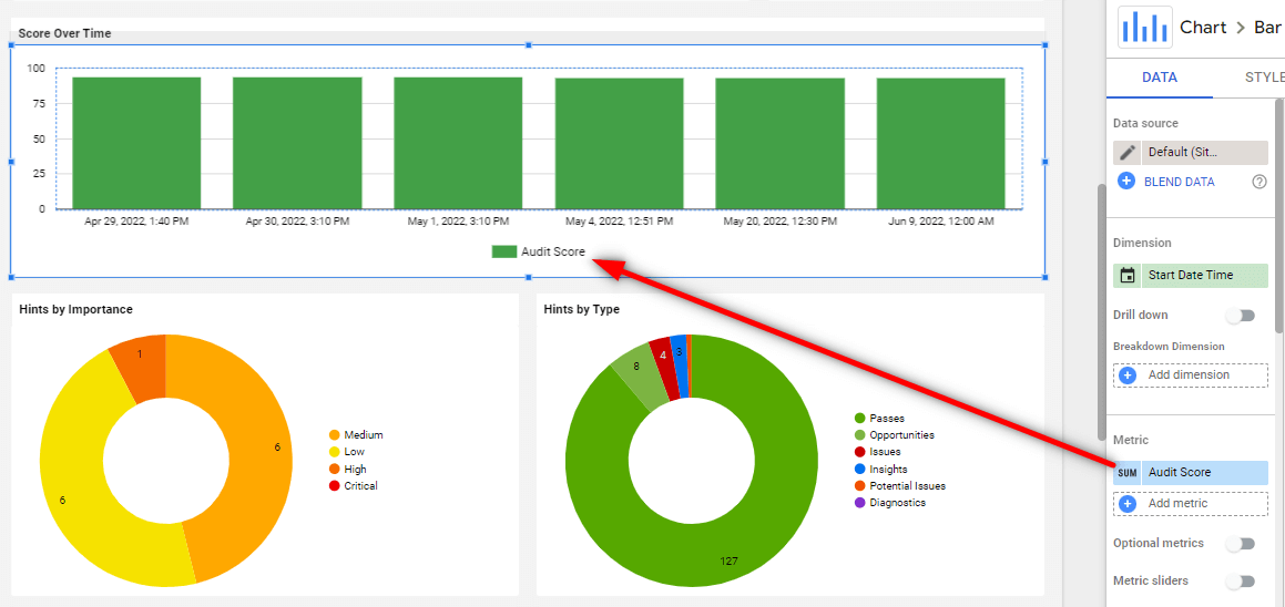
You can use bar charts to map a single metric over time, for example the Audit scores, allowing you to show how the audit score has improved (or got worse!) as time passes.
You can do this by setting 'Start Date Time' as the dimension, and then selecting a single metric (in this example, 'Audit Score'):
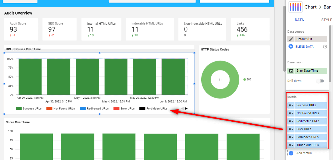
You can also chart multiple metrics at once, by again selecting 'Start Date Time' as the dimension, and then adding multiple metrics:
Of course there are lots of other chart options that work well with time-series data, such as this line-bar combo chart:
Or this line chart:
In each case, the important thing is that the dimension is set to 'Start Date Time' and you add numeric metrics.
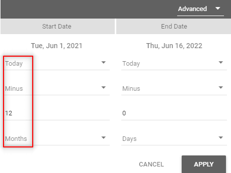
Additionally, you can control how your data displays by adjusting the 'Sort' and 'Default date range' options:
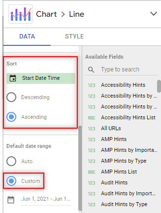
In the Single Project Looker Studio template, we have set the date range to use an 'Advanced' option, with a 'today minus 12 months' lookback (12 weeks on the weekly template):
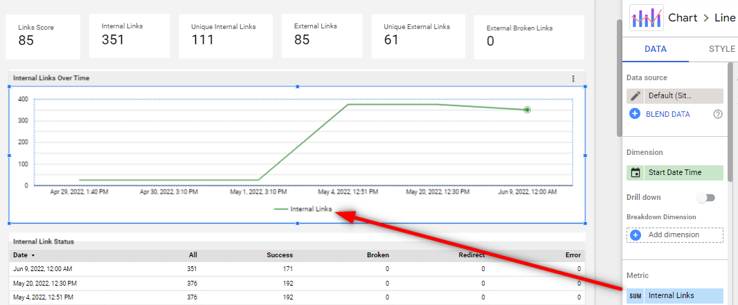
The same concept can be used for showing data changes over time in a table format, such as the one we have in the 'Links' section;
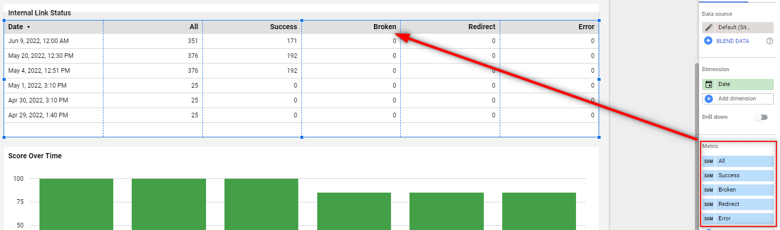
In this case, we have 'Start Date Time' as the dimension and then selected comparable metrics from the 'Internal Links' section:
Certain dimensions are set as 'named value pairs', which consist of data names and numbers.
For example, HTTP Status Codes, which have names (e.g. 200, 301, 404, etc...) and a count of URLs for each status.
This sort of data can be plotted on pie charts, where each segment represents a name, and the magnitude of the segment reflects the relative URL count. For example:
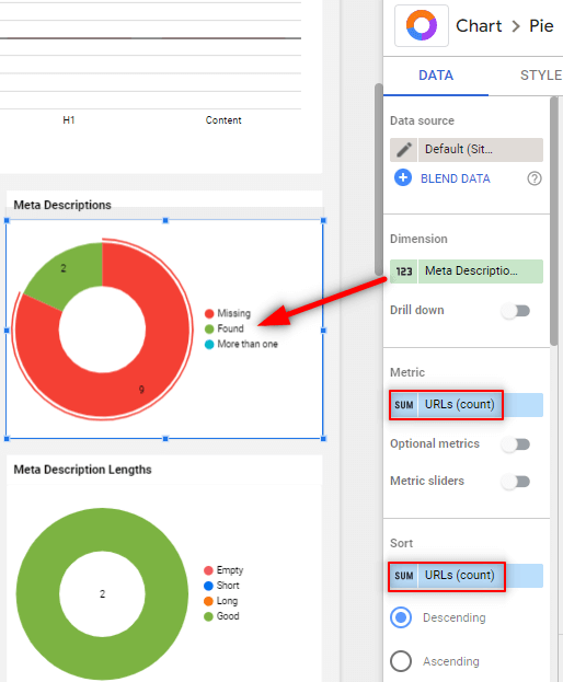
These dimensions need to be plotted with the metric set as URLs (count).
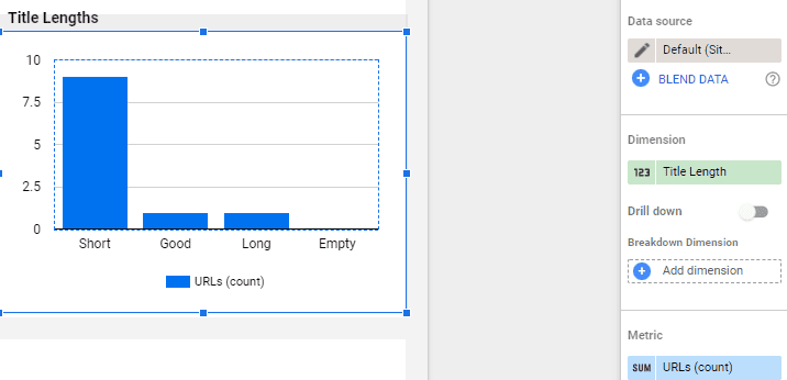
This type of data would also work well when plotted as a bar or column chart:
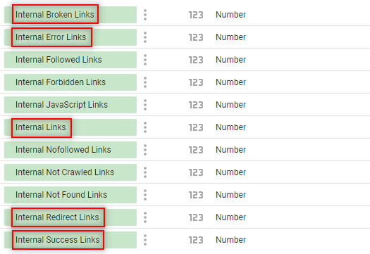
The dimensions that fit this format are as follows:
The template also contains Hints data in a range of formats, allowing you to understand the severity and types of issues affecting the website at a quick glance.
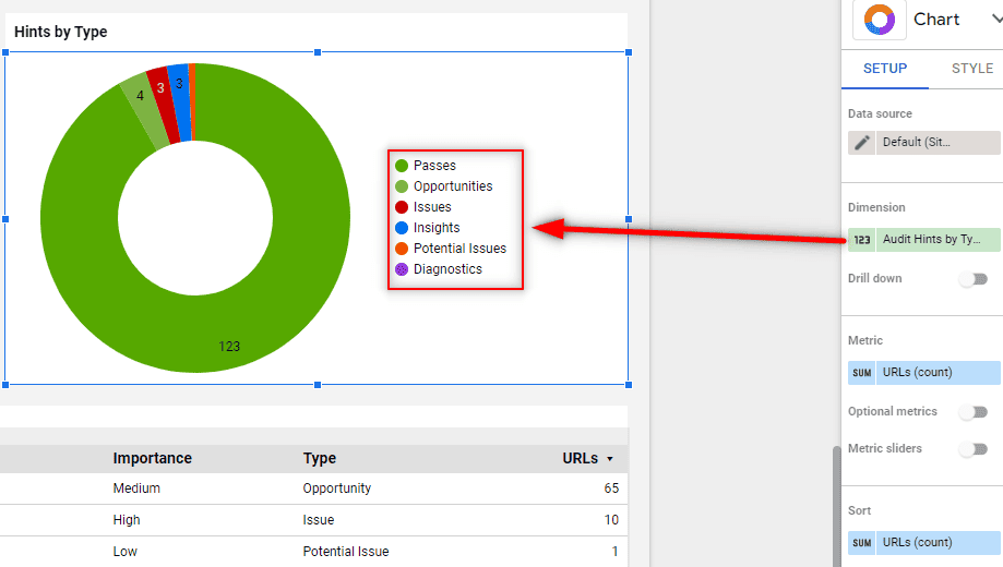
The 'Hints by Importance' and 'Hints by Type' are essentially special cases of the Named value pairs (see above), but they are additionally nested under a parent category.
For example, on the Overview page, the Hint data on the chart uses the dimension 'Audit Hints by Type', which relates to all the Hints across the entire audit.
But on the Links page, the dimension is 'Links Hints by Importance' (and 'Links Hints by Type' for the other chart):
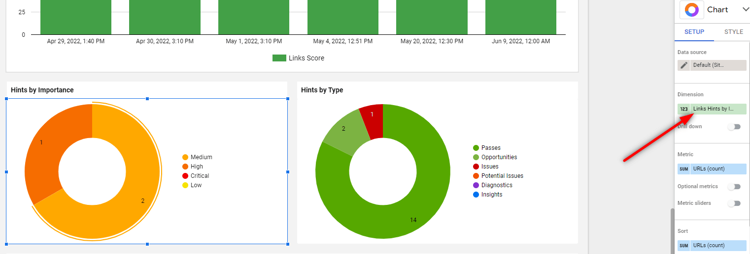
So the important thing here is to make sure you pick the relevant section for these 'Hints by' dimensions.
Again, you need to use this in conjunction with the metric 'URLs (count).'
The 'Hints List' dimensions provide an array of the top 10 Hints triggered in the audit (based on the highest number of URLs). You need to use this dimension with the 'URLs (count)' metric.
In the template, we have 'Top Hints' tables for each section, and also include the Hint Importance and Hint Type dimensions to provide deeper insight.
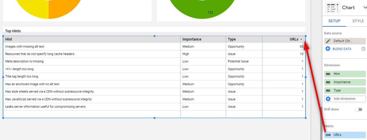
Again, these are split per section, so if you want to view Links specific Hints, you need to use the specific 'Links' dimension.
In the template you will see that we have renamed these dimensions for clarity on the column headers. You can always double-check the original dimension name by clicking into the field name:
This template is designed to help users who need to stay on top of lots of websites on a consistent basis, for example;
A monitoring dashboard allows you to easily see an overview of the data for multiple sites at once.
Head to Sitebulb's template page.
In the top right hand corner, hit the burger menu and choose 'Make a copy':
This will open a modal window entitled 'Copy this report', and it will take a minute to check the data sources - which will both show as '(Unknown)'. Don't worry about this, just click the 'New Data Source' dropdown on the right, and select 'Create data source' at the bottom:
Scroll down and locate 'Sitebulb Server' in the Partner Connectors section.
This will take you directly to the Connector page, which will allow you to set up your Sitebulb Server instance as a data source for Google Looker Studio.
Start by naming your connector;
The next step is to add your server details to the connector, to build the connection to your server. These are basically the same details you use to connect to your server from your desktop machines:
Note: It may be worth setting up a separate Secret Key specifically for Google Looker Studio.
Hit Next, and the page will reload after connecting to your server.
Then, select the 'Report Type' from the dropdown at the bottom. For this template we need the 'Multiple Projects' option:
(The Single Project option is covered in the section above).
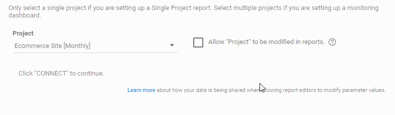
Once you have made your selection, the page will reload and there will be a new dropdown at the bottom, allowing you to select the projects you wish to connect. This list will only contain projects you opted-in to Looker Studio on the server. Select all the projects you want to include, and tick the checkbox Allow "Project" to be modified in reports.
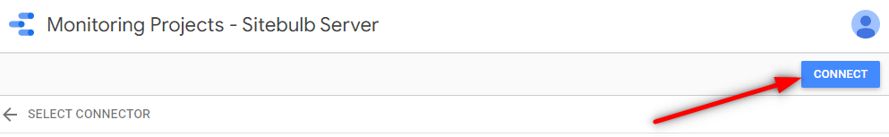
Now all you need to do is click the blue Connect button in the top right:
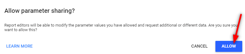
When you get faced with this modal warning message, just click Allow:
Once you have connected, you can navigate back to the template copy and start exploring the data.
This is what the template looks like:
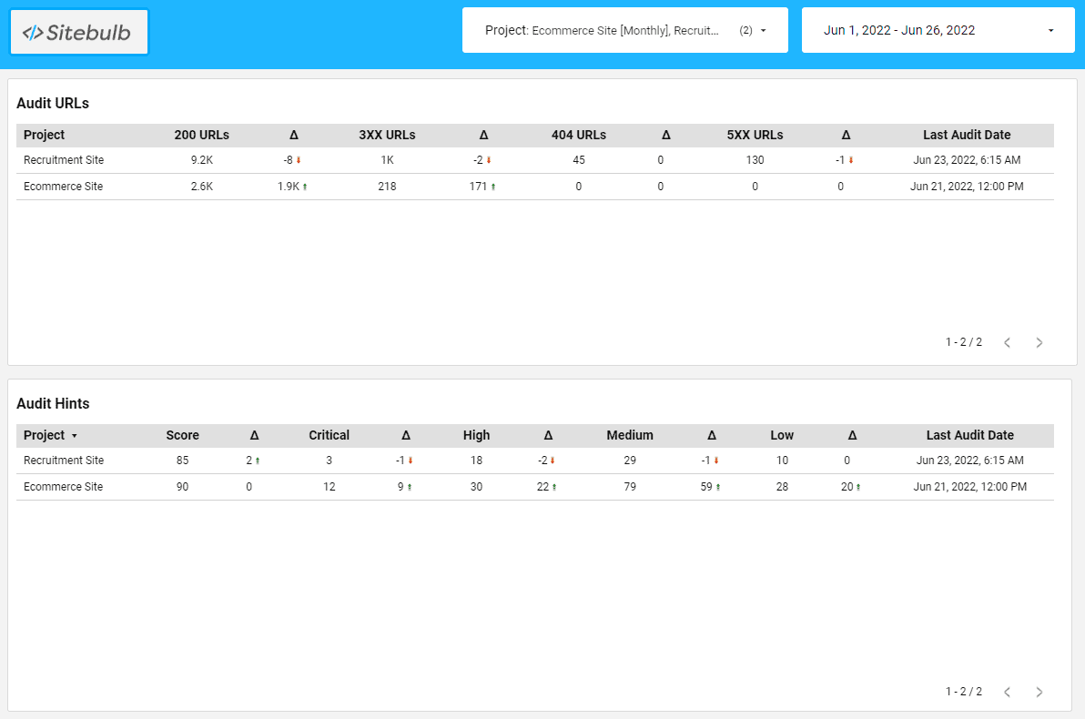
As you can see, it features key metrics the allow you to see very quickly if anything has dramatically changed.
Unless you are plotting 'over time' graphs, the data returned will be from the latest audit.
For example, if you have the time-frame in the top right set as 'last month', e.g. 1st to 30th June, and you have 4 audits across that month:
The data will be returned for the 25th June audit.
Unlike the Single Project Template, this one actually only includes one type of chart - Tables. We'll run through how these are set up and the sort of data they contain.
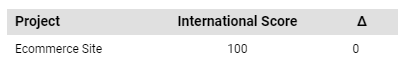
Tables provide a really easy way to show top level data for lots of projects in a single view. To use them, you need to set 'Project' as the dimension, and then choose whatever metrics you wish to see included in the columns.
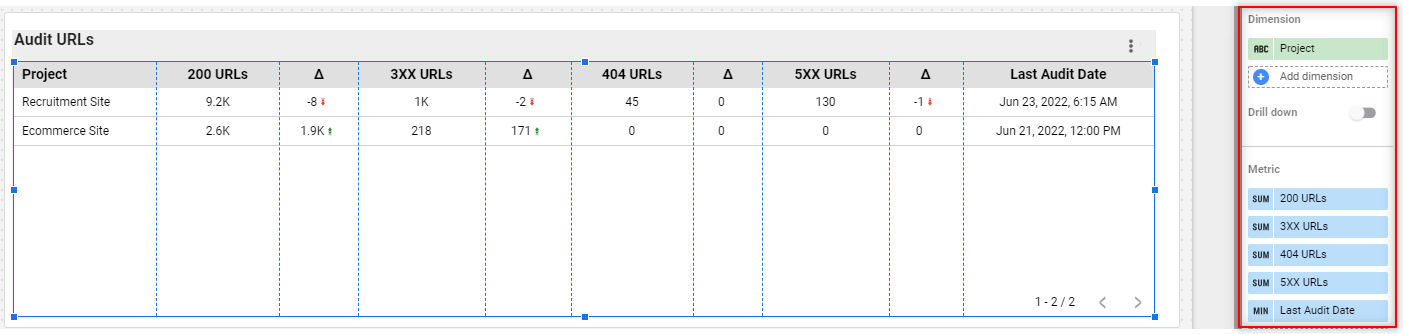
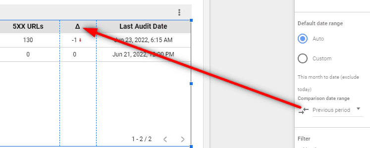
We have set the Comparison date range as 'Previous period', which in this situation means the delta (triangle) column is showing the gain/loss when compared to the previous audit.
In terms of setting up the tables, there is not really much more to it than this - the only thing that will change is the metrics you choose to include on each table.
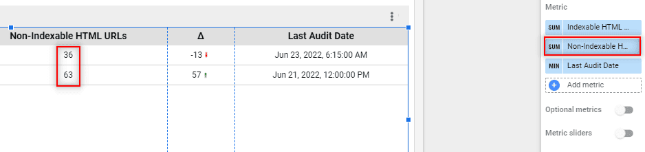
The metrics will be one of three different types of data:
These are simply a pre-summed value for the number of URLs that satisfy a particular criteria (e.g. the number of non-indexable URLs on the website):
These are the calculated audit scores for each section of the Sitebulb audit.
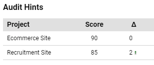
Scores exist for all the different sections, as you can see by searching 'score' in the list of metrics:
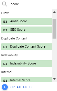
'Audit score' is the overall score for the audit - based on the number/type/importance of all the triggered hints across the audit; and 'SEO Score' takes only the SEO-related Hints into account. All the other scores match up to their corresponding section.
Note that if a particular audit option was not actually selected when setting up the audit, the score will show as '100.'
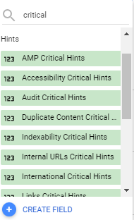
These are pre-calculated counts for the number of hints triggered for each different importance level;
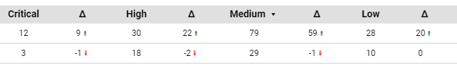
The different importance levels are:
And you can use data for the overall audit (e.g. 'Audit Critical Hints') or for any specific section (e.g. 'Indexability Critical Hints').