Sitebulb Brand Assets
Logo with grey text
The OG logo, you will find sitting proudly at the top of this page. This is what we reach for first when displaying a logo in a digital format.
Logo with white text
From posters to t-shirts, this variation is used for when we need something that works in the dark.
Mono white logo
Used when need a logo on a dark background in one colour. You will find this in our footer and merch.
Sitebulb logo without text
This logo is anything but square, we use it on our socials and favicons.
Fonts
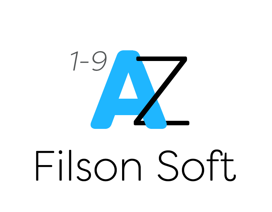
With its high readability and curvy soft sans-serif silhouette - Filson Soft is our workhorse font. Body copy uses Book font face while titles use a contrast of Thin and Heavy font faces.
Colours
The star of the show, our primary colour is used in our logo, headers and links.
A solid grey, used for headers, logos and background of footer.
An easy on the eye slate blue, used for our body copy.
Green is our attention grabber, used for when we really want you to click something and is always the primary action on a page.
This burnt orange is used sparingly, warnings and buttons that need to be thought about.
Soft moleskin grey used for our footers
Dark blue/black, some might even call bluck. Used for dark headers, and layered with blue and green gradients.


