How to Design Website Navigation: Balancing SEO, UX, and Client Needs
 Dani Leitner
Published May 17, 2024
For this article, we’ve asked Dani Leitner, an independent SEO Consultant focused on the German-speaking market, to walk us through how to design a website navigation that balances competing SEO, UX and client needs.
I believe we can all agree that a website's navigation is very important. The navigation provides every website visitor with a quick first impression of what the site offers. It's something you see on every page of a website. And, of course, it's there to help visitors move around the website easily.
It's not something we should leave to chance. In fact, it's a part of our website that needs a lot of thought. Since it's so crucial, there are often different teams all considering the question of how to design the perfect website navigation. Sometimes, this means it can be tough to handle these different teams’ expectations and still choose the best navigation possible.
In this article, we’ll consider the different viewpoints from SEO, UX, and the client's side and how we can bring all these together in a workshop to get everyone to agree on the best website navigation solution.
Everything in this article is based on my personal experience, and the examples I provide are from a real client case where we conducted a successful navigation workshop.
Contents:
- How to design website navigation for SEO
- How to design website navigation for UX
- How the client wants to design the navigation
- Final thoughts
How to design website navigation from the SEO perspective
Good website navigation is essential to improving your site's search engine performance. That's why it is important to put some thought into designing it. A well-organized navigation helps with several things:
- It makes the website easier for search engines to crawl
- It clearly shows the site's structure
- It spreads the authority among core pages
- It’s an important part of your internal linking and keyword optimization strategy
- It boosts your most important SEO pages
Let's explore what this involves in more detail.
Crawl Depth & Website Hierarchy
The navigation is featured on every page, which means the pages we add to it can be accessed within just a few clicks from anywhere on your website. This benefits users by allowing them to reach pages quickly, and it also supports search engines in effectively crawling our websites.
Keep these points in mind:
- Place your key pages in the main menu: This makes it easy for both people and search engines to see what's most important on your site. For example, a small bakery's website might have "Our Breads," "Cafe Menu," and "Order Online" right in the main menu
- Your navigation should show the structure of your site: This helps search engines understand the hierarchy and relationship between pages, improving content indexing. An example is an online store with a menu that goes "Electronics > Laptops > Gaming Laptops."
- Organize content from broad to specific topics: Start with the broadest topic and go deeper with submenus. This helps to reflect the structure of the site and navigate your user. For example, a cooking site could have a menu that says 'Recipes > Dinner > Vegetarian.
Distribution of Page Authority
The navigation is also important to distribute the page authority from one page to another. Internal linking helps significantly, but you should also consider using the main navigation to get some authority to your SEO pages.
Given this, we need to consider how many pages we should include in the main navigation. If your domain has low authority, using a mega menu to link to many pages might not be the best strategy.
Things to remember:
- Be selective to avoid diluting your page authority across too many pages.
- Concentrate on your most important pages.
Keyword Optimization in Anchor Texts
It's a best practice to use your main keyword when linking internally to pages on your site, including in the navigation. This helps show search engines and users what the linked content is about.
Keep these points in mind:
- Include the main keyword when linking to pages whenever possible.
- Don't be too creative; keep it easily understandable for users.
Highlighting Key Pages
Your navigation highlights the pages that are importantkey to your SEO and business goals. Is there a critical action users should take on your website? If so, add it to the main navigation. Are there certain pages or keywords that are vital to your business? Include them in the navigation. As mentioned earlier, this boosts the visibility of these pages to search engines and makes them easily accessible to users.
Keep these points in mind:
- Add pages that are essential for achieving your business goals.
- Update your navigation as your site expands.
Best Practices for SEO-Friendly Website Navigation
- Reflect website structure: Ensure the navigation mirrors your site's structure, offering a clear view of content hierarchy to both visitors and search engines.
- Keyword-optimized anchor text: Use the main keyword for each page in the anchor texts of your main navigation links.
- Simple and intuitive: Make navigation intuitive and easy to use.
- No more than 7 main menu items: Ideally, you should have 5 to 7 main menu items plus a CTA button on the far right.
- Logo links to the homepage: The logo in the header should always link to the homepage for easy access.
- Selective menu items: Link only important pages from the main navigation to prevent diluting page authority.
- Breadcrumbs and footer navigation: Add breadcrumbs and footer navigation for extra navigational paths, improving both UX and SEO.
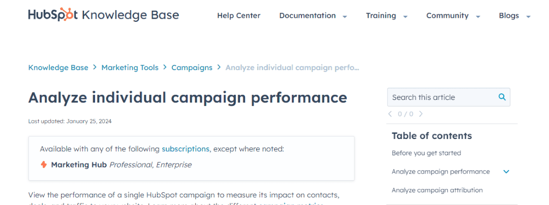
HubSpot uses Breadcrumbs very well to show you where you are in their knowledge base Hub - Source
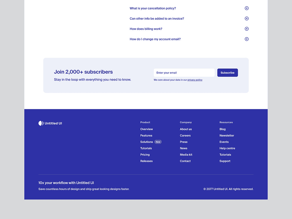
Example of a footer menu - perfect to put secondary pages like “career”, “press”, “news” but also for the most important SEO pages - Source
How to design website navigation from the UX viewpoint
Navigation on a website isn't just important for SEO and search engines; it's crucial for users too. And user wants and needs are front of mind for UX Designers.
The main goal for a UX Designer is to make finding your way around a website as straightforward, smooth, and clear as possible. They think about questions like:
- Which pages do users need most?
- Where do they want to go?
- What do they expect to find when they get there?
However, there's a challenge. Sometimes, the pages a UX Designer thinks are key aren't the same ones SEO experts focus on. And vice versa: many pages that SEOs consider vital might not get top priority in the UX Designer's layout, ending up on the second or third level instead.
Let's talk about some more things that are important for a UX Designer.
User Testing
To ensure the website's navigation is truly easy to use and understandable, we need to carry out user testing. There are several methods to do this while designing the navigation.
Two very useful tests are:
- Card Sorting: This involves asking users to organize website pages into groups that make sense to them. This helps us understand how to arrange the website's content in a way that feels natural to users.
- Tree Testing: This is almost the opposite. We give users a complete structure of the website and a task to find a specific page. We then see where they would go to find that page.
One issue with testing is sometimes the client might not have enough budget, time, or see the importance of doing these tests. If that's the case, you can still do some testing by asking people from your team or the client's team to participate in a test.
The results won't be perfect, since they might already be familiar with the company, but it's better than no testing at all.
Accessibility and Inclusivity
A UX Designer always focuses on making the website accessible to everyone. To improve accessibility, they include features like keyboard navigation, compatibility with screen readers, and options to adjust font size, among other things.
This is especially important if the website is meant to be used by people with disabilities or older people. Sometimes, we might not consider these needs at first because we are used to working with digital tools. You can find out how to do an accessibility audit here.
Simplify Complex Information
A main focus for UX Designers is to simplify a complex website structure. This means organizing pages in a clear way and using simple words for labels that users will understand. Ideally, these words are the main keywords that users would use to search for the pages anyway.
However, sometimes neither the UX Designer's choice of words nor the SEO consultant's suggestions are liked by the client, because they use different terms in their everyday business.
Best Practices for UX Navigation:
- Dynamic navigation: The navigation bar should appear when the user slightly scrolls up, maximizing screen space while maintaining easy access.
Search option: Add a search box in the menu to help users find what they need on your site. - Mobile-friendly: Make sure the navigation works well on mobile devices.
- Organized topics: Group related pages together in a clear way.
- Limit navigation levels: Try to have no more than three levels in your navigation to keep things simple.
- Mega menus for large sites: Use mega menus to help users navigate large sites more easily and to show off what you offer.
- Show user's location: Always indicate where the user is on the site. Use breadcrumbs for this, especially since not everyone starts from the homepage.
- Meta navigation for key functions: Use a separate navigation area for important things like user login.
- Follow conventions: Stick to familiar layouts, like having the logo link to the homepage, placing the login button on the right, and opening submenu items directly below the main menu options.
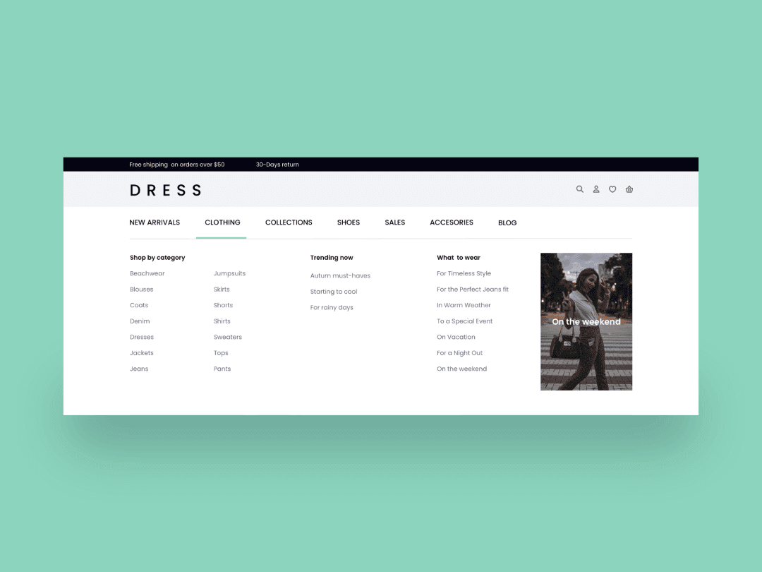
Example of a Mega Menu that has a clear structure and hierarchy - Source
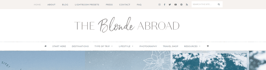
The Blonde Abroad uses a Meta Navigation, or secondary navigation, for Social Media and pages like “Press” and “Contact” - Source
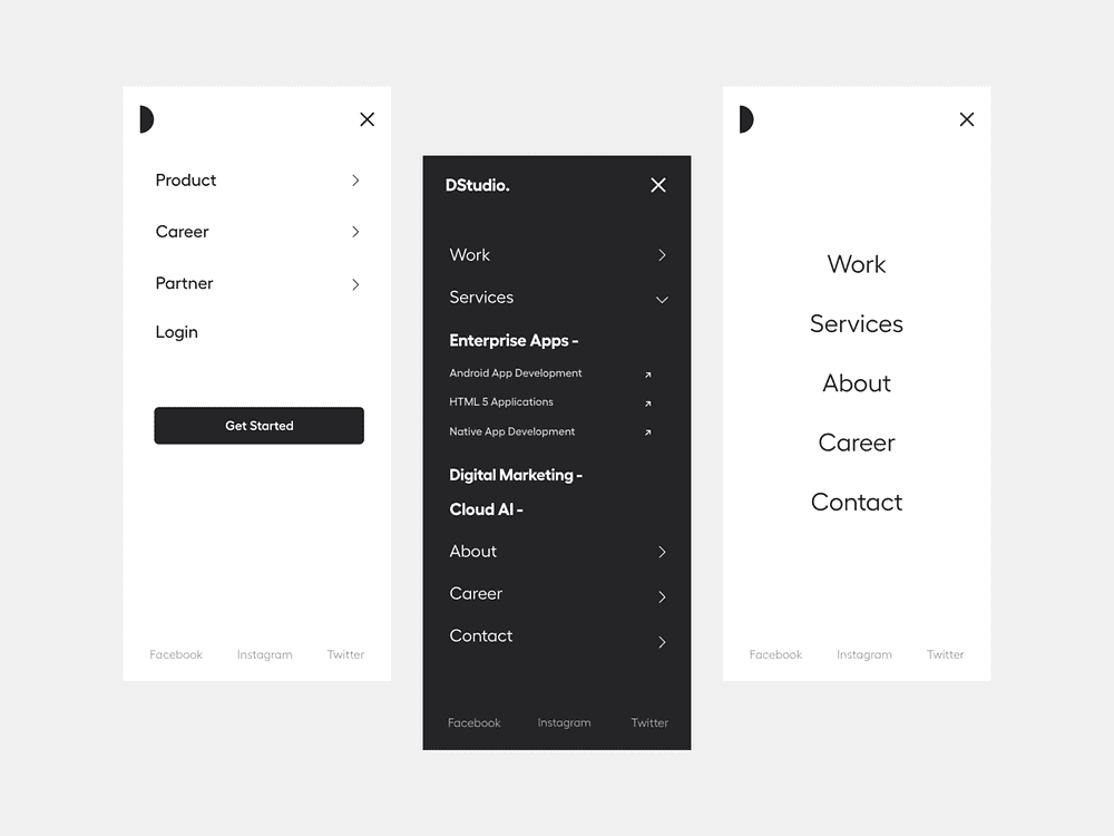
Never forget to think about how the mobile menu would look like. It makes a big difference if someone uses a mouse to navigate vs their fingers - Source
Addressing Client Needs and Constraints
You’ll note that some UX best practices align with SEO best practices, and vice versa. But this won’t always be the case. And after we've agreed to disagree to some extent between UX and SEO, the client's needs will also come into play.
This might seem like the easy part, but trust me, this is when unexpected things pop up that you wouldn't have thought would be important…
Technical Limitations
Firstly, there might be some technical limitations. Clients always have these, often because the developer doesn't have time, or we don't have the budget planned to make many changes.
Special Requests
Then there are special requests from different departments. The most typical one I encounter is the CEO wanting the investor relations section in the main navigation (first level). And the human resources department really wanting the career section to be directly accessible from the main navigation. This usually conflicts with the best practice of having only 5 to 7 menu points.
Page Names
Another common issue is the words used. Both UX Designers and SEO Consultants try to figure out what words users will use for products, services, or parts of a website. But, many businesses use their own special words for things, while a user might not understand them at all.
So, in the end, we're left with our nicely planned navigation, following SEO and UX best practices, yet we have to accommodate things that don't really fit.
Other challenges your client might come with include:
- Legal requirements
- Different user groups like private and business customers, each with unique needs
- Support and help sections
These aspects introduce additional layers of complexity, reminding us that beyond UX and SEO, it is the navigation of the client, and they have their own specific needs.
Holding a navigation design workshop to get everyone on board
Last December, I had a challenge with a client: we couldn't find a single website navigation solution that satisfied everyone. It was clear we all had to compromise and really listen to each other's expertise and reasons behind each proposed solution.
So, I organized a workshop to bring everyone together: the client, the UX Designer, and myself as the SEO Manager. Each of us arrived with our ideas, prepared to explain and discuss them.
We each prepared our version of the navigation, focusing on our area of expertise. I used keyword research to design the SEO-optimized main navigation. The UX Designer brought in user knowledge and analytics data to create a user-friendly design. The client had their own navigation, influenced by the desires of multiple internal stakeholders.
To make the session interactive and visually clear for the client, I prepared cut-outs of every existing menu item, plus those we wanted to add from an SEO perspective and the new suggestions from the UX Designer.
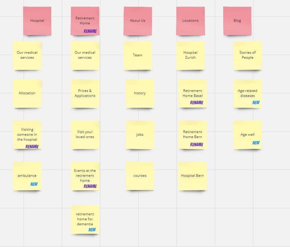
Reconstruction of part of the results from the Workshop on a Miro board. As you can see, we agreed exactly on which page should go where, which ones are new, and which ones they should rename.
This turned into a sort of card sorting exercise, with the client actively participating in the decision-making. With just four of us, it was a manageable group size to discuss and deliberate every choice.
The remarkable part of this approach was that it allowed everyone to explain their reasoning. We could all agree or disagree, and together, we found compromises that everyone understood and supported.
The result was a navigation strategy we were all comfortable with. It included the essential pages for SEO, a great user experience, and addressed the client's departmental needs.
Organizing your own workshop
If your workshop has more than four people, you might need to add more groups and exercises. This way, you can make sure everyone has a chance to talk and agree, just like in smaller groups.
In the end, workshops are a great way to get everyone to agree on a single plan. This is especially important if the person unsure about the solution is the client, as they might not move forward with it at all. With a workshop, you bring everyone together to be part of finding the solution.
Final Thoughts
To wrap up, making an effective website navigation is about teamwork. It's about SEO experts, UX designers, and clients all sharing their ideas to make the website easy to find and use by people and search engines.
Here are my key takeaways:
- Work together: Getting everyone to talk and share ideas is important. Each person has good ideas because of their special knowledge, and you should be open to listen.
- Be ready to change plans: Sometimes, we need to change our first idea to make things better for everyone.
- Don't forget secondary navigation: Some things can go to the footer navigation of the page, like jobs or contact info. It keeps the main menu clean and focused.
Further Reading
If you want to read more about navigation best practices, here are some links for you to dive even deeper into the topic.
Navigation & UX
- UX Booth - The Rules for Modern Navigation
- Forge and Smith - Website Navigation: UX Best Practices
- Nielsen Norman Group - Menu Design: 15 UX Guidelines to Help Users
- Adobe Blog - Best Practices for the UX of Navigation
- Nielsen Norman Group: IA Study Guide
Navigation & SEO
- Ahrefs - Mastering Website Navigation
- Search Engine Journal - Website Navigation: 7 Essential Best Practices
- Search Engine Journal: 7 Tips For Building SEO + UX-Minded Navigation
- Search Engine Land: Site Navigation & Information Architecture Fundamentals For SEOs
You might also like:

Sitebulb is a proud partner of Women in Tech SEO! This author is part of the WTS community. Discover all our Women in Tech SEO articles.

Dani Leitner is an SEO Consultant from Zürich, Switzerland, with a diverse background in IT and civil engineering before finding her passion in SEO. Specializing in the German market, she helps international and local companies improve their online visibility in Germany, Austria, and Switzerland. Dani thrives on diving deep into niches to develop effective SEO strategies tailored to each client's business model. And if that wouldn't be enough, she gets up every day at 6 o’clock to write for her German SEO Newsletter.
Related Articles
 Breadcrumbs in SEO: What Google's Mobile Change Actually Means

 These WordPress Website Mistakes Could Hurt Your Brand’s Credibility

 How to Stay Relevant in a World of AI Overviews & Query-Fans

 Sitebulb Desktop
Find, fix and communicate technical issues with easy visuals, in-depth insights, & prioritized recommendations across 300+ SEO issues.
- Ideal for SEO professionals, consultants & marketing agencies.
 Sitebulb Cloud
Get all the capability of Sitebulb Desktop, accessible via your web browser. Crawl at scale without project, crawl credit, or machine limits.
- Perfect for collaboration, remote teams & extreme scale.