 Sam Torres
Guiding us through the nitty-gritty details on how to audit a site for accessibility, and subsequently, SEO, is guest contributor Sam Torres of The Gray Dot Company. Sam offers a high level of experience in technical SEO, usability, and accessibility testing, and she shares her wisdom in this in-depth, action-packed how-to post.
Introduction
In this article, I will be guiding you through a simplified step-by-step process of how to conduct an accessibility audit, as an SEO team member, using Sitebulb as your primary tool. I also mention several other tools and resources that can help supplement your auditing arsenal.
Ensuring your site is fully accessible for all users is indisputably crucial for SEO. Sure, small sites may be able to scrape by with low accessibility standards, but as business and traffic grow, sites that neglect users with certain disabilities will soon find they're leaving a lot on the table, especially in terms of revenue. And for larger entities, there can be legal consequences with a non-compliant website, as regulated by the Americans with Disabilities Act (ADA).
What types of disabilities are most affected by web use?
Disabilities come in many forms and at varying levels of severity. Some of the most common types that influence website accessibility are:
- Visual Impairments – Vision problems can range in severity from mild to critical. They include conditions like color blindness (inability to distinguish between certain colors), low vision (blurry, clouded, or obstructed vision), and blindness (significant loss of vision in both eyes).
- Auditory Impairments – Auditory disabilities involve hearing impairment in one or both ears and can range from moderate, hard-of-hearing to substantial, uncorrected deafness. Even partial hearing loss can be problematic in hearing audio web content.
- Speech Impairments – Speech communication problems can make it difficult for users to be understood by software or other people. Conditions impacting the clarity and volume of speech can have certain accessibility limitations.
- Cognitive, Learning, and Neurological Impairments – This set of disabilities includes neurological disorders as well as behavioral and mental health disorders, which largely impact comprehension and retention.
Although this is just an abbreviated list of disability types, the first three in particular are especially affected by website accessibility and usability.
Which assistive technologies support website accessibility?
To bridge the communication gap, various assistive technologies have been developed.
Some of the most common types include:
- Screen readers and screen magnification software
- Voice recognition software
- Alternative mouse and keyboard devices
- Refreshable braille displays
- Head wand and mouth stick
- Motion tracking and eye tracking technologies
The range of solutions for web access disabilities is vast. For a closer look into common examples, consider platforms like Zoom Text, JAWS, NonVisual Desktop Access (NVDA), and Apple's Accessibility suite.
What do you look for in an accessibility audit?
Accessibility audits take many shapes, depending on whether we're auditing a website, app, or another digital platform. And the full list of audit items can be quite extensive. In abbreviated terms, some of the most common elements to look for in a website accessibility audit include:
- Determining your site's appropriate compliance standard (WCAG) and understanding what it entails
- Pinpointing key page templates to audit manually, looking at the following elements:
- Assessing content structure, headers, and text order
- Using a screen reader to test the display and order of content
- Evaluating the color contrast of text
- Assessing link text, link titles, and navigation elements for clarity
- Using a keyboard to tab through and navigate a page
- Checking form labels and field inputs
For a more comprehensive list of what to look at when auditing a site for accessibility, check out Deque University's list of rules based on different compliance levels. Deque's open source accessibility testing engine, Axe-core, is what powers Sitebulb's accessibility hints - so you're in good hands.
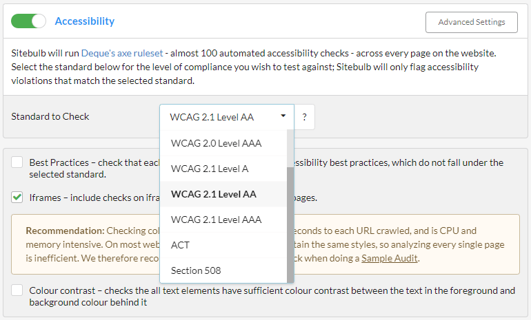
Determining what level of compliance you need
One of our favorite things about using Sitebulb to conduct accessibility audits is that you can set what standards to check when running your scan. Under your project's Audit Data, you'll find advanced settings under the Accessibility feature.

Based on the WCAG (Web Content Accessibility Guidelines) set by W3C (World Wide Web Consortium), there are levels of accessibility standards that you can select, ranging from WCAG 2.0 to Section 508. We always recommend consulting with your legal team (if applicable) to help determine what your compliance standards should be. For most sites, "WCAG 2.1 AA" is a reasonable standard to have in place, but please bear in mind this does not constitute legal advice. Please consult with your lawyer!
What's the difference between WCAG 2.0 and WCAG 2.1?
In simple terms, WCAG version 2.1 builds upon WCAG 2.0. So, it's not meant to replace it; rather, it covers more accessibility criteria, such as device orientation (for low-vision users on mobile), text spacing, and text contrast. 2.1 covers certain updated technologies that readers rely upon, so it's generally preferred to utilize this criterion.
For example, WCAG 2.0 AA has 38 success criteria, while WCAG 2.1 AA has an extra 12 additional success criteria added to it. WCAG 2.1 AA includes all of 2.0 AA, consisting of 50 success criteria in total (nothing in WCAG 2.0 AA has been changed; 2.1 AA simply adds to it).
WCAG is categorized into three levels of conformance based on the needs of different groups or situations: A (lowest), AA (mid-range), and AAA (highest). While AAA is the gold standard that reflects websites that meet the strictest accessibility standards, AA is typically suitable for most sites, unless specific legal requirements call for higher standards of compliance (e.g. large B2C companies in a highly-regulated industry). When in doubt, consult your legal team on which standard your site needs.
Visit w3.org for a thorough overview of each Web Content Accessibility Guideline, including WCAG 2.2 which is set to come out in 2023.
Analyzing & prioritizing your accessibility audit report
After running an audit scan with Sitebulb, the first thing to understand from the Accessibility report is if there are template issues. The reason is, template issues are generally sweeping problems that, once fixed, can correct a lot of the problems across the site.
Pinpoint page templates to audit sweeping accessibility issues
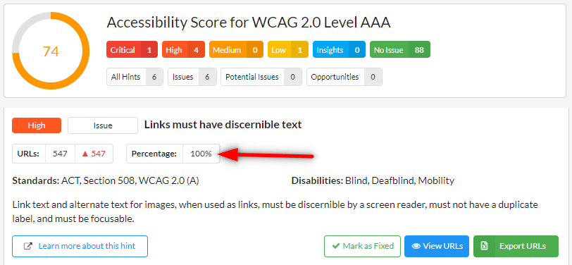
In pinpointing template-based accessibility issues, I first click to filter the report based on "critical" or "high" concerning issues and then look at what percentage (or number of URLs) have been impacted by given compliance hints in the report. The greater the percentage, the higher the likelihood that the issue is impacting a template versus an individual element on a given page.
For example, you'll see that the "high" level issue mentioning "Links must have discernible text" is essentially impacting every page on this example website (100% of URLs). That's clearly a template issue that we can fix, and fix rather efficiently.
While template fixes may require web development support, they're usually big wins across the whole or a major portion of your site. If you have a very large site, consider tackling these issues like you would a JavaScript audit and parse out what needs to be fixed by template or section of the site. This can help make everything significantly more manageable.
What we love about conducting accessibility audits with Sitebulb is that the report includes a short description of the actual issue at hand (just below the "Standards" criteria it falls under). This helps minimize any ambiguity of what problems like "discernable link text" actually mean.
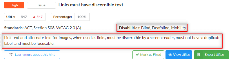
Additionally, we can see what disabilities are relevant to the given problem. In this case, blind users are most challenged in seeing links without discernible text.
While using the Critical, High, Medium, etc... criteria is a great way to prioritize your accessibility audit and what to tackle first, I also like to keep in mind what issues are most impacting SEO. Patrick's previous post is a strong point of reference, as he alludes to high-priority digital accessibility concerns that influence SEO (particularly involving JavaScript).
Address the fundamentals of web accessibility
With these accessibility-driven SEO priorities in mind, hopefully, you've already remedied fundamental issues like:
- missing ALT text on images
- missing anchor text for a link
- links that point to 4xx errors
Sitebulb does an incredible job at automating and identifying sitewide accessibility issues like these and more. However, some elements that are worth auditing take a more manual approach. Below I discuss several additional factors that typically result in accessibility concerns, and I further elaborate on how to approach these matters with other perspectives and tools.
Other accessibility factors that SEOs tend to overlook
Having conducted my fair share of accessibility audits, I've come to learn several common denominators that are accessibility plagues. These are issues that most SEOs generally overlook, but can negatively impact performance.
- Color contrast issues: Is everything on your site able to be seen by those who are colorblind? You might be surprised by the high percentage of users who are colorblind, so making sure you address any color contrast issues is critical.
- Also, please, please, please stop using red text! Even visually-able users have a hard time with red text. While it works in very small instances, for the most part, it’s blurry on screens and should be avoided.
- I like this WCAG Color Contrast Checker to identify such problems, as it helps us see a page from the perspective of such visual disabilities.
- Unhelpful anchor text: Beyond simply having anchor text, is your anchor text actually helpful for users? If you took a link out of context (e.g. next to an image or part of a button) and the visual aid is gone, does a user still know where they're going?
- In addition to having helpful anchor text, keep in mind that using a link title can help communicate the link's destination as well. For instance, if you have a link to your about page and the anchor text is "Learn more" consider including a link title that reads "Learn more about our team and core values." This text will appear when a user hovers over the link, as well as give the proper context for those on a screen reader (it also provides more context for crawlers so win-win!).
- Disorderly text: The contents of a page might look orderly from a top to bottom visual perspective, but have you actually navigated your site by tabbing through using only your keyboard?
- If your text is out of sequence when navigating via a keyboard, then a screen reader's interpretation will also be off. This will inevitably create functionality issues for those who rely on such tools to use your site. More on this further below.
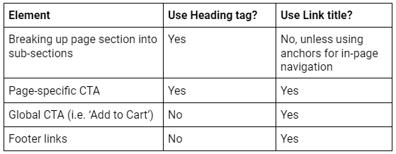
- Headings vs. Link titles: There is some (quality!) debate about where, and how, header tags should be used; we generally recommend not using headers on global/templatized sections (think global CTAs and footer/navigation links), and instead, should only be used within the main body of the page - so the reader can tell what that specific page is about.
In areas where there may be some text styling to encourage higher click-through, consider using a link title within the anchor tag to properly set expectations about where that link goes.
Example recommendations:
- Infrequent testing and audits: Are you consistent with your auditing efforts? Regular, automated testing—in combination with manual testing, for high-priority items - is a smart way to prepare for inevitable website changes and accessibility concerns. How often should you do an accessibility audit?
- Auditing cadence varies on how often changes are being made and how often new content is being built. Between 6 to 12 months is generally adequate for many websites. However, larger and more active sites with multiple content formats may want to consider higher frequent audits.
- Accessibility audits are a standard operating procedure after any significant design changes or new UX features are implemented.
Taking a manual approach to audit templates for accessibility
There are different realms of accessibility testing, from fully automated methods to more manual or custom approaches. The automated approach utilizes comprehensive tools and suites like Sitebulb or SortSite to conduct more complete, sitewide audits. The manual technique leverages more specialized tools like tota11y, WAVE, and Helperbird to test more granular page-specific elements, such as the case with template audits.
Both automated and manual approaches serve their purpose, but there are certain things that a manual approach will reveal more effectively (especially when auditing individual page templates for accessibility.) Let's dig into this process, the toolkit I use, and some of the things that I look for.
Try tota11y to manually audit important page elements
When conducting accessibility audits, I like to start by using the bookmarklet tota11y to visualize and evaluate how a page looks and performs with assistive technologies like screen readers. Tota11y makes it easy to do this across several key criteria.
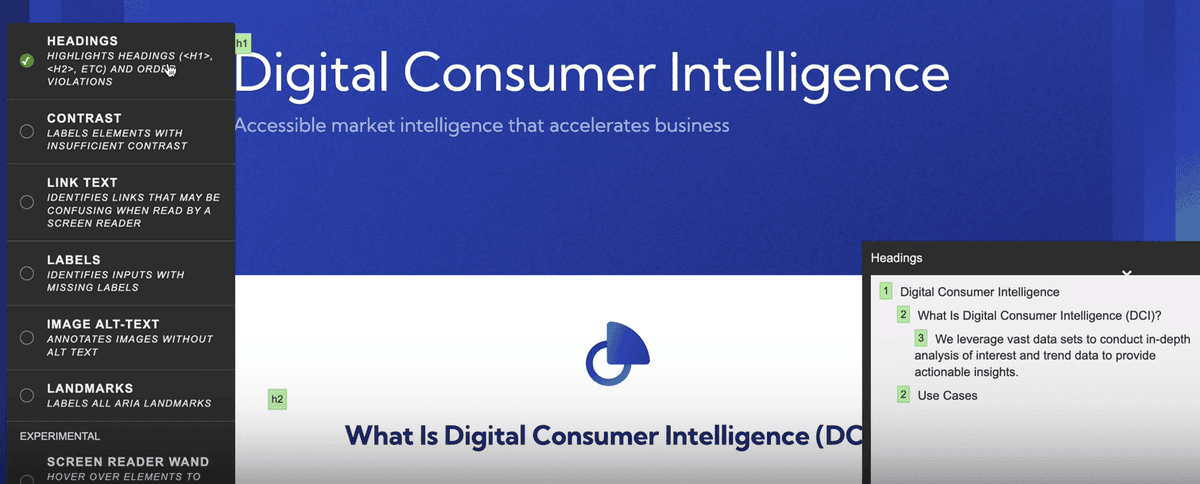
The first criterion is Headings. Given the number of people who are using on-screen readers (or are merely skimming a page's content,) we care a lot about headings and how they show up. By visualizing exactly how a page's headings appear on assistive technologies, we can assess whether or not users (who are only seeing these things on such assistive technologies) are viewing them properly.
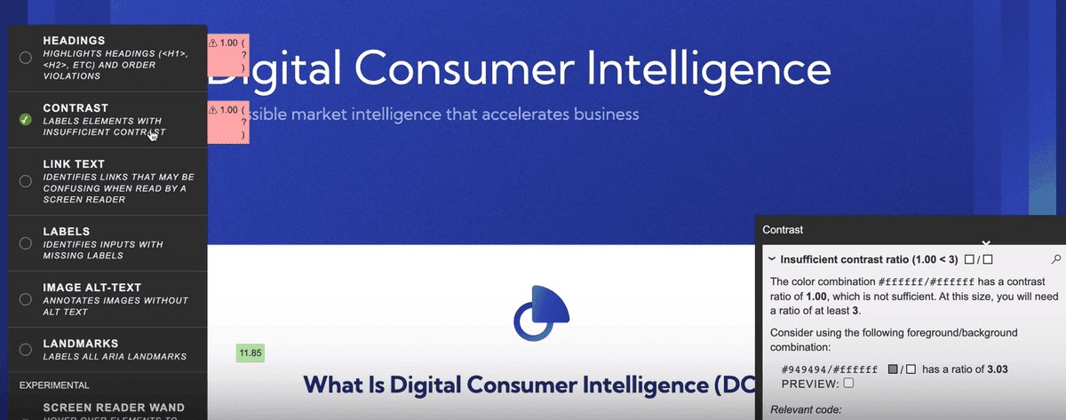
Contrast identifies page elements based on their color in contrast to their foreground/background, providing a ratio score to each element. The lower the ratio, the weaker the contrast. In turn, those with color blindness will have a harder time reading your content when contrast is low. We want at least a ratio of 3 across all clickable and readable elements, so clearly there's work to be done for this site design.
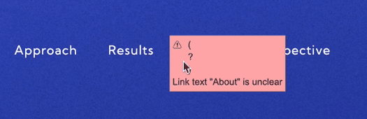
As mentioned above, it's important that your link's anchor text is actually useful. Otherwise, those who rely on screen readers might find links vague and confusing. The link text feature helps us identify any links that may be confusing (e.g. "click here" or "learn more" without any further context).
It's also worth checking for missing labels, which are intended to communicate your form fields. Any inputs with missing labels might make those form fields ambiguous to users, so it's important to ensure you're labeling these inputs clearly and appropriately.
Two other features from the tota11y toolkit are image ALT-text and landmarks. Landmarks help users understand the type of content that they're reading, such as bullet lists or sub-heading 2.
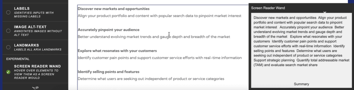
Also, be sure to explore tota11y's Screen Reader Wand, which helps us get a better idea of how other users are experiencing our website. With this tool, you can hover over specific page elements to view them as a screen reader sees them, thereby making sure a screen reader is getting the right information.
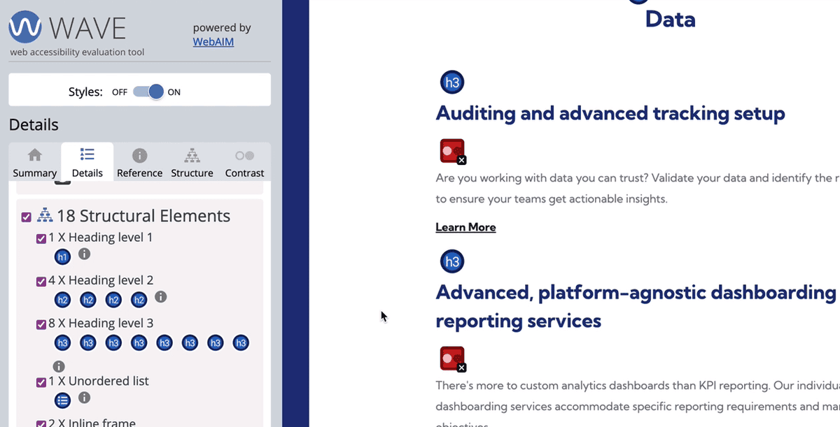
Take an in-depth look at specific accessibility concerns with WAVE
The other tool I use for auditing templates is WAVE, which is similar to tota11y in many ways but is even more detailed and granular. If you're not 100% sure what you're looking at, it's easy for this tool to become overwhelming, especially considering not everything is going to be a serious matter of concern. But, if you're looking to conduct an accessibility audit on a template using a fine-tooth comb, then WAVE is worth checking out.
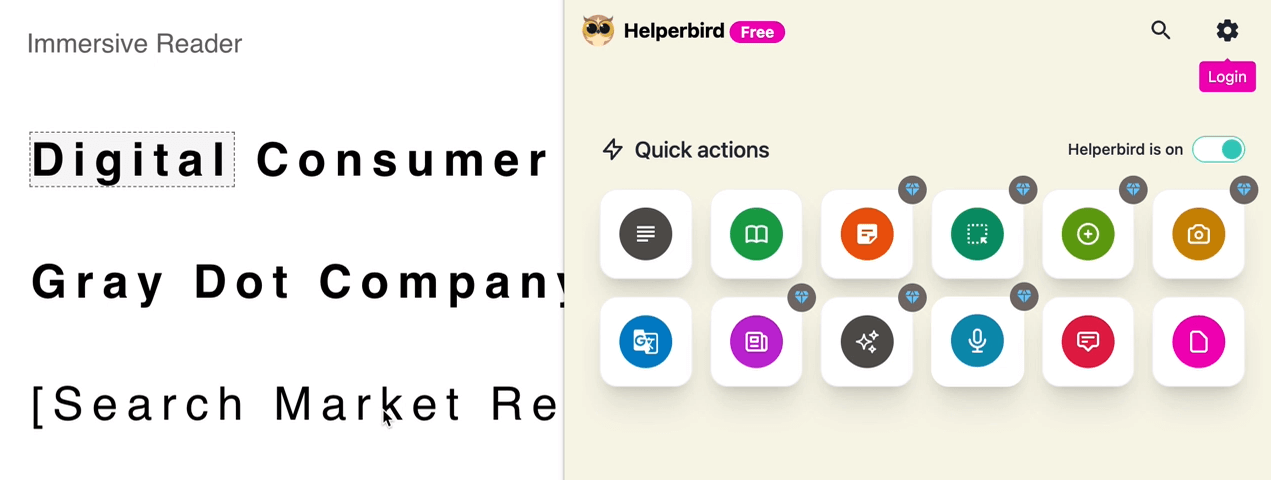
Use Helperbird to simulate screen reader software
If you'd like to simulate exactly how a screen reader interprets your page's content, Helperbird is a robust tool that does just that. It's a paid Chrome extension that offers a free version that works on pages with less copy.
Essentially, Helperbird mimics most screen readers software by actually reading the copy on your page. If certain text is not getting read, then there’s likely an accessibility issue that needs to be fixed. They also have a slew of other tools to experience your web pages in many different forms.
All things combined, I like these tools because they help us build empathy with certain less-abled users who are experiencing our website. We as users without disabilities typically cannot fully understand what it's like to rely on assistive technologies like screen readers. And tools like these help us see websites through these unique perspectives.
As a side note, Google itself is just a screen reader. All Google understands is the content it reads using these same mechanisms. So from our point of view as SEOs, these digital accessibility testing procedures are just as important for users as they are for SEO.
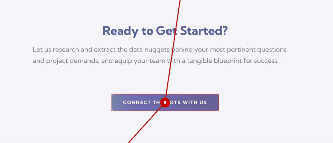
Testing the tab navigation order with taba11y
Another important aspect of any thorough accessibility audit is testing the tab order in which users navigate a site via a keyboard only. The tool I like to use for this is taba11y, which is a simple Chrome extension that scans a page and sequences the tab order. It does several other cool things, like color changing to test against different forms of colorblindness. But we're going to focus mainly on testing tab navigation order.
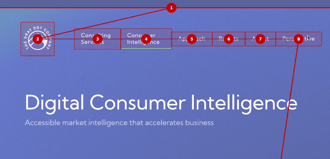
While you can tab through a page manually, taba11y provides a nice visual of what a page's tab sequence looks like.
For example, one of the things I am noticing with this page on our site is that none of the actual page content is tabbable. You can obviously tab through the top navigation. But after the last menu option, users who are tab navigating the page will skip past all of the page content down to the bottom CTA button. Clearly, that's an accessibility flaw that we’ll want to address.
How to sell your clients an accessibility audit
As the spectrum of Internet users becomes progressively diverse and assistive technologies continue to evolve, accommodating the needs of disabled users is becoming increasingly important. Thankfully, we're also seeing legislation to support accessibility on the web. Because of this, we recommend taking the time to learn what may be required for your area. For example, in the United States, the Americans with Disabilities Act requires web content to be accessible for state and local governments (Title II) and businesses that are open to the public (Title III). However, even for organizations and websites that don’t fall under their region's specific criteria, prioritizing accessibility is a good practice that benefits a business in many ways.
Simply running an accessibility audit report using a tool like Sitebulb is a low-effort investment that can provide ample leverage in selling clients on a more in-depth or manual audit. Because Sitebulb makes it easy to highlight a site's most alarming concerns, you can pitch your clients on specific fixes, all while enlightening them on the big-picture importance of accessibility in today's digital world.
Equipped with your new (and/or improved) accessibility audit chops, you can bake these services into your core offering, especially if providing SEO is your primary focus. Because SEO and accessibility go hand-in-hand, this value-add can help elevate your existing offering and distinguish your SEO services as more premium and forward-thinking.
Accessibility auditing is both an art and a science
In any accessibility evaluation, we're combining both psychology and technology to better empathize, adapt, and optimize for better user experiences. While some organizations have stricter accessibility standards compared to others, there are no concrete rules on how you approach your auditing practices. Hopefully, these tools and insights equip you with the resources and know-how to get the job done based on your organization’s standards and requirements.
Sitebulb is a powerful website auditing and SEO platform that can help guide many different functions. At The Gray Dot Company, it's our go-to tool for conducting comprehensive crawl analysis and leveraging valuable recommendations to aid investigative procedures like website accessibility audits.
You might also like:
Sitebulb is a proud partner of Women in Tech SEO! This author is part of the WTS community. Discover all our Women in Tech SEO articles.

Formerly of Gray Dot Co, now as the Tech SEO Senior Manager at Pipedrive, Sam Torres uses her multidisciplinary background as a developer and data architect to solve complex problems at the intersection of marketing and technology. She is known for blurring the lines between disciplines to deliver creative, high-impact technical strategies with a transparent and honest approach.
Related Articles
 What AI Agents See: The Accessibility Tree Is an SEO Surface

 The Brand-First Technical Audit: Why Your Entity Health Is a Technical SEO Problem

 How We Run SEO/AEO Audits Using Claude AI, MCPs, and Sitebulb

 Sitebulb Desktop
Find, fix and communicate technical issues with easy visuals, in-depth insights, & prioritized recommendations across 300+ SEO issues.
- Ideal for SEO professionals, consultants & marketing agencies.
 Sitebulb Cloud
Get all the capability of Sitebulb Desktop, accessible via your web browser. Crawl at scale without project, crawl credit, or machine limits.
- Perfect for collaboration, remote teams & extreme scale.