Zero to 100 Looker Studio Guide for SEO Professionals
Published December 9, 2024
In our final article of the year, Liam Lesani takes us through the ins and outs of using Looker Studio for SEO reporting.
If you are interested in building and visualizing SEO data with Looker Studio and want to design a practical SEO-focused dashboard, this article will help you learn how to do this from scratch.
Contents:
- Overview of Looker Studio
- Key features & benefits for SEOs
- Building your SEO dashboard
- Best practices and tips
- Common mistakes
Overview of Looker Studio
Looker Studio is an amazing free tool for data visualization and business intelligence that helps individuals create custom, interactive dashboards. You can build these custom dashboards using data from a wide range of sources, including Google-related tools like GSC, GA, and BigQuery, as well as non-Google sources like Postgresql or MySQL databases, third-party APIs, and more.
Looker Studio allows users to transform raw data into insightful visualizations without requiring advanced technical knowledge, making it easy to share these visualizations with clients and others. That’s why so many SEOs use it.
Key Features & Benefits for SEOs
If you’re new to Looker Studio, let’s briefly look at the most important features for SEOs.
1. Data Connectivity and Blend Data
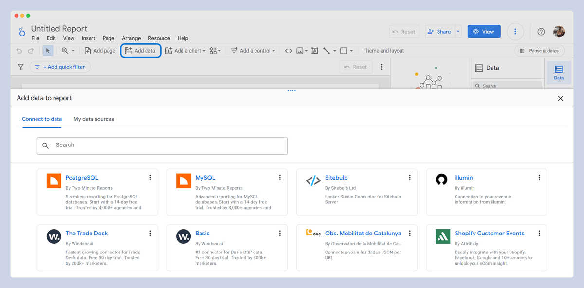
Looker Studio allows you to easily connect data from GSC and GA to your report with just a few clicks. Additionally, it offers Custom Data Source Integration, enabling you to import data from website audit tools, like Sitebulb, Ahrefs, and others.
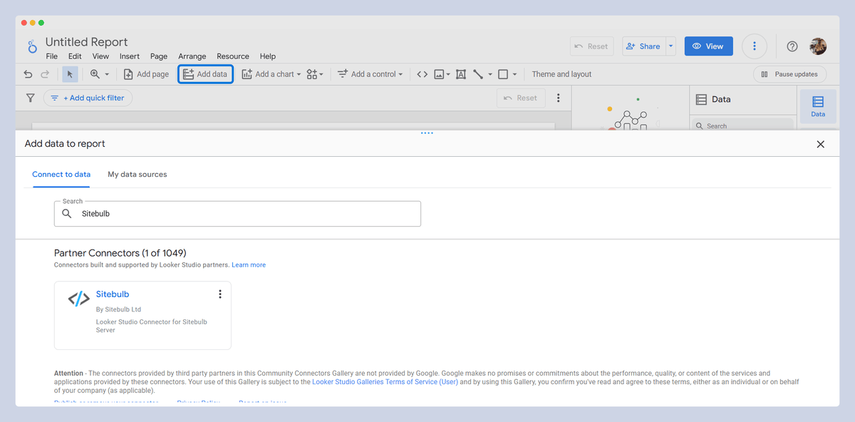
FYI, Sitebulb has a connector that adds its data straight to your Looker report. All you need to do is click on "Add Data" in the header and select the desired connector.
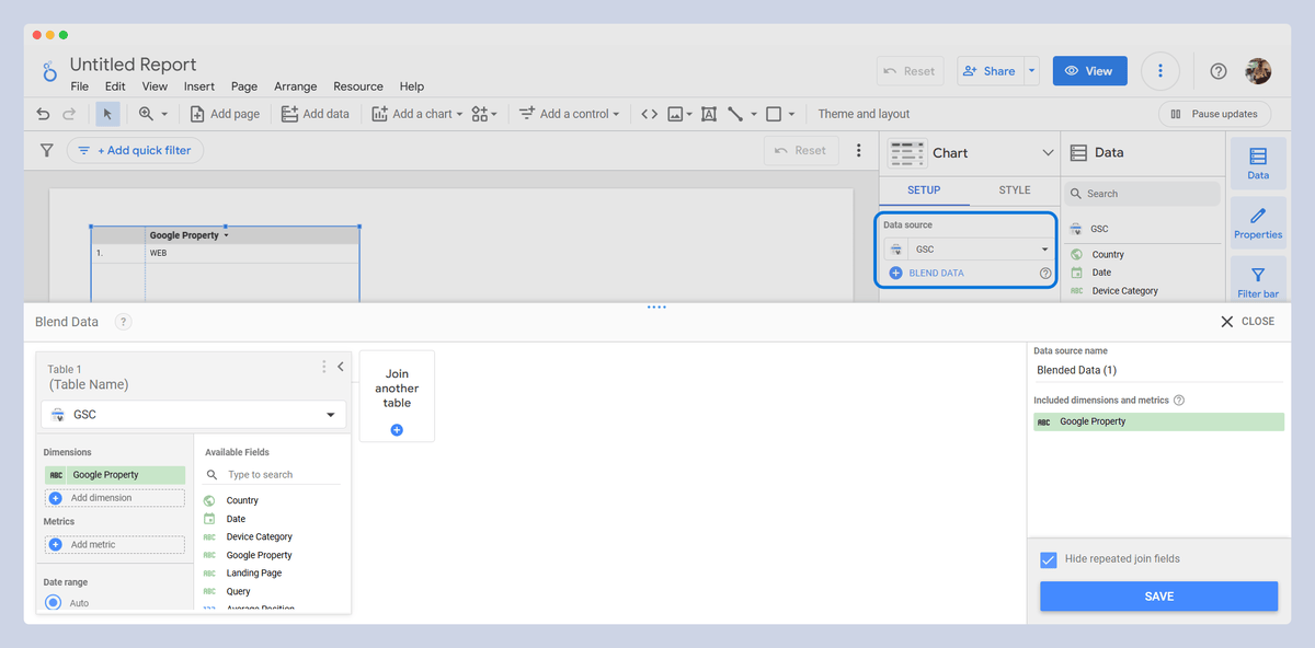
The next feature is data blending, which allows you to join and blend your data in various ways.
For example, you can blend data from GSC, GA, and Sitebulb and other tools to see how many clicks a specific URL has received, how many sessions it has, and how many backlinks it has. Normally, this data would be scattered across different platforms, but with the blending feature, you can view everything in one place, giving you a more unified and comprehensive view of your data.
2. Customizable Dashboards
Another great feature of Looker Studio is the customization of the dashboard. With a drag-and-drop interface, you can easily design your desired layout without needing any coding skills. Additionally, Google provides a Template Gallery with many ready-made templates that you can edit and use according to your needs. Other users also create and share their templates for Looker Studio, which are either free or available for purchase.
For example, here are two Sitebulb x Looker Studio report templates you can use:
Looker Studio single project template
Looker Studio multi-project monitoring template
3. Advanced-Data Visualization
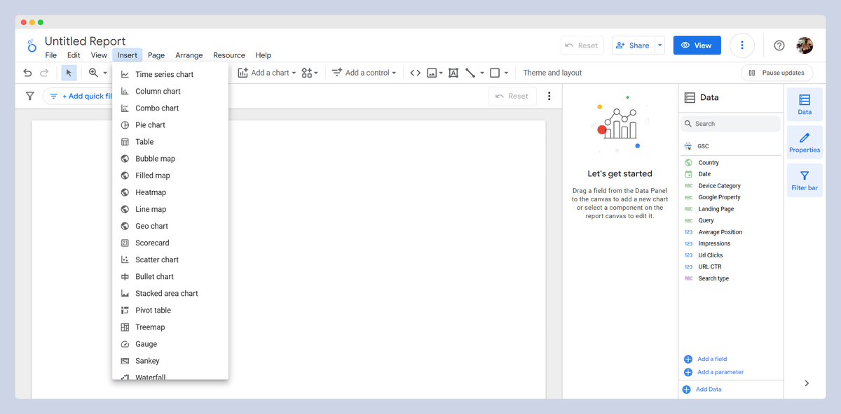
One of the key features of Looker Studio is the variety of chart types available, such as Scorecard, Table, Time series, Pie, and more. It also offers a range of controls, like Drop-down lists, Fixed-size lists, Input boxes, and Advanced filters. In addition to charts, Looker Studio includes chart interactions, controls, and filters that make it easy to sort and manipulate your data.
Calculated Fields is a feature that allows you to write custom formulas. It lets you create new data by applying simple formulas to your existing data. It is like a math tool for your reports! You can use it to do things like adding numbers, combining fields, or making decisions based on conditions, helping you customize your data insights.
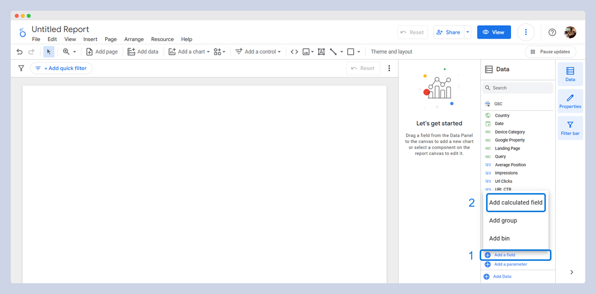
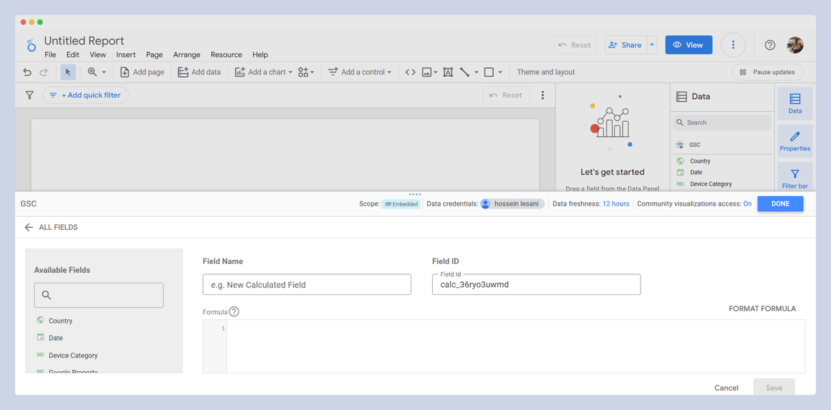
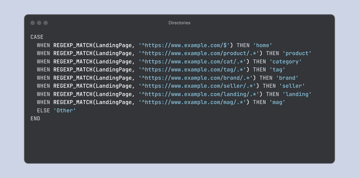
For example, you can create a new ‘calculated field’ to analyze the traffic of different directories. You can see a sample of the RegEx code in the below image:
4. Real-Time Reporting
The Live Data Updates feature is very useful because it ensures you never see outdated data, allowing you to check your desired metrics in real time.
This feature becomes significant when you want to use a dashboard repeatedly, for example in monthly reporting on KPIs. There's no need to manually check these elements or export and upload GSC data every month. Looker Studio automatically refreshes the data and can even email it to you.
5. Collaboration and Sharing
I love Looker Studio’s collaboration and sharing features, which enable you to create highly professional dashboards and make them available to others for free or for a fee.
For example, I recently created a dashboard called Queries Performance Tracking, which was built with sample data and made public for free. All you need to do is open the link to the dashboard, select your GSC, and easily view your own queries’ performance.
6. Automation and Scheduling
Looker Studio allows you to set up automated email reports, enabling you to track the entire report or a filtered section of it on a daily, weekly, or monthly basis. Simply click the button next to ‘Share’ in the header, configure the settings, and you will receive the report image and the attached PDF file via email.
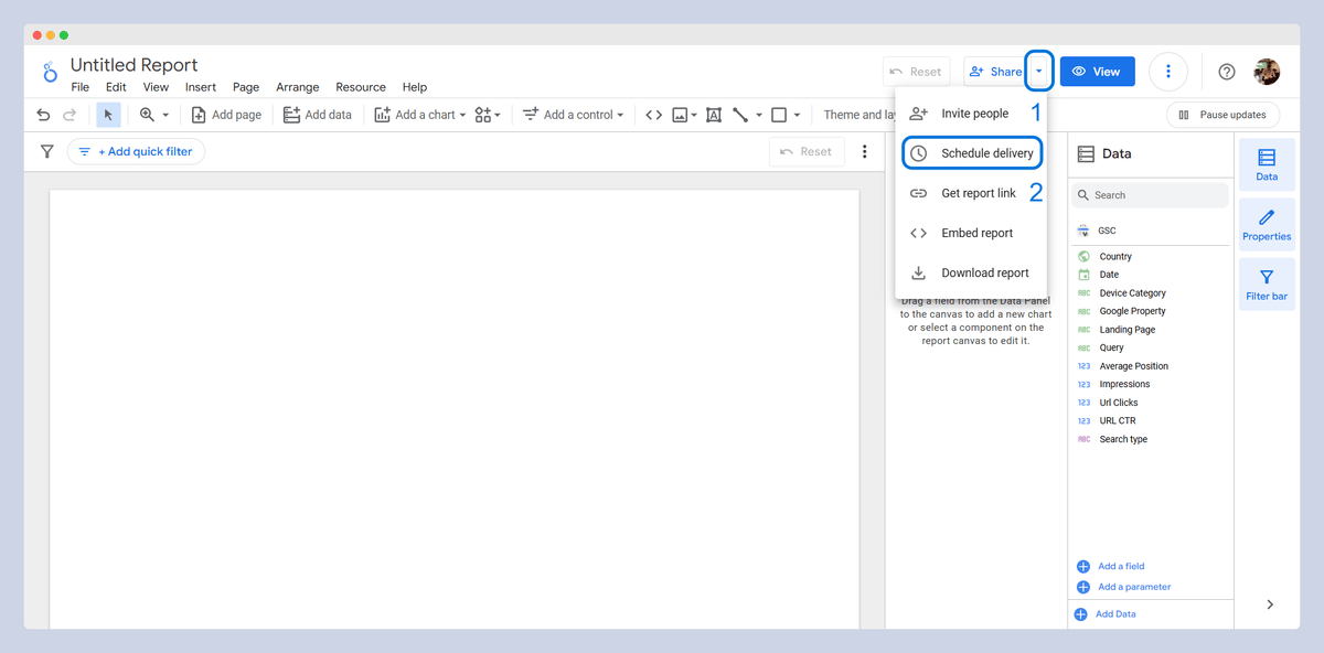
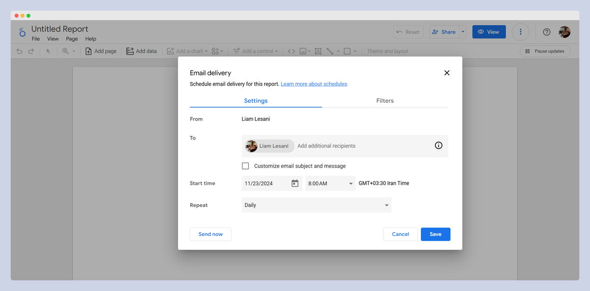
Data Refresh Schedules allow you to configure data sources to refresh automatically. You can set a refresh frequency for each data source via the “Manage added data sources” section, ensuring your data stays up to date without manual intervention.
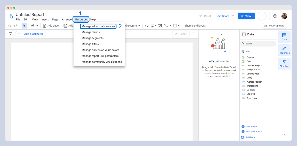
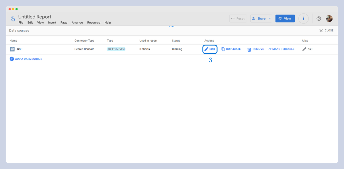
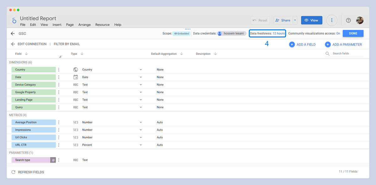
These seem to me to be the most important features of Looker Studio for SEO professionals. If you work with it, you will quickly realize that it offers many incredible capabilities beyond what we have covered here!
Building Your SEO Dashboard
Once you have a solid understanding of Looker Studio’s features, you can then move on to creating functional and professional dashboards tailored to your SEO needs.
Looker Studio dashboard components:
- Metrics
- Dimensions
- Metrics vs Dimensions
- Data sources
- Connectors
- Charts and Tables
- Filters
Metrics
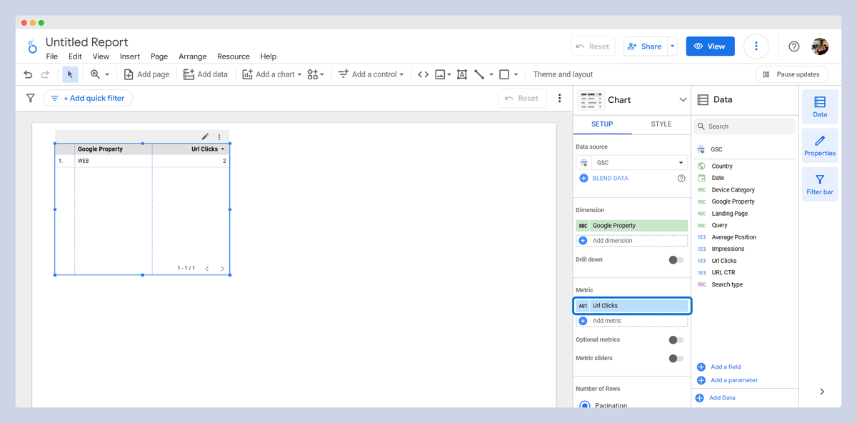
Metrics are quantitative values used to measure and analyze data. They are numerical data points that represent measurable aspects of your performance, such as the number of sessions, clicks, impressions, conversions, or revenue.
Examples of Metrics in SEO:
- Sessions: The number of times users visit your site.
- Page Views: The total number of pages viewed by visitors.
- Conversion Rate: The percentage of users who complete a desired action (like making a purchase or signing up).
Metrics are used in charts, tables, and scorecards to display performance levels over time or in comparison to other variables.
Dimensions
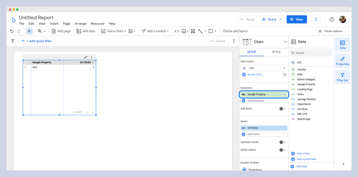
Dimensions are descriptive attributes or categories of data that provide context to metrics. They help you segment your metrics by specific characteristics, like location, device type, or source of traffic.
Examples of Dimensions in SEO:
- Landing pages: analyze which pages are attracting the most organic traffic.
- Country or Device Type: segments traffic data by geographic location or device.
Dimensions work as groups that classify data, making metrics more meaningful by showing breakdowns in categories (such as sessions by country, or clicks by device type).
Metrics vs. Dimensions
Metrics answer “how much” or “how many” by measuring specific quantities but dimensions provide context by showing “what”, “who”, or “where” to classify or group the metrics.
Example for Comparison:
- Dimension: Country tells you where users are from.
- Metric: Sessions tell you how many visitors came from each country.
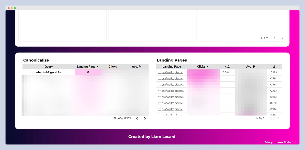
Tip: Some dimensions can also be used as metrics. For example, by default, queries and landing pages are dimensions in the GSC data source. However, you can use them as metrics to see how many landing pages each query has. This data can help you identify keyword cannibalization on your site.
For example, as shown in the image below, "what is k2 good for," has 8 pages on SERP. These landing pages are listed in the adjacent table and need to be reviewed by the SEO team.

Data Sources
In Looker Studio, data sources are like the gateways to all your important information. These could be tools like GSC, GA, or even something like Sitebulb. By connecting these data sources, you can pull in metrics and dimensions that help you visualize and analyze data from different platforms all in one dashboard. It is a great way to get a comprehensive view of your data!
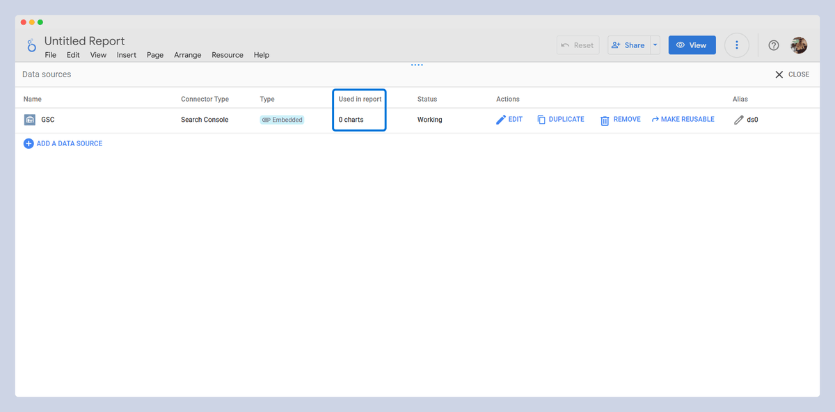
To manage data sources, you can go to the “Manage added data sources” section. Here, you can check details such as where the data source is used (used in report) and its status. You can also edit the data sources, and if possible, within the source, modify the type and aggregation according to your needs.
Connectors
Connectors are tools within Looker Studio that allow you to link external data sources to your dashboard. Connectors act as bridges, facilitating access to different data platforms directly within Looker Studio.
Types of Connectors:
- Google Connectors: Includes GSC, GA, Google Ads, YouTube, and BigQuery.
- Partner Connectors (by third-party platforms): Tools like Sitebulb, Semrush, or HubSpot.
As mentioned, Sitebulb has a dedicated connector for Looker Studio, the Looker Studio Sitebulb Connector, which allows users to visually track and monitor their On-Page and Technical SEO status in a single dashboard.
Some examples of the data you can display in your dashboard using this connector include:
- HTTP Status Code
- Structured Data Errors
- Pagination Status
- Canonical Status
- Indexable Status
- Title Identification
- Meta Description Identification
- Duplicate Content by Type
- Core Web Vitals
It is highly recommended that you read the Looker Studio Sitebulb Connector guide to fully understand how to make the most of these features.
Setting Up Connectors:
Click "Add Data" in the header, select the desired connector, and after authorizing, you can add the data to your report.
Charts
Charts and graphs help you turn data into visuals that are easy to understand. They show trends, comparisons, and patterns at a glance.
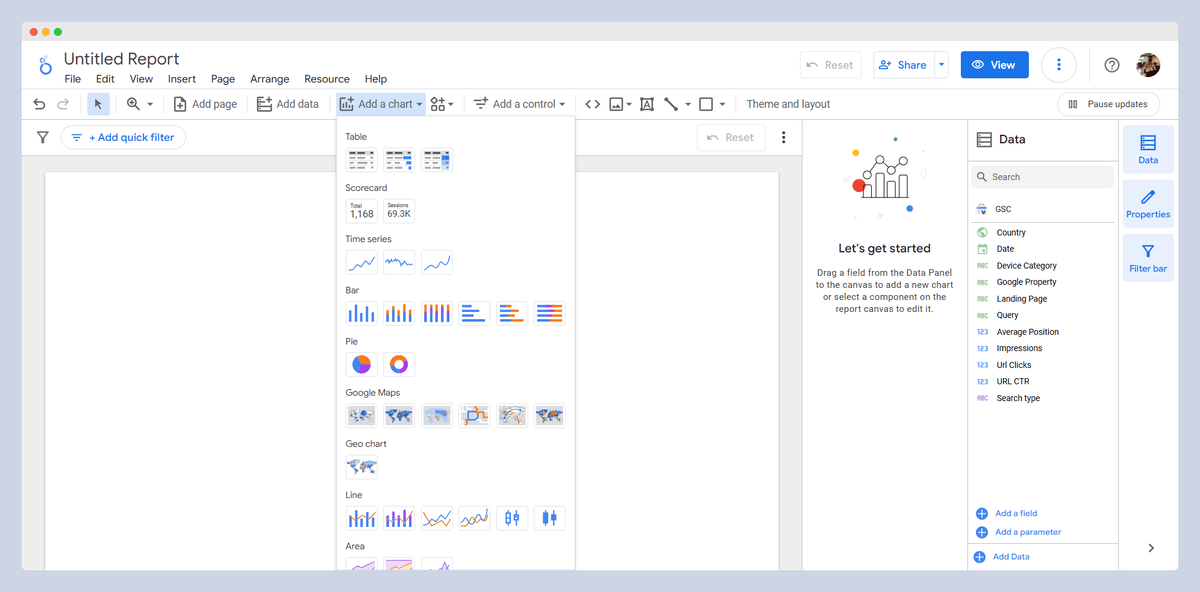
Types of charts (plus examples from real data):
- Scorecard: shows key metrics like total sessions and conversions.
- Table: displays detailed data like top pages, and queries according to clicks.
- Pivot table: summarizes data such as traffic by source and device.
- Bar and Column: compare metrics like organic vs paid traffic.
- Pie: shows proportions, like traffic sources (organic, referral, ads).
- Combo: combines two metrics such as sessions and conversions for comparison.
- Geo: visualizes traffic or conversions by country.
- Google Maps: shows user locations on a map.
- Line: tracks trends over time, like ranking changes or traffic growth.
- Area: shows traffic growth over time, emphasizing volume.
- Scatter: shows relationships, like queries rank vs clicks.
- Bullet: displays progress to a goal, like SEO target rankings.
- Treemap: visualizes blog post count per category.
- Sankey: shows how users flow through stages, from the first sessions to conversions.
- Gauge: displays progress towards SEO goals, like target clicks at the end of year.
- Waterfall: shows changes in traffic or rankings over time.
- Timeline: tracking query ranking changes over time.
- Funnel: shows user journey, from visitors to conversions.
Controls
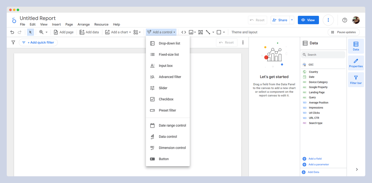
Controls are powerful tools that allow users to interact seamlessly with data by filtering it according to specific dimension values, setting custom time frames for reports, and defining parameters that can be utilized in calculated fields or shared with the data source. These capabilities create an engaging and dynamic experience, making data exploration both intuitive and highly interactive.
Types of Controls (plus examples from real data):
- Drop-down list: select a specific option like country or device from a list.
- Fixed-size list: display a set number of options such as show the top 5 landing pages (based on clicks or other metrics)
- Input box: enter a custom Query/Landing page to track its performance over time.
- Advanced filter: complex filters for applying specific conditions to refine data, such as equal, contains, or RegEx.
- Slider: Adjust a range of values (Use a slider to compare traffic from the past 3 months vs. the last 6 months.)
- Checkbox: select multiple options like organic, referral, and paid traffic sources
- Preset filter: quickly apply a predefined filter, such as applying a filter for last month’s SEO performance or a button for download report.
- Date range Control: Choose a custom date range of view keyword rankings from January to March.
- Data Control: switch between data sources like GSC.
- Dimension control: change the data breakdown by dimension (Switch between Queries and Landing pages)
- Button: trigger actions like refresh data.
Best Practices and Tips for Creating a Functional SEO Dashboard
This article is intended to teach the right mindset for creating a functional dashboard for SEO professionals.
When aiming to create a professional dashboard, we face a few questions:
- What is the purpose of this dashboard?
- Who makes the most of it?
- What data sources are needed?
- What dimensions and metrics should be covered?
- How should these dimensions and metrics be represented?
1. Defining the Purpose of the Dashboard
The most important part of building a dashboard is understanding why you are creating it. What do you want to track? Will it be a static report that won't be updated, or will it be dynamic, updating automatically?
Here are a few examples of useful SEO dashboards:
- SEO Monthly Report
- SEO Audit
- Traffic and Conversion Tracking
- Backlink Analysis
- Landing Pages Analysis
- Queries Performance Tracking
2. Identifying the Primary Users
Who is expected to use this dashboard? Is it going to be viewed by someone who is an SEO specialist and understands my data, or am I going to present the data to one of my clients who has limited familiarity with SEO?
Examples:
- For SEO Specialists: a detailed view with metrics on landing page performance, backlinks, and technical SEO metrics.
- For Clients: A high-level summary with KPIs like traffic growth, conversion rates, and ROI, with minimal technical details.
3. Determining the Necessary Data Sources
The size and number of data sources can become very large at a big scale, and it is necessary to select only the ones that are relevant to our goal and audience. For example, the goal is to create an SEO Audit dashboard that provides insights to the marketing team, and an overview of the current situation is needed.
First Step: Clarify the Dashboard’s Main Objectives
The main objectives to cover in this audit are:
- SEO performance
- Technical SEO health
- Analyzing SEO-driven conversions and revenue
Second Step: Select Data Sources Aligned with SEO Objectives
- GSC & GA for SEO performance: Current traffic conditions and changes over the past year or compared to the previous quarter.
- Sitebulb for technical SEO health: Understanding the current technical SEO status and issues such as crawl errors, broken links, duplicate content, etc.
- GA for analyzing SEO-driven conversions and revenue: Analyzing the impact of SEO on sales, mapping the funnel, and comparing it with other marketing channels.
4. Deciding on Dimensions and Metrics
One of the essential aspects of creating a good dashboard is selecting the right dimensions and metrics. Keep in mind that the selection should be based on the needs of the audience and the objective of creating the dashboard.
First Step: Identify Key Metrics Based on the Dashboard’s Purpose
- Traffic metrics like Clicks and Organic Sessions for SEO performance
- Technical SEO metrics like number of Not Found and Redirected URLs, Duplicate Content, etc for Technical SEO health
- Conversion metrics like Conversion Rate (CR), Average Order Value (AOV), and Average Items per Order (AIPO), Net Merchandise Value (NMV) from Organic Channel vs Other Channel for Analyzing SEO driven conversions and revenue
Second Step: Identify Dimensions Based on the Dashboard’s Purpose
We need to decide how to view and categorize different metrics. Should we look at them by landing page, by country, or by different directories of our website?
For example, it is preferred to view traffic metrics and technical SEO metrics based on landing pages and conversion metrics generally by organic channel.
An important point here is that one of the things that can really help us is adding calculated fields, where you can add custom fields to dimensions and metrics based on your needs.
5. Designing an Effective Data Representation
The way we visualize these metrics and dimensions is very important. At the beginning of this article, different types of charts, graphs, and controls were explained, and some examples for each were provided; I hope they will be helpful.
Make sure to present each data correctly. What I mean by this is to use charts or graphs that are simple and understandable for your dashboard audience. Additionally, they should be placed in the right spot on your page.
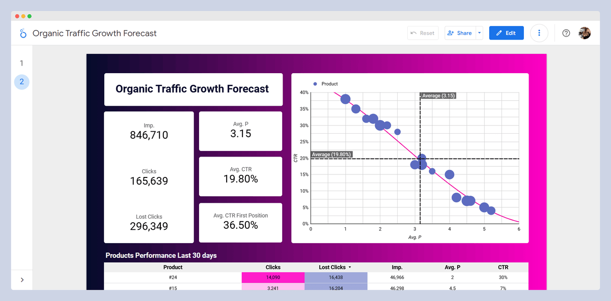
For example, you are preparing a forecast for the marketing manager of an ecommerce site, and you are going to analyze the maximum growth potential of one of the site's categories (including about 30 products).
A big mistake is creating a table or pie chart of the products with the most Lost Clicks and placing it at the top of the page. Doing this would likely confuse your audience and make it harder for them to understand your message.
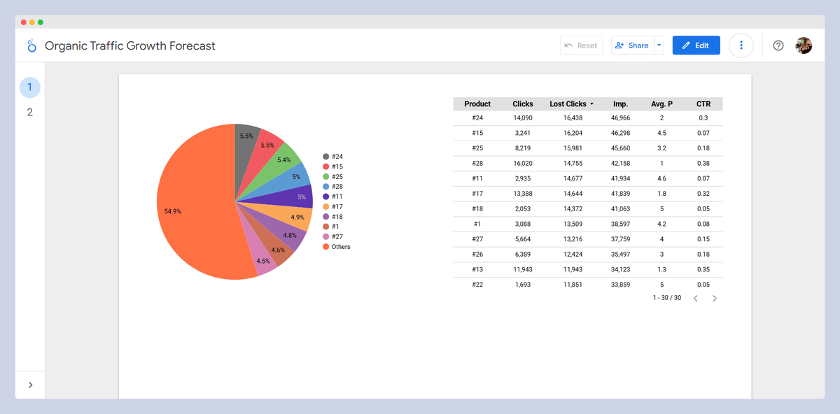
The better approach is to place a few scoreboards at the top of the page, displaying the current Avg. CTR and Avg. Position, as well as the Avg. CTR and Avg. Position for position one. Along with these, also include Impression, Total Clicks and Total Lost Clicks. Additionally, have a scatter chart to display the opportunities. Finally, include a Table that allows viewing the product performance details.
6. Appearance Matters
The visual design of the dashboard is critical. It is recommended to explore plenty of sample dashboards and use websites to select suitable colors.
Key Principles of Visual Design for SEO Dashboards
- Color Harmony and Consistency: Using the right colors together helps dashboard users easily see and identify important data.
As an example, growth is usually shown in green. If you change this color to black, it becomes difficult to be recognized at first glance. Additionally, if the background color makes it hard to see the green, it’s better to have a white background for this section to ensure that it is easily readable.
In general, attention should be given to the contrast of colors, their readability, and how they are used.
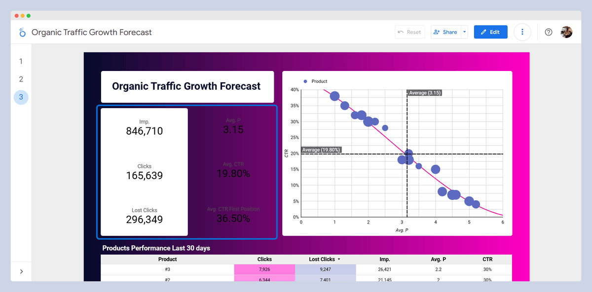
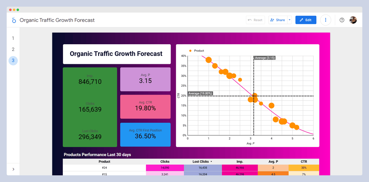
Tip: Avoid using too many colors, as it can create a cluttered feeling and confuse the audience. A maximum of four colors can be effective: two primary colors and two secondary colors. Ideally, choose primary colors that complement each other. For example, dark blue and orange make a good combination, but light yellow and white do not create a pleasing contrast.
- Simplicity and Clarity in Design: A simple design helps them focus easily on the important points.
- Intuitive Layout and Navigation: What helps the users reach their goals quickly is including key metrics and avoiding overwhelming them with too much information at first glance.
Quick Tips
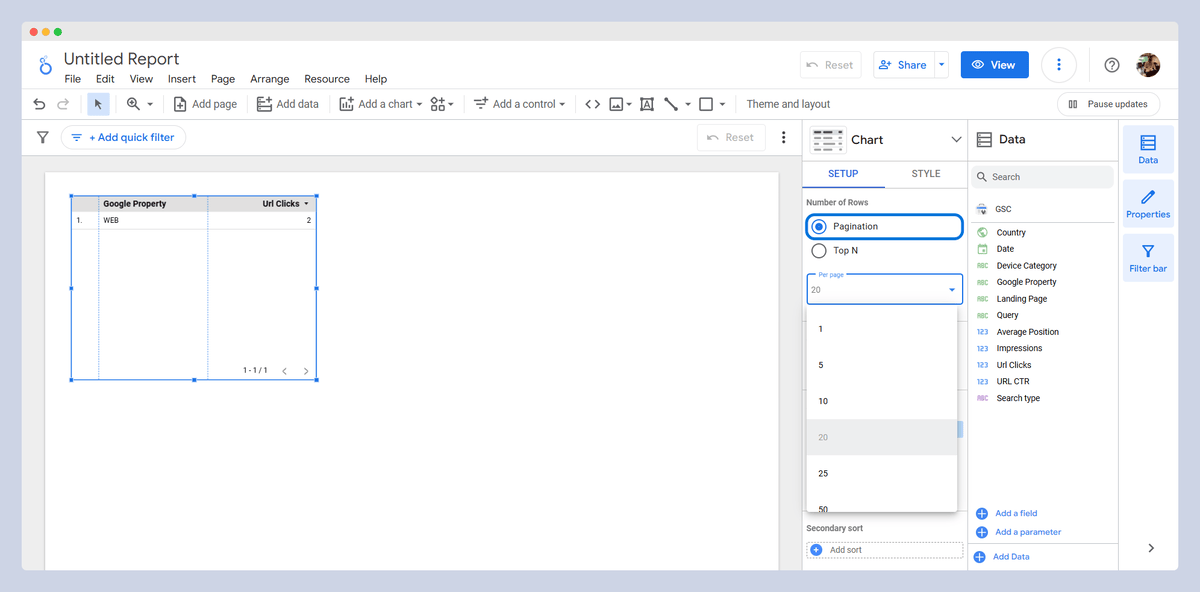
- Since the load on Looker Studio happens on the user's browser, make sure to filter data tables with pagination and set a limit of 20-25 items, especially if you have many tables.
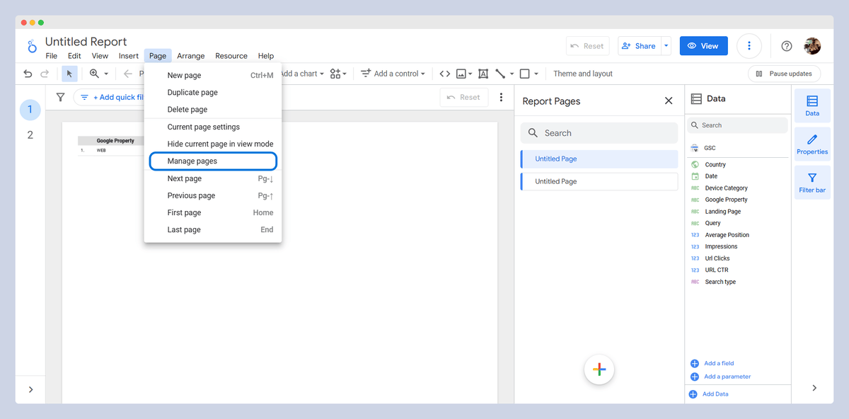
- Preferably, do not place all metrics on a single page; instead, segment them into different pages. To do this, you can click on the "Add page" section in the header, and to manage these pages, click on "Manage page" in the header's Page section.
Common Mistakes
- Lack of a clear goal for creating the dashboard
- Not considering the expertise level of the individuals who will use the dashboard
- Overloading with metrics that don't align with your objectives
- Ignoring the design of the dashboard and not grouping the data properly
Conclusion
I hope that you now have a good understanding of Looker Studio and its components, key features for SEOs, and how to build a professional SEO dashboard. Good luck with your data analysis and reporting!
You might also like:

Liam Lesani is the SEO Team Lead at Welltopia Pharmacy with over 5 years of experience. He specializes in enterprise e-commerce SEO and is a data-driven consultant focused on driving product growth.
Articles for every stage in your SEO journey. Jump on board.
Related Articles
 Beyond Cosine Similarity: Testing Advanced Algorithms for SEO Content Analysis
 How to Develop an SEO Strategy: What Does the Data Say?
 10 New JavaScript SEO Statistics for 2024
 Sitebulb Desktop
Find, fix and communicate technical issues with easy visuals, in-depth insights, & prioritized recommendations across 300+ SEO issues.
- Ideal for SEO professionals, consultants & marketing agencies.
Try our fully featured 14 day trial. No credit card required.
Try Sitebulb for free Sitebulb Cloud
Get all the capability of Sitebulb Desktop, accessible via your web browser. Crawl at scale without project, crawl credit, or machine limits.
- Perfect for collaboration, remote teams & extreme scale.
If you’re using another cloud crawler, you will definitely save money with Sitebulb.
Explore Sitebulb Cloud


 Liam Lesani


