


These WordPress Website Mistakes Could Hurt Your Brand’s Credibility
 Rebecca Barnatt-Smith
Published December 15, 2025
We welcome back Rebecca Barnatt-Smith who outlines some common Wordpress website mistakes, with real-world examples and what to do to fix them. A must-read for Wordpress or Wix users.
Credibility is everything in an online space. Trust begins the moment a visitor lands on your website, and any design missteps can instantly erode it.
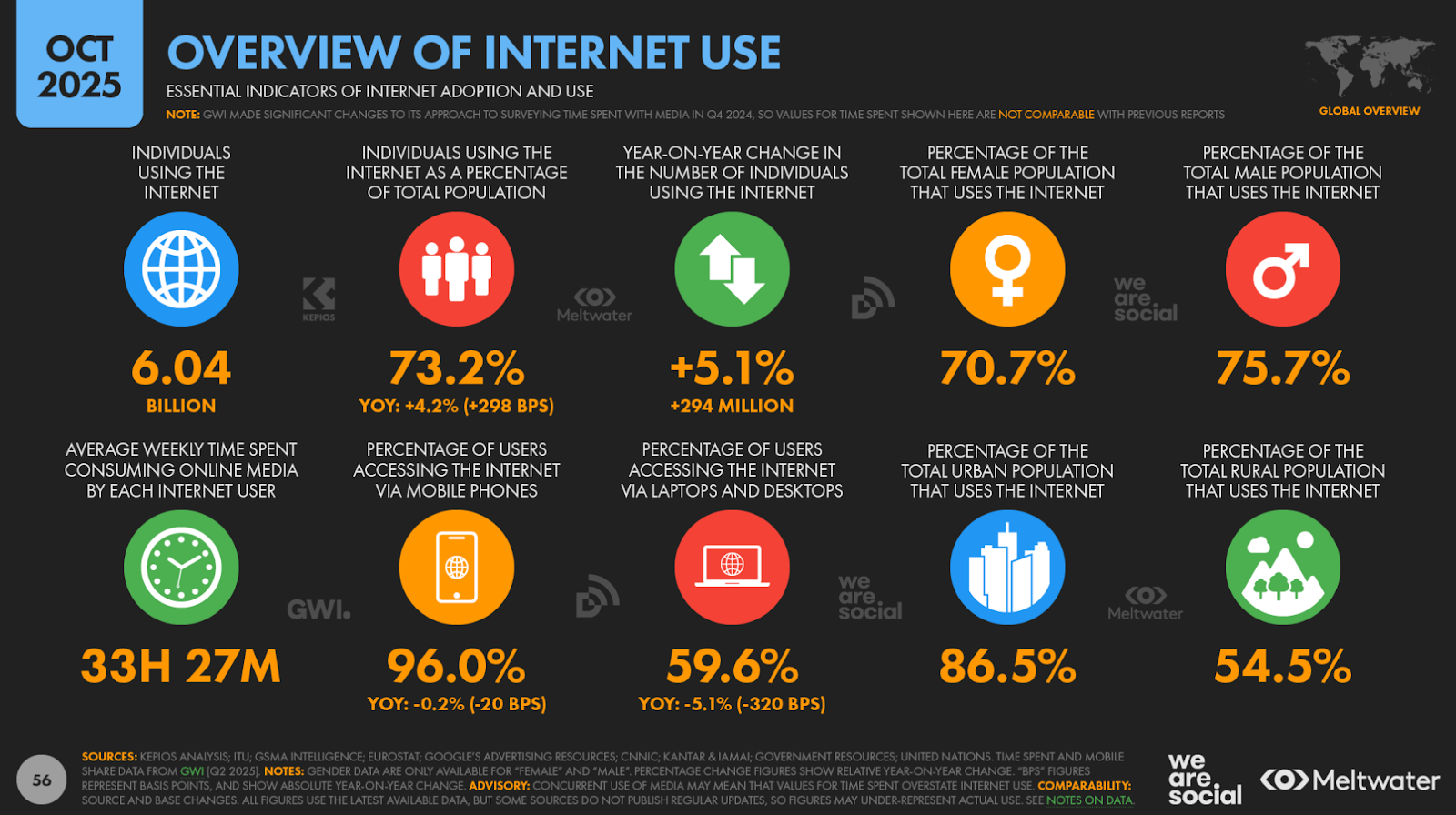
Did you know 46% of consumers base their decisions on the credibility of websites on visual appeal alone?
Therefore, maintaining core elements such as website accessibility, navigation, and design has become crucial in a competitive online marketplace.
From Amazon to M&S, no brand is immune to making mistakes when it comes to UX performance, even if you’re using a popular web builder like WordPress or Wix.
Let's take a deeper dive into the world of WordPress as we uncover some of the most common design mistakes that could cost you your brand’s credibility.
Contents:
Mistake #1: Using an Outdated or Generic Theme
An outdated website design immediately gives your target leads a poor impression of your brand.
It takes online visitors just 0.05 seconds to form an opinion about your website. If you’re spotting an old or cookie-cutter WordPress theme, don’t be surprised if your bounce rate continues to climb.
Poor website design choices make your brand look dated and unreliable. While your adjacent online branding on socials and other industry platforms may attract leads, an outdated WordPress theme can make your website feel disconnected and misaligned with your brand identity.
To demonstrate the impact that outdated web design has on your brand’s credibility, I’ve placed two website homepages competing for the same customers side by side:
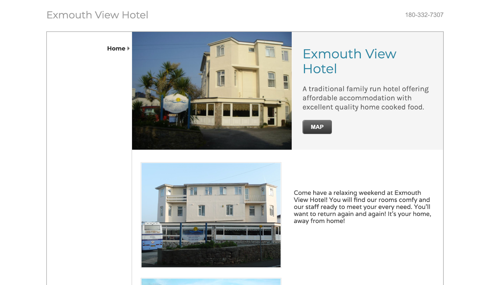
(Image Source: Exmouth View Hotel)
First, we have Exmouth View Hotel’s website. As you can see here, this web template is outdated and not designed to fill larger, modern desktop screens.
With no drop-down navigation in place, users are drawn to jumbled sections that are tricky to navigate and make the site look ‘clunky’.

(Image Source: Manor Hotel)
If we compare this with their competitor, Manor Hotel, we immediately receive a more positive experience. From a powerful use of negative space, to modern fonts and an accessible drop-down menu, Manor Hotel’s website design immediately appears more credible and encourages leads to click through and convert.
With these examples in mind, can you see how an outdated website design can immediately skew your view of the brand itself?
The key here is to stay on top of your website theme. Regularly updating your WordPress template is essential if you want to rival competitors.
Using tools like WP Theme Detector, you can view competitors’ theme frameworks and quickly discover the name, author, and version of the WordPress theme, making it easier to replicate popular designs and stay relevant in a Google search.
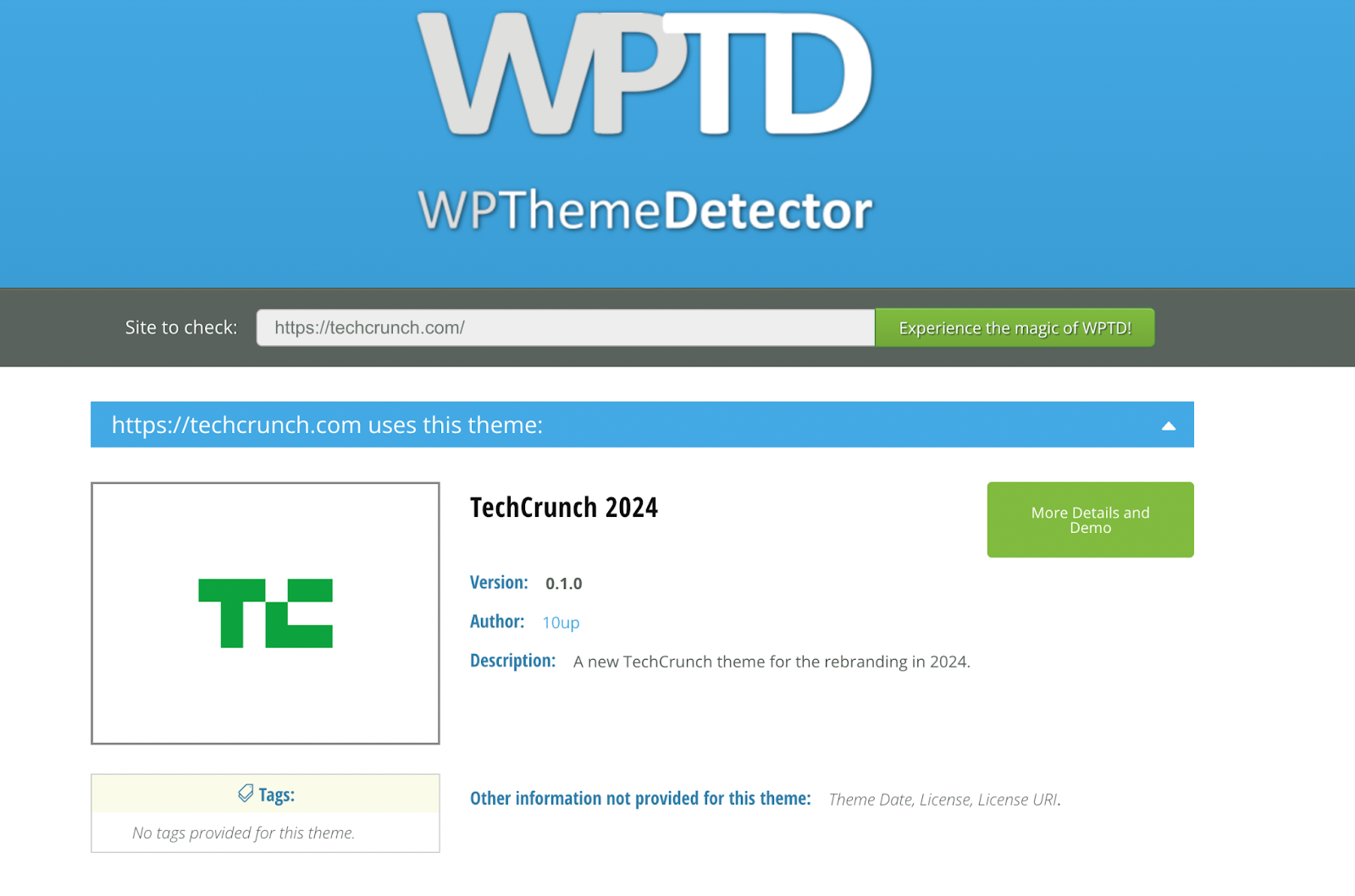
(Image Source: WPThemeDetector)
Mistake #2: Slow Loading Times and Poor Core Web Vitals
Users often equate slow sites with low credibility. In fact, according to a Google study, more than half of all online users will bounce if a page takes over three seconds to load.
Sites slow down for a number of reasons. From too many large file visuals to traffic bursts that a poorly hosted domain can’t handle, poor website management, and overcrowded UX design could be behind your website crashing.
The online ‘big dogs’ are not immune to website performance issues either. For example, during their Prime Day sales in 2018, Amazon’s web store crashed, leaving millions of customers unhappy as they were met with a picture of a dog, rather than the deals they were hunting for.
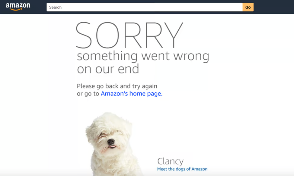
(Image Source: Liquid Web)
With masses of traffic to deal with at once, Amazon’s bandwidth was stretched, causing its global site to lag before crashing completely.
While the website was down for less than a day, it could have cost around $100 million in lost sales.
If you’re a WordPress website owner, maintaining your core web vitals is key, especially if you want a fast-running site. To expand your bandwidth and handle traffic spikes with ease, investing in a powerful WordPress hosting provider is essential.
Make sure you also stay on top of your page-by-page performance metrics.
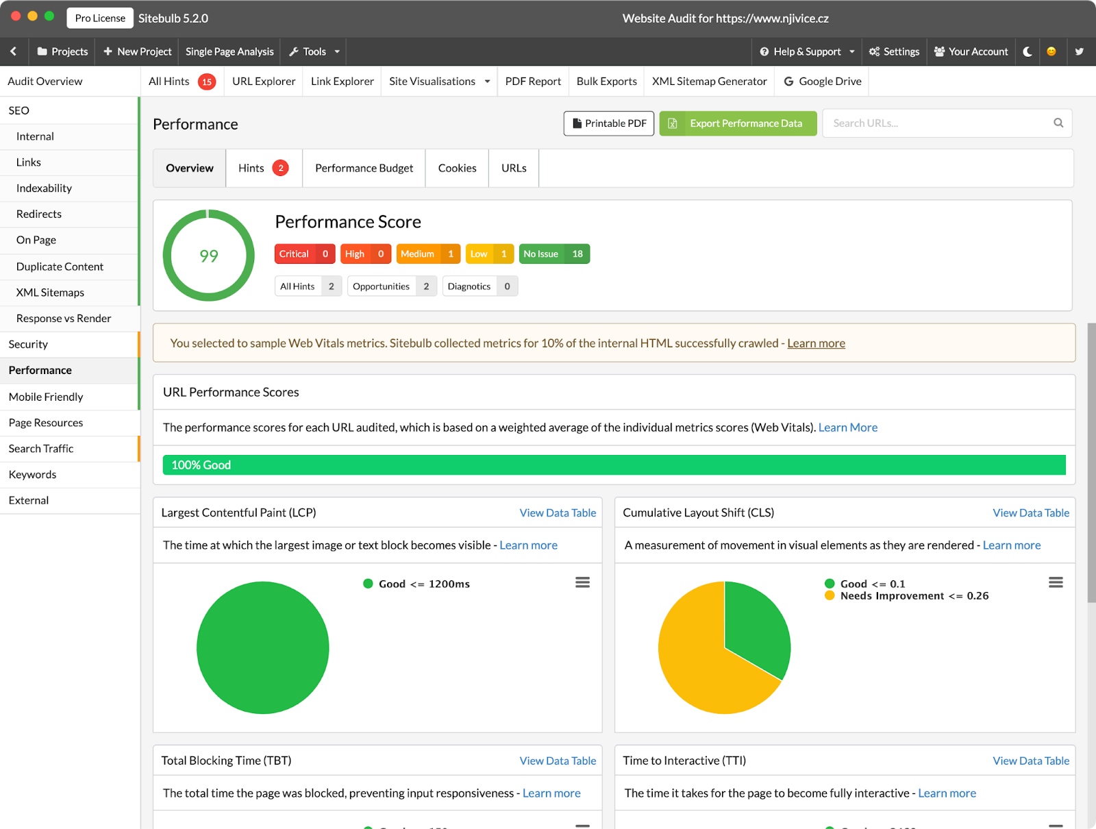
Using Sitebulb’s performance report, you can collect Web Vitals data at scale and get bulk PageSpeed insights to spot template based issues.
Mistake #3: Ignoring Mobile Optimisation
Ignoring mobile optimisation is a costly mistake when it comes to creating your WordPress website.
Nearly 60% of all web traffic comes from a mobile device in 2025, so an unresponsive mobile site screams “outdated”.
Your WordPress mobile site should be optimised for smaller screens. This means prioritising large, touch-friendly buttons, legible fonts, and simplified navigation for mobile users.
Some of the key elements on a WordPress website that slow down mobile experiences include:
- An excessive number of plugins
- Images with large file sizes
- A desktop-only WordPress template
- Basic WordPress hosting plans
- Third-party ads, scripts and fonts
Each one of these mobile design mistakes could cost you half of your audience. In fact, in 2025, around 45% of users struggle with non-mobile-optimised sites and consider a mobile-friendly site crucial when purchasing goods online.
M&S is a great example of an e-commerce website that felt the negative effects of ignoring mobile optimisation back in 2014. The high street store saw an 8% drop in online sales as users struggled to navigate their mobile website.
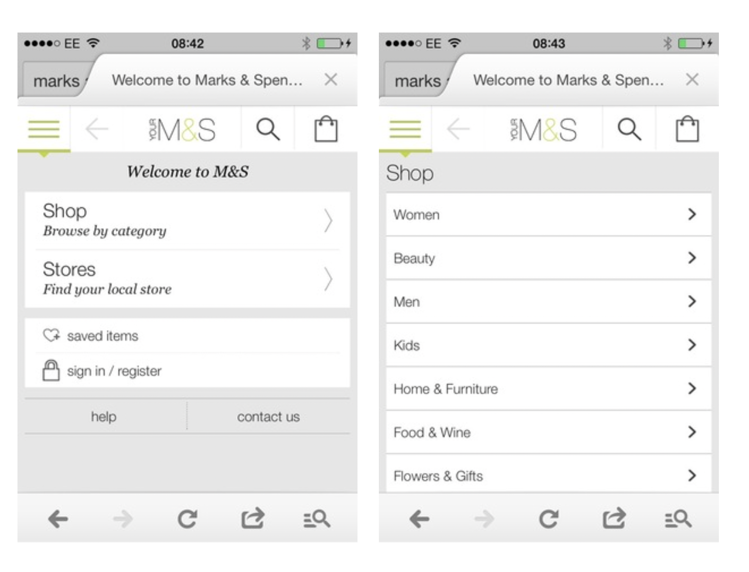
(Image Source: Econsultancy)
The picture above shows the mobile experience before and after it was optimised. They added a mobile-friendly drop-down navigation that prioritised large buttons and haptic feedback for an enjoyable smartphone experience.
Admittedly, this was a long time ago. However, you might be surprised to learn that not every website is optimised for mobile, even today.
Sitebulb's mobile-friendly Hints focus on helping you identify and revisit any issues that negatively affect your WordPress website when accessed via a mobile browser.
Mistake #4: Inconsistent Branding
Inconsistent branding could be a killer for your WordPress website. If you’re mismatching colours on every page and changing fonts/icons regularly, you lose that consistency that gives your brand credibility.
“Elements of your visual identity, such as your logo and design, need to appear uniformly across all platforms, including your website, social media and packaging, for example,” Jessica Wong, Founder and CEO of PR firm Valux Digital, told Forbes.
“Inconsistent use quickly erodes consumer trust. On the other hand, consistent use of your colour palette and typography reinforces brand recognition.”
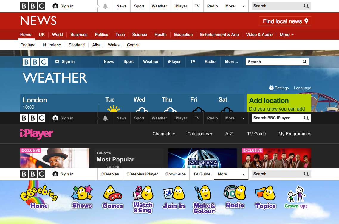
The BBC is an excellent example of a brand that knows how to prioritise consistency with its branding. While each of their individual sub-brands stands out, the BBC ties them together with consistent fonts, navigation, and logo placement.
To make your branding more consistent, start by managing the design elements you intend to place on each page, such as your icons, colour scheme and font.
I recommend using tools like IconScout to create cohesive icon sets and Coolors for palette management.
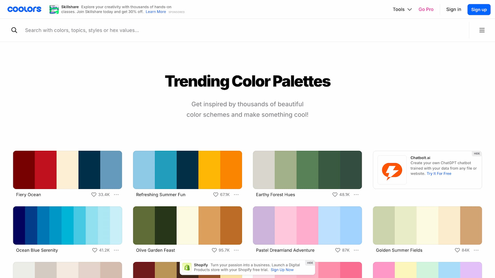
(Image Source: Coolors)
Not only is Coolors free, but it's also a great starting point if you’re looking to redesign your WordPress website. With ready-made and trending colour palettes to choose from, it's simple to create a powerful, cohesive design.
Mistake #5: Forgetting About Accessibility
Last but not least, don’t forget about accessibility. Every time you ignore accessibility, you not only lock your website out of a large portion of online users, but also damage your reputation.
The best WordPress websites are accessible to users of all abilities. When designing yours, follow the Web Content Accessibility Guidelines (WCAG) and choose a WordPress template designed with accessibility in mind.
A real-life example of poor website accessibility and the challenges it causes comes from Amnesty International.
After failing to meet WCAG guidelines in 2021, the brand released a statement revealing which elements of their website failed to meet accessibility standards:
- “Page headings are not always used in a way that is consistent or hierarchical.
- Most PDFs on amnesty.org are only partially conformant with WCAG and PDF/UA accessibility standards.
- Some images have poor colour contrast or burned-in text.
- Some images are missing alternative text. This is more of an issue on older webpages.
- Some videos do not have audio descriptions.”
Amnesty has since revamped its web design, now including an accessibility plugin that allows users to customise their UX experience based on their abilities.
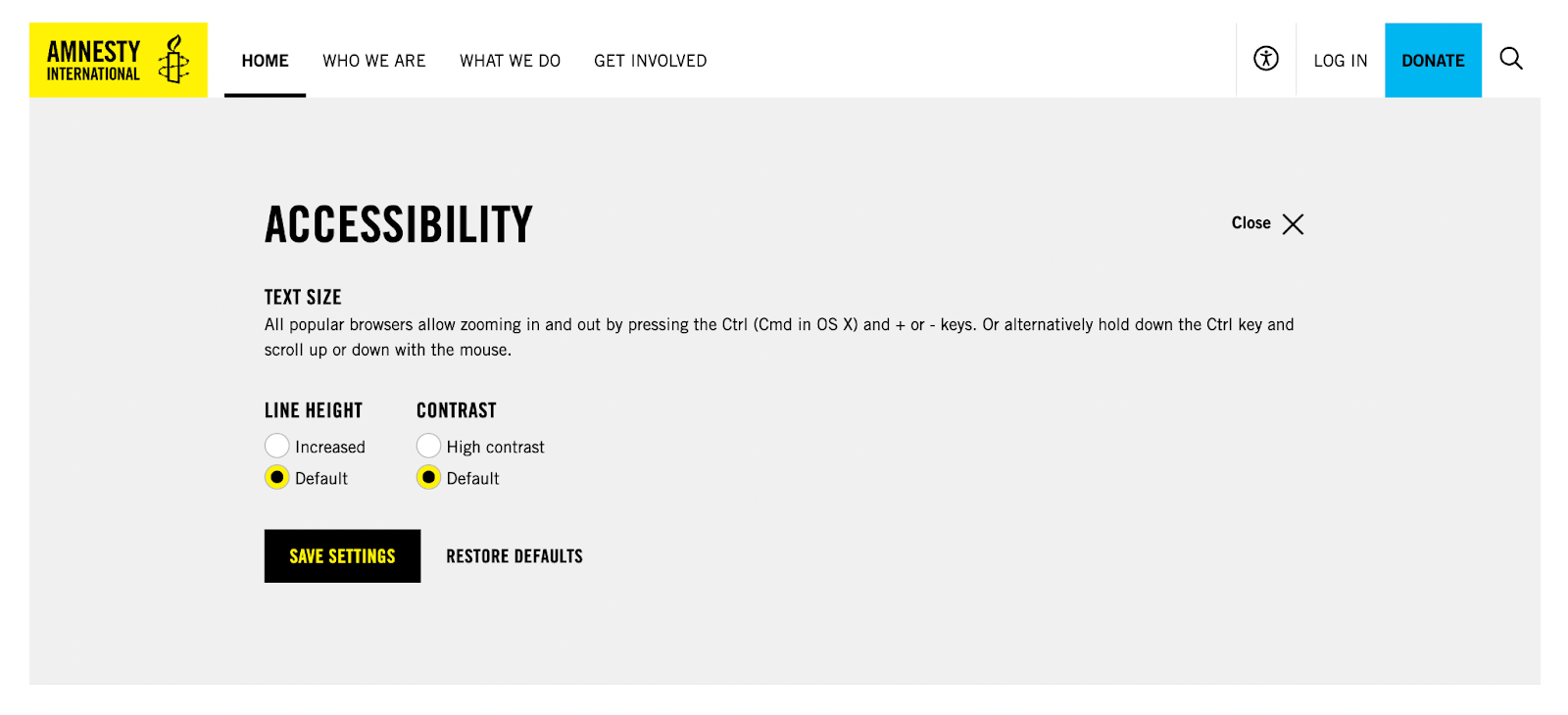
(Image Source: Amnesty International)
When it comes to checking your own UX design health, you can use Sitebulb to conduct a website accessibility audit. When you set up your crawl settings, be sure to select ‘accessibility’.
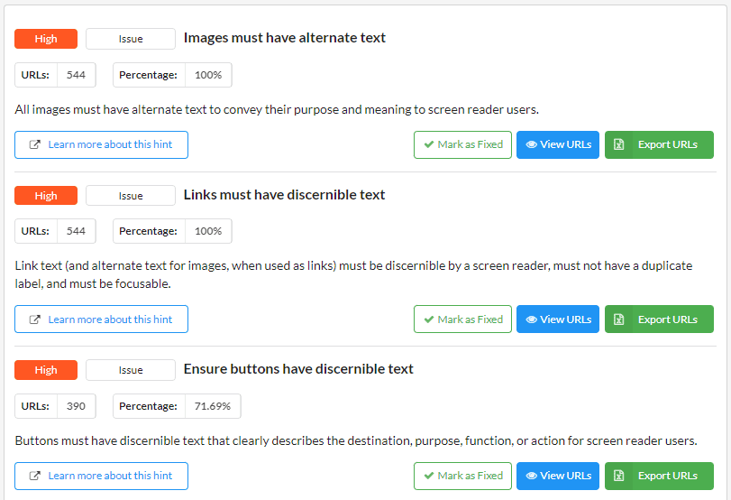
Here you can discover what elements of your WordPress design are accessible, and which components need revisiting.
Sitebulb will automatically test every crawled page against over 95 best-practice accessibility checks to ensure your website remains compliant with WCAG standards. And if you’re embedding video, remember to add captions during the editing step. It’s now easier than ever, especially since some editing platforms can generate captions automatically.
Turning Credibility Risks Into Strengths
Building trust in an online marketplace takes time and effort. Credibility grows through consistency and attention to the small details.
To ensure your WordPress website remains visible in today's search landscape, you must regularly audit your site for design, speed, and UX issues.
Using Sitebulb, you can stay on top of your SEO with a comprehensive on-page analysis that highlights any mistakes you may have made in the design process. With helpful Hints to guide you every step of the way, you’ll have your website shining in no time!

Rebecca is a freelance journalist and a content manager at Solvid Digital. She specialises in all things SEO and likes to write about the newest digital marketing trends on the block.
Related Articles
 Agency Technical SEO in 2026: AMA with Tory Gray & Patrick Hathaway

 JavaScript SEO AMA with Sam Torres: 13 Questions & Answers


 Advanced SEO Guide to Rendering: How to Debug, Test & Control What Google Sees

 Sitebulb Desktop
Find, fix and communicate technical issues with easy visuals, in-depth insights, & prioritized recommendations across 300+ SEO issues.
- Ideal for SEO professionals, consultants & marketing agencies.
 Sitebulb Cloud
Get all the capability of Sitebulb Desktop, accessible via your web browser. Crawl at scale without project, crawl credit, or machine limits.
- Perfect for collaboration, remote teams & extreme scale.