


PDP Optimization: A Blueprint for Product Pages People Love & Buy From
 Gabriela Jennifer Troxler
Published July 28, 2025
This week, Sitebulb welcomes Gabi Troxler to share her blueprint for effective PDP optimization…
We SEOs are in full crisis mode. SEO, GEO, LLMO? Purchases directly in ChatGPT and Perplexity? Google rendering all Product Listing Pages useless?
All hail the Product Detail Page (PDP). The last and only page standing between your user and their purchase. This is your foolproof PDP blueprint – based on my experience and with real life examples. I’ve also added a PDP template for you to use at the end of the article.
Contents:
Why the PDP?
87% of customers feel product content is the most important factor when deciding whether or not to purchase an item online, according to Convertcart. Information on the product page becomes essential – as they cannot physically see, feel, or smell the item.
Ever since 2011, the panda algorithm update has been targeting little content of no value, stuffed with keywords, bad UX and untrustworthy sites. Product pages are especially prone to thin content. And even though I don't see many panda penalties nowadays, content remains a huge missed opportunity on product pages.
Care for an example?
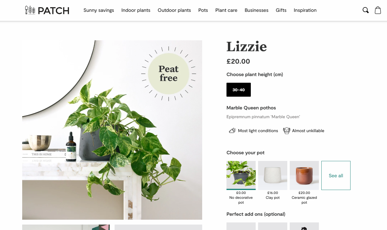
This is Patch Plants, a brand I love and used as inspiration when founding my own online plant store in Switzerland.
They're doing a lot of things incredibly well, and the design is clean and easy to follow. However, they could do better on their product pages.
Patch Plants decided to give their plants names. From a "plants are a living being and should be treated as such" business perspective, this makes sense. But from an SEO perspective, they missed the chance of putting a keyword into the H1.
When we scroll down, we get upselling & cross-selling. That comes at a point when we never really had a chance to decide for or against this product in the first place.
We only know what it looks like – and its size.
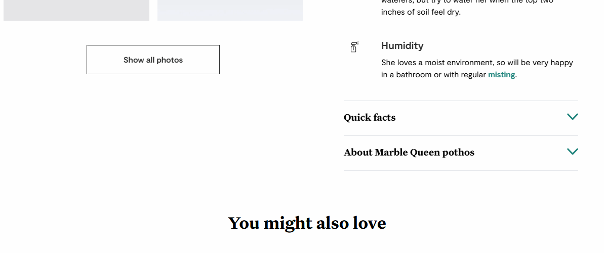
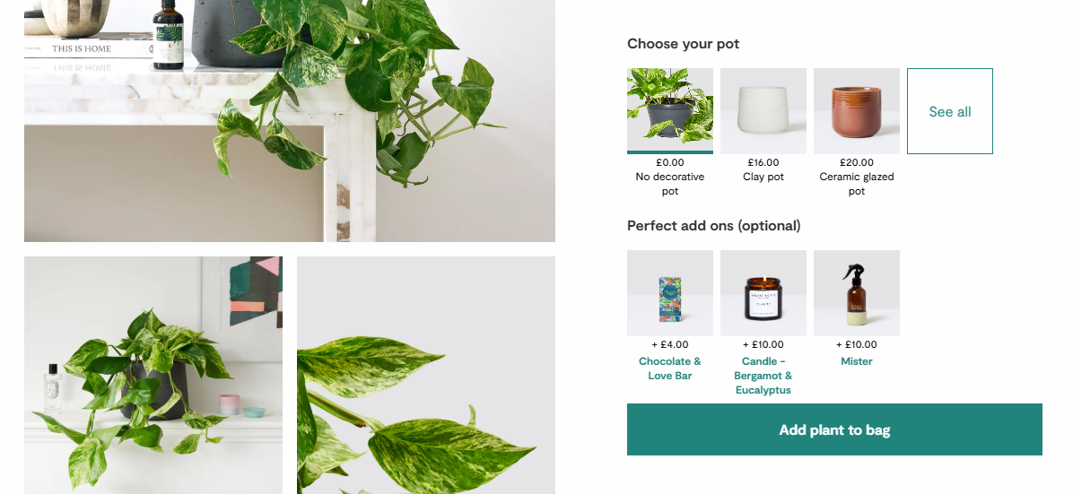
Only if we scroll even further down do we get more information on the product, but hidden by an accordion, which can be an issue for search engine crawlers and bots. The product page ends with a generic “you might also love”.
While we can certainly agree that this isn’t the worst product page of all times, it lacks depth and user guidance. When optimizing a PDP, I focus on building trust in potential buyers and a great UX.
Let’s look at a few better examples.
Optimizing your PDP: getting the basics right
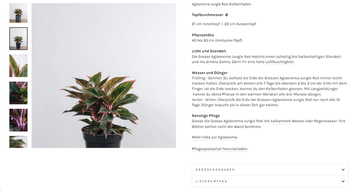
This is a plant from feey, the e-commerce shop I co-founded. We'll get into the visuals below. Here, I just want to draw attention to how many important elements you get above the fold.
Note: When you do this exercise for your own site, consider smaller screens like laptops and maybe tablets.
The following elements are crucial above the fold:
A breadcrumb
A product title with unique keywords – concise, clear, specific
Reviews (and the total review number)
Pricing, availability and shipping information
A clear, big CTA for great UX
Also consider the order and hierarchy of things. I’ve seen product pages that screamed “item available!”, but the “add to cart” button was nowhere to be seen (only much further down).
What is also available here, which are the “cherries on top”:
Three company USPs
A little quote from an actual customer. Bigger testimonials with pictures would be nice to have, but are missing here for the sake of space – remember, this is all above the fold.
The return policy. You could show payment options. All shipping and return information adds to the credibility of your brand, which helps with E-E-A-T, specifically trust. A return policy allows customers to “de-risk” their purchase.
A perfect PDP’s copy
Remember that quote from the beginning? 87% of customers claim it’s the content that seals or breaks the deal for them. In my experience, most opportunities for shops lie in expanding the copy.
Let’s start with some don'ts:
Avoid thin content. That doesn’t just mean “add copy”, but instead, avoid fluff and meaningless text chunks.
Avoid keyword stuffing. More isn’t more.
Avoid using the generic product description if you’re a reseller – unless you don’t care about standing a chance against Amazon.
Consider our plant example again.
What happens if I'm not convinced by anything above the fold? I scroll down.
And when I scroll down, I get a bunch of text.
This text is:
not too long, not too short, but exactly what the user needs
keyword-oriented
This is also where most shops lack depth.
They include a product summary with technical specifications. (In this example: the size of the pot and the height of the plant.). But they fail to give unique information.
And this is important, I argue, especially in the realm of interchangeable products like shoes, sofas, and plants.
Instead, here’s what you can do to make your interchangeable product more enticing:
Be more detailed than your competitors
Give examples on how to use the product
Describe how the product solves your users’ problems
Answer users’ most pressing questions (or let them ask and possibly answer questions themselves)
Include H2 tags
Yes, H2 tags DO have a place in product descriptions, and they're incredibly powerful tools to add benefits, keywords and therefore value. They also make the content easier to scan and read.
Mind you, I’m not asking you to include everything and turn this thing into a blogpost. I’m merely asking: What does a user need to be convinced at this point? What is standing in their way? How can you help them make a decision?
And that includes the most powerful tool yet:
Discouraging users from buying the product.
Voilà, I’ve said it. Think about it this way: You will build a considerable amount of trust by saying when a product is NOT for a specific type of user.
If a plant needs water twice a day and you’re someone who travels a lot, that is not the plant for you.
By effectively discouraging sales here, I bet on having a happier (and therefore returning) customer further down the line.
Another way to achieve this trust and guide users on their decision journey is complementing the PDP with informational guides.
Why mix intents, you ask? Shouldn’t the PDP be fully focused on a commercial user intent?
Yes and no. You want to make your product page as helpful as possible. Think about what people need to decide right then and there. What will allow them to make an informed decision.?
It’s basically what I call adding information gain to product pages.
That’s where I will also say (and this is a hill I will die on) that it’s okay to link from product pages to more informational bits. If they need the info, if it helps them make that decision, users will come back and buy (and they’re also perfectly capable of opening a link in a new tab).
Since I’ve hinted at it: The keywords for product page success
The theory goes: Collection pages are for short-head keywords, you’ll want to go into the longtail on product pages.
But to the contrary, I’ve had huge success with calling a product the same as the collection page and having both showing up on the SERP (along with the informational guide covering the same keyword)!
The trick is to cover all major, relevant search intents on your website. In case of the plant “monstera” for example, the intents are the following:
Buy
Care
Encyclopedic information (where do the plant and its name come from?)
Reserve the last for Wikipedia. Don’t even try to compete. Focus on the intents relevant and credible for a plant’s shop.
A visually appealing PDP
Be it clothing, be it plants, one HUGE hurdle many e-commerce stores need to overcome is making a physical product as tangible as possible online. That's a tremendous feat, if you think about it.
And visuals definitely help.
A few ideas here:
Video, for example of a dress swaying with every movement
Product images from EVERY angle
Maybe even a 360 degree showcase
The dress on different body types
Help with sizing – a ruler on the image, some object (or body part) for reference close to the product
Product images are critical. They should be bright, clear, and detailed.
And because I still see it: Don’t ever use stock photos. Many fashion brands and retailers don't even show the product from the front and back. That’s how big the opportunities for visuals on PDPs are.
And think about product usage. How is the physical product applied in real life? Can you show it or draw it? There is so much potential there.
Going beyond images and video, what else could you do?
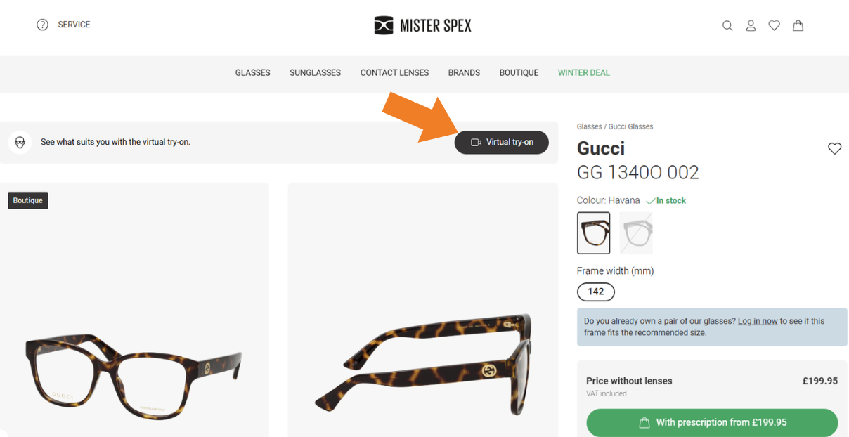
This is Mister Spex UK.
While we could talk about the H1 – and its lack of keywords –, we can appreciate the "virtual try-on" that is very prominent here.
That's what I'm talking about when I say reduce friction to buy physical products online.
Any lesser-known brand, any new brand in a saturated market NEEDS something like this to get ahead of the competition. It takes some thinking, some designing and will cost some money, depending on the industry. But it is your job as an SEO to look out for such opportunities – after all, you have the data about what people are searching for.
We're talking about making a physical object as tangible as possible online, right? Here’s one more example:
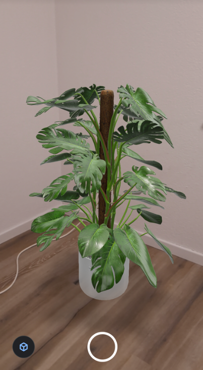
This is AR. Augmented Reality.
On desktop, the feature doesn't do much, but on mobile, it opens your phone camera – no app needed – and you can see the plant you’re about to buy in your space.
Talk about making it easy for customers! This renders measuring and calculating obsolete. With just one click of a button, users know whether or not a plant fits their space.
The social proof on PDPs
You know the drill:
Testimonials
Reviews
User-generated content
Before we buy a product, especially one that we’d usually buy in person, we need other people’s trusted opinions. We need to be sure we get what we expect – and we know our peers to be ruthless when they review something online.
As a shop, it is our job to lower barriers, reduce friction, and make people feel safe when they buy online.
This is especially true in the age of AI.
AI-supported SERPs basically abolish product listing pages.
Comparison and decision-making happen elsewhere, not on our websites.
Even more reason to pay attention to your PDPs. And to make trust your one big goal.
Here are a few tips that go beyond displaying reviews and testimonials on your PDP:
A “verified customer” tick/badge
Adding nuance to the review registration process to allow testifying to different parts of the experience: Would you gift this? Do the photos do it justice? Would you buy it again? Is it true to size?
Allow UGC like video product tests, product comparisons or customer Q&As
If you’re a reseller or generally a shop with a wide range of products, you can and should use your vast user data for even more trust-building.
Consider this example:
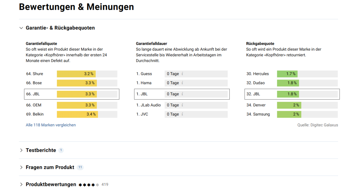
This is a headphones PDP on Digitec, a Swiss electronics shop. You can see what they do with their data: They let customers know the likelihood that they'll have to return those headphones, compared to the ones of other brands! (In German, Garantie- & Rückgabequoten = warranty and return rates.)
Reviews are also a great opportunity to build your brand. Reply to customer reviews, especially the bad ones. Maybe you won’t convince that one hater. But the unsure user still browsing will read your reply and see that their concerns are unfounded.
Learn more: How to Rank Product Pages in Google's New Product SERPs
Don’t neglect the technical site health on PDPs
This isn’t the main topic of this article, but just to point out a few elements especially important on product detail pages:
Ensure appropriate load times (consider lazy loading, optimized image sizes, using a CDN, and embedding videos, not uploading them). This is especially important for LLMs.
Structured data: make use of Google’s Rich Results and the schema.org library.
Manage crawling and indexing with effective internal linking, faceted navigation and canonicals.
Make sure your important content is visible without JavaScript.
Don’t sleep on accessibility. It is mandatory in the EU now.
It should go without saying: pay attention to responsiveness. Over 58% of traffic comes from mobile devices, meaning traffic, and purchases, are happening on mobile
The downloadable blueprint: PDP template
I’ve distilled all these learnings into a single PDP template for you to use. You can download it here.
Tl;dr
In an era where AI-powered search results threaten traditional product listing pages, your product detail page (PDP) becomes the last bastion. Your success hinges on five core principles:
not making your users search for the most vital information
creative copy that answers even more user questions and builds trust
compelling visuals that make physical products tangible online
robust social proof through detailed reviews and user-generated content, and
solid technical foundations including mobile optimization and structured data.
Get these right, and your PDPs will become powerful conversion platforms that customers love to buy from.

Sitebulb is a proud partner of Women in Tech SEO! This author is part of the WTS community. Discover all our Women in Tech SEO articles.

Gabi Troxler is an SEO consultant, trainer, and public speaker. She helps businesses build a brand and thriving customer relationships through SEO. Her career began in the healthcare and finance industry before founding feey AG, a well-known Swiss e-commerce brand.
Related Articles
 Your Products Are Entities Now. And AI Can Only Work With The Data You Give It.

 The Agentic Web: Future of Ecommerce in the AI Era
 SEO for Growth Case Study: Revolutionizing a Saturated Market

 Sitebulb Desktop
Find, fix and communicate technical issues with easy visuals, in-depth insights, & prioritized recommendations across 300+ SEO issues.
- Ideal for SEO professionals, consultants & marketing agencies.
 Sitebulb Cloud
Get all the capability of Sitebulb Desktop, accessible via your web browser. Crawl at scale without project, crawl credit, or machine limits.
- Perfect for collaboration, remote teams & extreme scale.