
Beyond Keywords: Designing Empathy-Based Ecommerce Architectures
 David Carrasco Pamies
Published April 20, 2026
Massive thanks to David Carrasco who joins us this week to explain why and how we should be structuring ecommerce sites according to buyer intent for better ecommerce SEO.
Open the sitemap of most ecommerce sites and what you usually see is a warehouse. Categories mirror inventory logic, supplier structures, or internal departments. That makes sense if you manage stock. It makes much less sense if you're a buyer trying to solve a problem.
I've audited enough ecommerce sites to notice the same pattern: the architecture reflects the org chart, not the buyer's mental model. Abby Covert, former Senior Information Architect at Etsy, puts it well: "Start with your users, not your org chart."
Most of the time, when people hear "empathy" in a business context they think tone of voice, softer copy, brand warmth. That's not what I'm talking about. This is about structural empathy: organizing the site around the problems buyers are actually trying to solve instead of mirroring how the warehouse happens to be organized.
That mismatch used to be a usability issue. It's now a visibility issue too, because the systems deciding which URLs get surfaced are becoming less forgiving of warehouse logic.
Contents:
- The warehouse problem
- Why this matters more now
- The strategy: from volume clustering to intent clustering
- The audit: reading your architecture through the crawl
- The fix: buyer-problem pages as architectural bridges
- How to prioritize (when you can't restructure everything)
- How to measure if it's working
- Where this doesn't work (and what to watch for)
- What this changes in practice
The warehouse problem
Let me describe a site I audited. A furniture retailer, six top-level categories: Sofas, Tables, Beds, Storage, Lighting, Outdoor. Perfectly symmetrical. Perfectly generic. The kind of architecture you get when the site was built by copying the competition's mega menu.
The problem was that this retailer was known for sofas. That was their thing, the product customers associated with the brand, the category that drove the business. Sofas generated roughly 38% of their organic revenue. But the architecture didn't reflect it. In the sitemap, sofas had exactly the same structural weight as lighting.
It got worse below the surface. The subcategories that mattered most — corner sofas, sofa beds, modular sofas — were buried at crawl depth 4-5 behind parameterized filter pages. The main "Sofas" category had around 280 internal links pointing to it. "Corner Sofas," their most-searched subcategory, had 3. The filter pages were thin: no unique H1, no optimized titles, no contextual internal links. Some were blocked in robots.txt.
The gap between reputation and architecture was striking.
Offline, this was a brand people associated with sofas. Their branded search data confirmed it. Customers searched for the brand name plus sofa terms far more than any other product. You could spend an hour in their showroom talking to a sales advisor who knew everything about fabrics, frame construction, and what fits in a narrow living room. None of that expertise existed on the website. The architecture gave sofas the same weight as lighting, and the product knowledge that made the brand special was nowhere in the sitemap.
Google couldn't tell this was a store with genuine expertise in sofas. Neither could a first-time visitor.
And for queries where buyer intent was clearest, like "best sofas for small living rooms" or "corner sofa vs L-shaped sofa," the site had no URL at all. That traffic went to competitors who had built buying guides for those exact problems.
Information architecture practitioners call this the "tomato problem": a tomato is botanically a fruit, but nobody looks for it in the fruit aisle. When the system's categorization contradicts the user's mental model, the friction is real enough to kill the session.
Baymard Institute's usability testing across 19 major ecommerce sites found task completion rates as low as 10–30% when users were asked to find common products. When they couldn't find something, they didn't blame the navigation; they concluded the store didn't carry the product.
The furniture retailer wasn't failing because it had bad products. It was failing because its website architecture told a story about itself that wasn't true.
That gap between architecture and reality has always cost conversions. But something has changed recently in how buyers discover products, and it's making that cost harder to absorb.
Why this matters more now
This matters more now because discovery has changed. Buyers arrive deeper in the site, with less patience for navigation.
During Cyber 5 2025, Yottaa tracked nearly 700 ecommerce websites and found that 77% of AI-driven sessions landed directly on product detail pages. Even from Google Search, only 4.8% of sessions started on a homepage. Buyers — and the AI agents acting on their behalf — increasingly skip the front door and land wherever they find the best answer to their question.
AI-referred traffic is still small in absolute volume. But the pattern matters more than the volume: buyers arrive further down the funnel, expecting the URL to resolve their problem without navigation. If your architecture forces them to climb back up to a category page and browse down, they'll just go somewhere that doesn't.
Internal linking matters here because it tells both users and search systems which URLs deserve attention. If informational content and products live in separate silos, the site looks fragmented rather than expert. Google sees it. AI agents see it too.
If the way buyers find products has changed, the way we organize keywords to build architecture needs to change too.
The strategy: from volume clustering to intent clustering
The standard keyword workflow goes: pull data, group by volume, map to existing categories. The output confirms the warehouse architecture with demand data on top.
The problem is that clustering by volume, without filtering by intent, groups queries from entirely different buyer journeys into the same bucket. "Standing desk" at 50,000 searches and "best desk for back pain" at 8,000 land in the same category. But the second user has a specific problem, a different journey, and likely a higher willingness to pay. A warehouse architecture treats them identically.
Clayton Christensen's Jobs To Be Done lens helps. Buyers don't buy products in the abstract. They "hire" them to solve a problem. Once you accept that framing, the architecture question stops being "what terms have volume?" and becomes "what problems deserve a landing page?"
What this looked like in practice
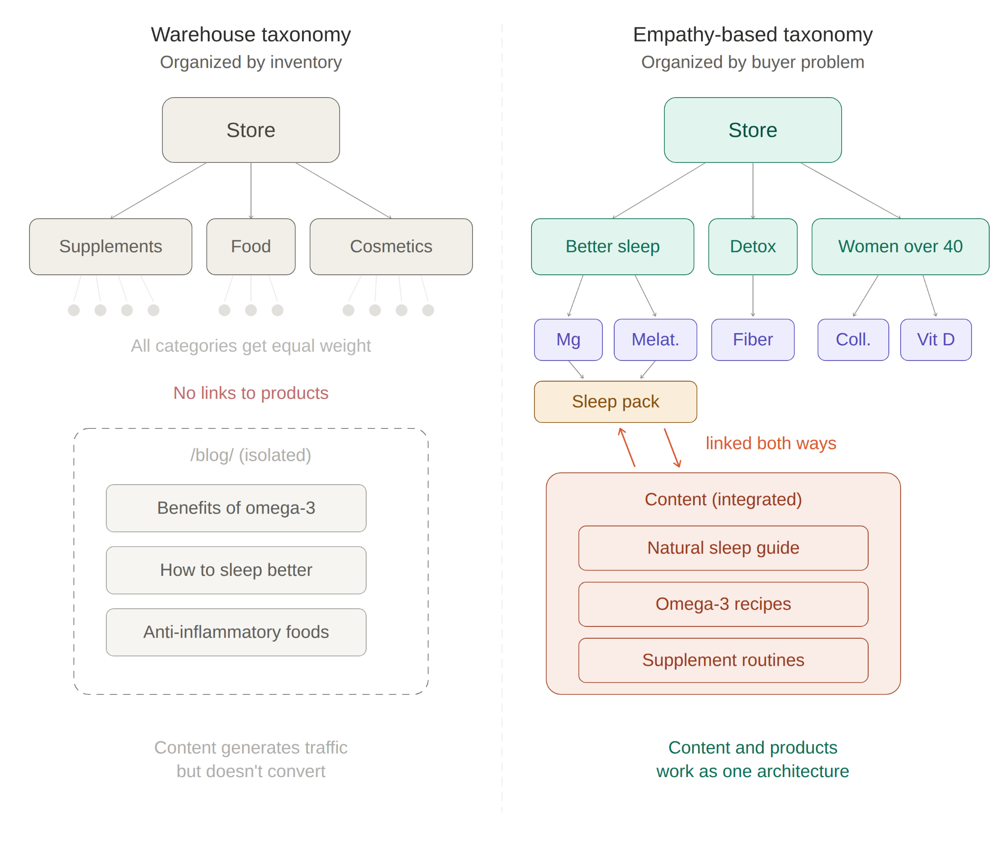
I worked with a health and wellness brand that sold supplements, superfoods, and natural cosmetics. Their own products, not resold. Their categories were warehouse labels: Supplements, Food, Cosmetics. They described what the products were, not what they did.
The brand had a strong content operation. Roughly 180 blog posts generating about 35,000 organic visits per month. But the ecommerce pages were almost invisible: around 4,500 visits per month. The blog and the store were islands on the same domain. A post about omega-3 benefits could pull 2,500 visits and not link to a single omega-3 product in the store.
The ratio was 8:1; eight times more traffic to content about products, than to the products themselves.
And the blog content was largely generic. "Benefits of omega-3," "best foods for inflammation," "how to improve your sleep." Useful, sure. But the kind of content that AI Overviews are already summarizing directly in the search results. For Google, the site looked like a health blog that happened to have a shop. For the user, the journey from "this is interesting" to "I'll buy this" required effort the architecture didn't help with.
So we asked the customers directly. Email surveys. Instagram stories. Simple questions: what problem are you trying to solve?
The answers weren't product categories. They were:
"How do I sleep better naturally?""What should I take for inflammation?""I want a simple routine, not five separate supplements.""I'm over 40 and I don't know where to start."
The process happened in stages. First, those answers helped us create more specific, audience-focused content. Content that was genuinely useful to their buyers rather than generic wellness advice. Articles that connected directly to the products they sold, with contextual inline links instead of generic banners. Recipes that linked to the actual ingredients in the store. The goal was to help first and sell as a consequence.
Then, as the data accumulated, we restructured the architecture around those buyer problems. Instead of Supplements / Food / Cosmetics, the site started surfacing pages like "What to take for better sleep naturally" (linking to melatonin, magnesium, and herbal teas), "Anti-inflammatory foods" (linking to omega-3, turmeric, and canned oily fish), and "Supplement routine for women over 40" (linking to collagen, magnesium, and vitamin D).
And as we kept listening, the problems reshaped the product catalog itself. Some buyer problems turned into curated bundles — sleep, energy, detox, skin. Two became entirely new products, possible because the brand controlled its own manufacturing. We published blog posts about specific problems as demand tests: the ones that generated the most engagement became the basis for the packs.
The buyer problems reshaped the architecture. And eventually the product catalog too.
The audit: reading your architecture through the crawl
In practice, empathy only matters if it changes structure. If nothing moves in the sitemap, you're just talking about tone.
A map of buyer problems is only useful if you can compare it against what your site actually looks like. A crawl can tell you where the gaps are.
In practice, I look for three things:
P ages that matter commercially but sit too deep
Buyer problems with no adequate URL
Internal links flowing to low-value pages instead of decision pages
Where the authority actually flows
Crawl depth is a proxy for priority. What sits at 1-2 clicks from the homepage is what the business has decided matters. What sits at 5+ clicks is what has been deprioritized — often without anyone realizing it.
In one audit, I exported the full index from Search Console and cross-referenced it with revenue data. Parameterized search and filter pages — URLs like ?sort=price&color=red&size=M — made up roughly 40% of what Google had indexed but contributed less than 3% of organic revenue. The site was feeding Google thousands of low-value URLs while starving its best pages of internal authority.
Sitebulb's URL Rank (UR) metric makes this visible.
UR measures internal page strength on a 0–100 scale using only internal links, which isolates the internal signal. That's what you want when diagnosing architecture problems. Crossing UR with crawl depth reveals the pages your structure has buried: low UR + high depth = pages that haven't been given the opportunity to rank.
Sitebulb's documentation puts it directly: "The lower left quadrant will contain URLs that are deep in the site and with relatively low URL Rank. This is where you will most likely find the pages that have not been given the opportunity to rank."
Back to the furniture retailer.
When I pulled up the UR × Depth scatterplot, the picture was immediate. Their 14 strongest sofa subcategory pages — corner sofas, sofa beds, modular sofas, the URLs that matched what customers actually searched for — were all sitting in the lower-left quadrant. Deep and weightless. Meanwhile, top-level categories like Lighting and Storage, which generated a fraction of the revenue, sat comfortably in the upper-right with high UR and shallow depth.
The architecture had inverted the business's own priorities. The products that paid the bills were structurally invisible. The products nobody searched for had all the internal authority.
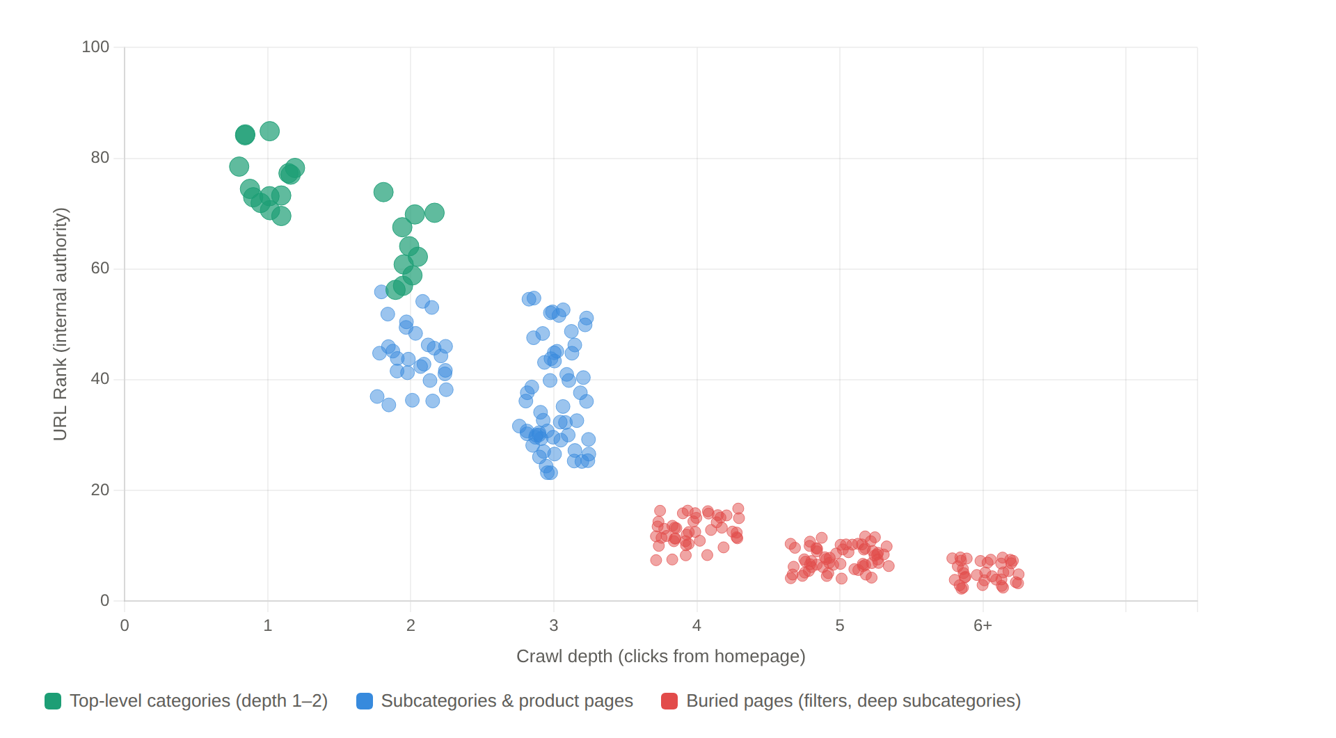
Original graphic by the author: illustrative diagram based on real audit data.
What the crawl map tells you
Sitebulb's Crawl Maps make structural patterns visible in a way spreadsheets can't. A warehouse architecture appears as a flat, uniform network radiating from the homepage, everything at depth 2-3 thanks to the mega menu, link equity diluted across thousands of equally weighted nodes. It looks organized. In practice it means every product and category has been treated as equally important, so nothing stands out.
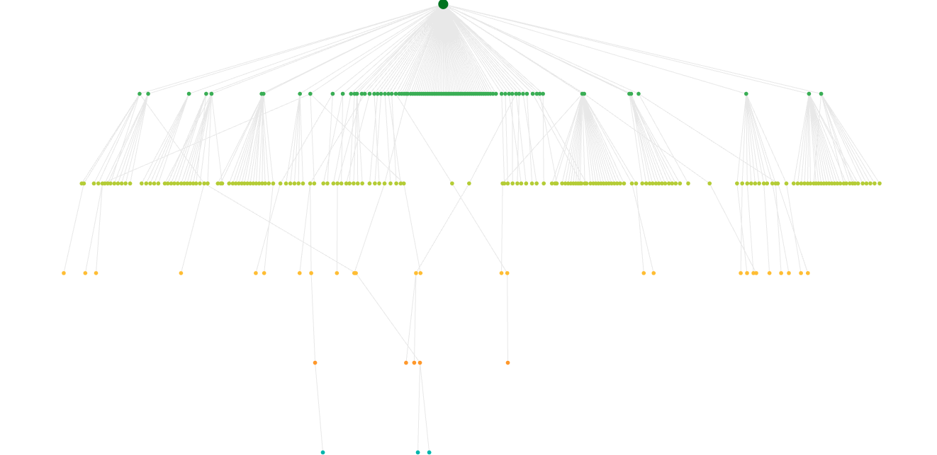
Sitebulb Crawl Tree: warehouse-style flat architecture. Screenshot from Sitebulb.
An empathy-based architecture looks different: distinct hub-and-spoke clusters around topic hubs, with denser internal linking concentrating authority where it matters. The clusters aren't accidental. They're the visual signature of an architecture that has decided which buyer problems matter most.
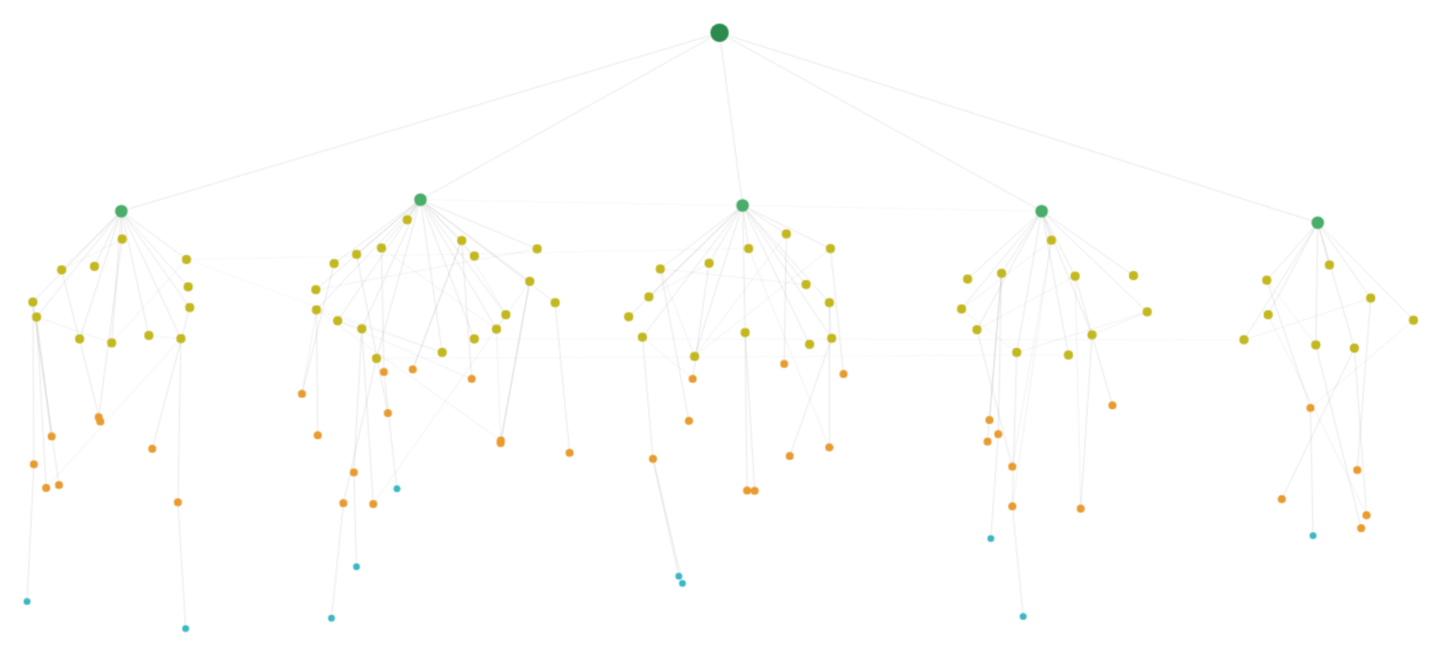
Sitebulb crawl map from a client site after restructuring around buyer-problem hubs. Each cluster represents a topic hub with concentrated internal authority.
The orphan page problem
Sitebulb integrates Search Console and Google Analytics data to flag pages that get traffic or clicks but have no internal links pointing to them.
In the health brand's case, several blog posts were performing in search despite zero internal support. Orphan pages that Google found through the sitemap but the architecture completely ignored. Closing those gaps is immediate and free.
The broader picture is consistent with what the crawl maps show. SearchPilot's controlled test on Iceland Groceries — one of the few actual A/B experiments on internal linking — showed that adding links from L2 to L3 categories drove +25% organic traffic, with both source and destination pages gaining. And JetOctopus documented a case where restructuring internal links improved crawl rates from 40% to 70%.
The fix: buyer-problem pages as architectural bridges
B2B SaaS has been doing this for years: pages organized by role, industry, or use case.
In ecommerce, the equivalent rarely gets treated as architecture. Buying guides and "shop by concern" pages exist, but they usually live in a blog subfolder, disconnected from the commerce structure. When they work, it's almost always because someone decided to treat them as architecture rather than content marketing.
What I'm calling a Solution Page here is a URL built around a specific buyer problem, integrated into the commerce structure. Products inline. Bidirectional internal links to relevant categories and PDPs. Not a blog post. Not a category page. A bridge between both.
Brands that treat this as architecture
The supplements industry is a good place to see this in action, because the gap between how brands organize products and how buyers think about them is especially wide.
HSNStore, one of Spain's largest supplements retailers, has a mega menu that goes beyond the standard product taxonomy. Alongside the expected categories (proteins, creatine, vitamins), the menu includes an "Objectives" layer: gain muscle mass, weight loss, endurance.
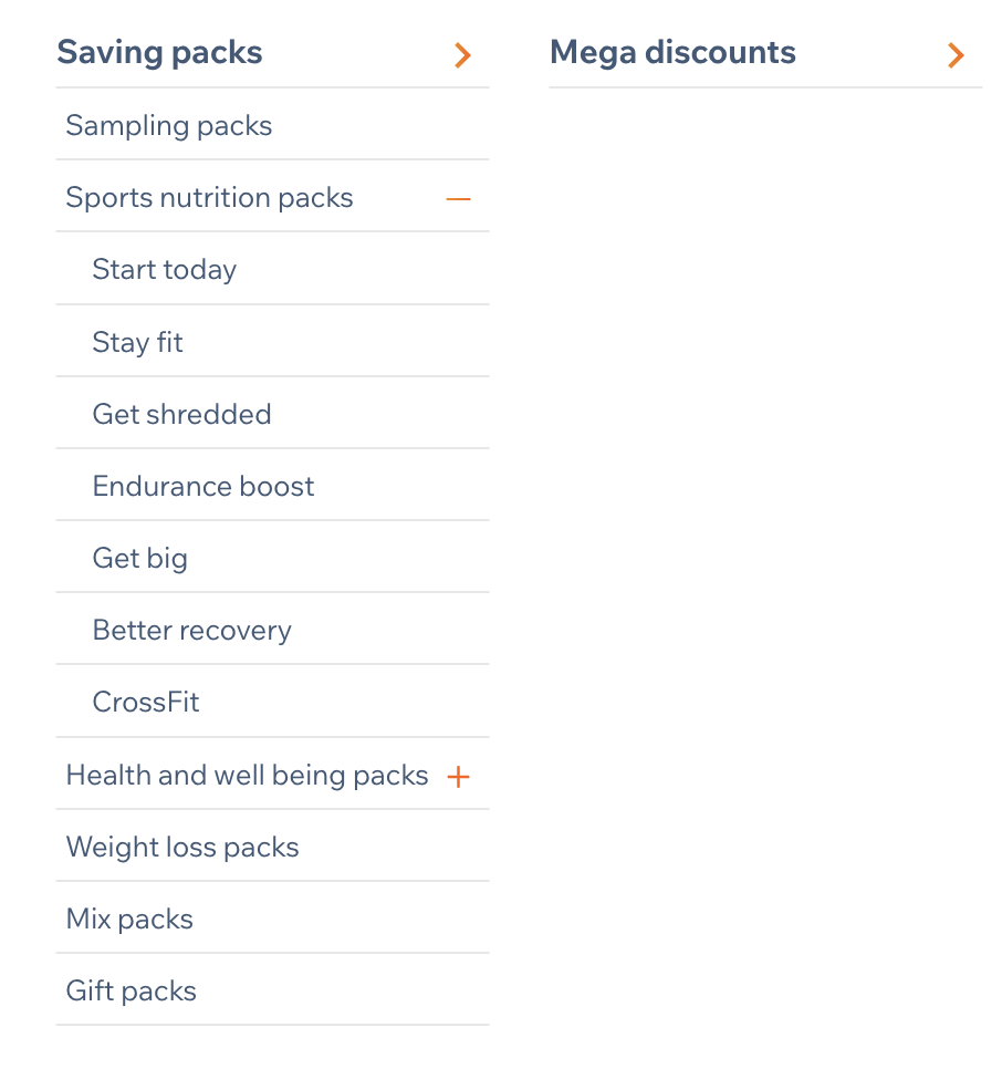
HSNStore's packs menu organized by objective, not by product type. Screenshot from HSNStore.
For newcomers overwhelmed by the catalog, they also built a dedicated packs-by-objective page that starts with one simple question: "What's your goal?" Instead of forcing the buyer to be a supplement expert, it maps navigation to the buyer problem. I analyzed this architecture in a Sistrix SectorWatch, and what struck me is how clearly it turns a navigation problem into a conversion opportunity.
Myprotein does something similar with a three-track menu (Objectives, Products, Ranges), but the principle is the same: one architecture, multiple mental models.
REI built a bidirectional loop. Their "Expert Advice" hub contains buying guides and gear care articles, but the loop goes both ways: guides link to product categories, and PDPs link back to relevant guides. The architecture creates a cycle, not a dead end.
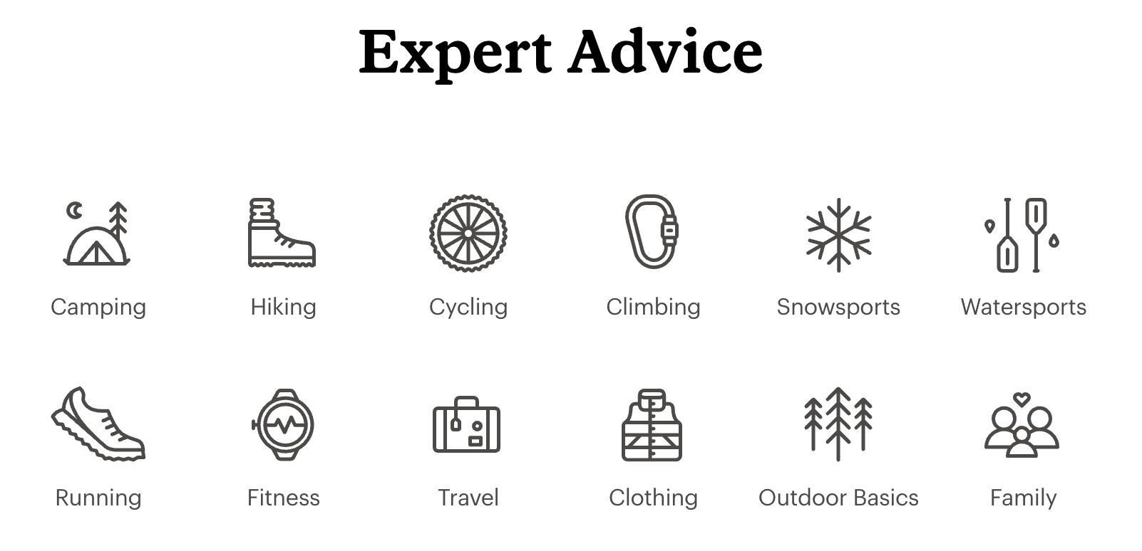
REI's Expert Advice hub, the entry point for buying guides that link bidirectionally to product categories and PDPs. Screenshot from REI.
Most ecommerce sites don't do this. The default is still to organize by product.
What happened when we built them
Back to the health and wellness brand.
We replaced generic categories with problem-based pages and reconnected 60 blog posts to relevant products through contextual inline links. Not "check out our store" banners at the bottom, but links woven into the text: "If you're looking for a quality plant-based omega-3, [this is the one we use]." Recipes linked to the ingredients the store sold. The founder's nutritionist credentials were added across all content pages as E-E-A-T signals.
Over the first six months after rollout, using GA4 organic landing page data segmented by page type:
Organic sessions to ecommerce URLs increased from roughly 4,500 to 14,000 per month
Organic sessions to blog URLs fell from roughly 35,000 to 22,000 per month, partly by design after we pruned around 120 low-value posts
The organic purchase conversion rate on blog URLs increased from 0.3% to 1.8%
The traffic mix shifted from 78/22 (blog/ecommerce) to 55/45
By month six, organic sessions landing on ecommerce URLs were converting at roughly 6× the rate of sessions landing on blog URLs
The more interesting shift was in the traffic mix: fewer low-intent visits, more sessions landing on URLs that could move directly from problem recognition to product discovery.
The problem-based pages became the bridge between informational entry points and product discovery. "What to take for better sleep naturally?" isn't a blog post and isn't a category. It captures informational intent and shortens the path to transaction within the same URL.
The brand also started reclaiming visibility from marketplaces that had been outranking them for their own product names.
By month four, they began overtaking the main marketplace for a growing share of tracked branded queries. By month eight, they ranked above it across most of the core branded product terms we were monitoring. Those marketplace pages — outdated, now showing competitors' products under the brand's own traffic — finally started to drop.
Original graphic by the author.
How to prioritize (when you can't restructure everything)
An ecommerce site with 50,000 SKUs can't restructure overnight. When a client asks me where to start, I don't open a keyword tool first. I start with three inputs.
Revenue data. GA4 landing page report filtered by organic, sorted by revenue, not traffic. The top 15-20% of revenue-generating pages are Tier 1. Everything else waits.
Internal search and support signals. What are people searching for on the site and not finding? Zero-result queries are architectural gaps. They tell you which buyer problems don't have a URL yet. What questions does customer support keep answering? Those are buyer-problem pages waiting to be built. If the brand talks to its customers directly (surveys, social, community), even better. That's where the real language lives.
Search Console impressions without clicks. High impressions, low CTR, wrong page ranking. That's where the site has demand but no proper URL to capture it. If Google is showing a weak filter page for a query that deserves its own landing, that's a structural gap, not a content gap.
I score each opportunity on three axes:
Business value (margin × volume)
Implementation difficulty (can we ship this without a dev sprint?), and
Competitive gap (is anyone else answering this query well?)
The first batch is usually 8-12 pages, small enough to ship in a month, big enough to measure.
How to measure if it's working
Not everything moves at the same speed.
Technical health (days to weeks)
Page Indexing report in Search Console: are new pages moving from "Discovered – currently not indexed" to indexed within 2-3 weeks?
Crawl Stats: did discovery crawls spike?
In Sitebulb, re-run the crawl and compare UR × Depth distributions. Did previously buried pages gain authority? The "orphan URL received search traffic" hint flags pages performing despite no internal support, which tells you where the architecture still has gaps.
Visibility (weeks to months)
Segment Search Console Performance by URL pattern (/guides/, /category/, /product/) and track impressions, clicks, and CTR separately.
The question isn't "did traffic go up?" It's "did the mix change?" If buyer-problem pages start earning impressions for mid-funnel queries that previously had no URL, the architecture is working.
Business impact (months)
GA4 landing page report by organic, segmented by page type, tracking revenue per session and conversion rate. The comparison that matters: intent-led pages vs. blog posts for the same topic cluster.
In the health brand's case, the buyer-problem pages converted materially better than generic blog content covering the same topics, because they shortened the path between problem recognition and product discovery. That pattern has been consistent across every implementation I've done.
Honest timelines
4-6 weeks before the technical layer stabilizes. 2-3 months before visibility shifts are clear. A full quarter before business impact is measurable with confidence.
Where this doesn't work (and what to watch for)
This approach has real risks, and the line between "empathy-based architecture" and "architectural mess" is thinner than it looks. If you add buyer-problem pages without guardrails, you can end up with more problems than you started with.
Cannibalization
If a buyer-problem page targets keywords overlapping with an existing category or product page, you create algorithmic confusion. Pages swap rankings, link equity splits. The guardrail: one primary intent per canonical URL. If you find yourself building a Solution Page that could just be the category page with better content, make it the category page with better content instead of a new page.
When warehouse logic is the right answer
For high-SKU industrial catalogs with expert buyers, specification-based taxonomy is the buyer's mental model.
A procurement engineer buying a quarter-inch brass pipe fitting doesn't need a buying guide. They need exact-match filtering by diameter, thread type, and pressure rating. Empathy doesn't always mean adding an intermediate layer. Sometimes it means removing friction for expert buyers who already know exactly what they need.
Internal linking isn't magic
SearchPilot's A/B tests showed that increasing internal links didn't conclusively benefit recipient pages in some configurations. The impact may be redistribution rather than net gain. More links doesn't automatically mean better results.
The short-term cost of cleaning up
And one honest note from my own work: cleaning content has a short-term cost. The health brand's blog traffic dropped 37% before the architecture change paid off. That dip is real, it lasts weeks, and it's a conversation you need to have with stakeholders before you start pruning.
What this changes in practice
None of this requires tearing down an existing architecture. It's an intent layer on top of the product structure that already exists.
Next time you open an ecommerce crawl in Sitebulb, before checking canonicals and status codes, look at where the internal PageRank flows. Pull up the UR × Depth view. If the pages with the highest internal authority are all generic product categories, and none of them answer a specific buyer problem, you know where to start.
Every ecommerce site already has an architecture that says something about the business. Whether that matches how buyers actually think about their problems is a different question, and one most site audits skip entirely.
Empathy, in this context, is just precision. Precision about what the buyer is trying to do, and whether the site makes that easy or hard. The warehouse will still be there: the products, the categories, the stock. What changes is whether your sitemap describes the warehouse or the buyer.

David Carrasco is an international SEO consultant and speaker based in Barcelona. He works with brands on search visibility across traditional and AI-driven discovery channels.
Related Articles
 AI Search, RAG, Agents and Crawl Bots: A Plain-English Guide to What They Mean


 What AI Agents See: The Accessibility Tree Is an SEO Surface
 The Brand-First Technical Audit: Why Your Entity Health Is a Technical SEO Problem

 Sitebulb Desktop
Find, fix and communicate technical issues with easy visuals, in-depth insights, & prioritized recommendations across 300+ SEO issues.
- Ideal for SEO professionals, consultants & marketing agencies.
 Sitebulb Cloud
Get all the capability of Sitebulb Desktop, accessible via your web browser. Crawl at scale without project, crawl credit, or machine limits.
- Perfect for collaboration, remote teams & extreme scale.