What SEOs Need to Know About Core Web Vitals & Performance Testing
 Patrick Hathaway
Updated May 17, 2024
A lot has been written about Core Web Vitals. Some of it assumes a lot and expects a lot of the reader. Especially in terms of the foundational understanding of what I consider to be a highly technical subject, that pushes the boundaries of what most SEOs should be expected to know.
I happen to stand very firmly on the side of the 'SEOs do not need to learn coding' fence, and I think with Core Web Vitals it is more important than ever to differentiate the bits that an SEO should be responsible for, and the bits a developer should be responsible for.
The aims of this article are threefold:
- To give SEOs of pretty much any level the foundational understanding they need
- To introduce some of the tools and approaches to audit and test this stuff
- To draw the line between SEO work and developer work
Table of contents
- The evolution of performance testing
- What are Web Vitals?
- Types of performance data
- How to access Web Vitals data
- Understanding Web Vitals lab data
- Understanding Opportunities and Diagnostics
- Working with developers to improve Web Vitals
- Further reading & resources
The evolution of performance testing
Over the years, how the SEO industry judges website performance has evolved significantly. The biggest changes have been to do with how performance is measured, as this has shifted to be in closer alignment with actual user experience.
This is a change from, 'Is this website empirically fast?' to 'What is the user experience like for actual users, on the specific devices and internet connections they are actually using?'.
This is a fundamental shift, and has been made possible by two projects, championed by Google:
- The ability to measure and report on different facets of user experience, with a set of 'Core Web Vitals' (CWV) metrics.
- An ongoing collection of real user data (known as 'field data') measuring these Core Web Vitals scores, via the Chrome User Experience Report (CrUX).
Why Core Web Vitals are important to Google
When Google announced that the Core Web Vitals would be rolled in as a ranking factor, optimizing them became a hot topic.
Google's influence in the increased prominence of Core Web Vitals in SEO circles cannot be understated. It is in Google's best interest for web pages to load faster, as this saves them resources crawling and rendering web pages. Motivating SEOs to become site performance evangelists is certainly one way to push their narrative forwards.
On May 28th 2020 they explicitly told the world that Core Web Vitals will be rolled into their page experience signals and used to help determine the order of search results (along with hundreds of other ranking factors), and as of June 15th 2021, this officially started rolling out:
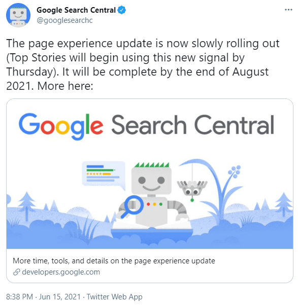
For SEOs, this makes CWV difficult to ignore. However, I believe it is important to frame our understanding with realism, and Google themselves make this clear in their article, 'Evaluating page experience for a better web';
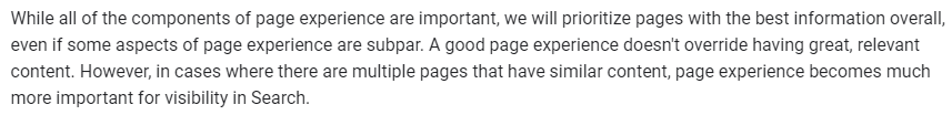
Google has spent years refining their algorithms to understand query intent and to reward the most relevant answers in response to these queries. They are not about to undo all of that work overnight just because a page loads a little slower.
In fact, they have given us clarity that Core Web Vitals fit in alongside the other signals they consider important for page experience:
Note that, in March 2024, Interaction to Next Paint (INP) replaced First Input Delay as the responsiveness metric.
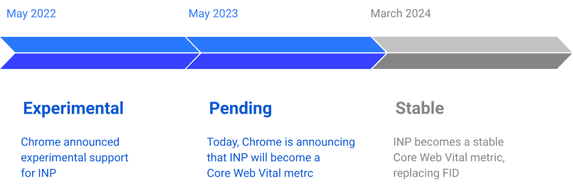
This change was explained in a blog post by the Chrome team:
“Rather than only measuring the first interaction, INP takes all interactions into account, reporting one of the slowest over the entire lifetime of the page. And, rather than only measuring the delay portion, INP measures the full duration from the start of the interaction, through the event handler, and until the browser is able to paint the next frame. Hence, Interaction to Next Paint. These implementation details make INP a much more comprehensive measure of user-perceived responsiveness than FID.”
You may have noticed that Search Console now shows INP as the new metric for responsiveness and has stopped reporting on FID. If you’ve been optimizing your website for FID, this remains a “good foundation” for INP.
However, when conducting technical website audits, it is important to recognize where Core Web Vitals fit in. Whilst it is not acceptable to completely ignore website performance, it should not automatically become a priority at the cost of other important factors.
What this means for website owners
Websites that deliver a smooth and frictionless user experience are typically rewarded by better engagement, higher conversion rates and greater customer satisfaction. So there are already plenty of good reasons why it is important for website owners to care about page experience. Now, with it becoming a factor in terms of organic search performance, this should simply be considered an additional lever when talking to clients about improving site performance.
Often, however, the development work required to improve CWV involves rebuilding elements of the CMS, reconfiguring page templates, or adjusting how and where certain scripts are used. This sort of work rarely happens in a vacuum, as it often also affects other website functionality, the responsibility for which can span multiple departments.
So it is important that both clients and developers get buy-in for improving CWV, and that as SEOs, we work alongside developers to understand the feasibility, impact and priority of potential optimizations.
Later on in this post we will cover communication, but I also want to mention it up-front as it needs to be a core consideration in how performance recommendations are handled.
What are Web Vitals?
As users, we all know what a good page load experience feels like. Perhaps more pertinently, we all know what a bad experience feels like too. But 'a good experience' is hard to measure in a repeatable and consistent manner.
It is this problem that Google has tried to solve with the Web Vitals initiative. Web Vitals are a set of metrics developed by Google to help measure the quality of user experience. There are more Web Vitals metrics other than the 'Core' ones listed below, and we'll explore them in further depth later on.
What are Core Web Vitals?
Core Web Vitals are a subset of these Web Vitals metrics, and they currently focus on three aspects of the user experience - loading, interactivity and visual stability.
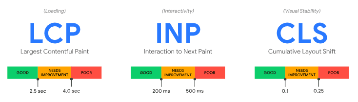
- Largest Contentful Paint (LCP) - this measures the time it takes for the largest image or text block to be visible. It is meant to represent how long it takes for the user to feel like the page content has loaded.
- Interaction to Next Paint (INP) - this measures the time it takes for the page to show visual feedback following a user interaction (e.g. tap on a button). It is meant to represent how long it takes for the user to feel like the page is responsive.
- Cumulative Layout Shift (CLS) - this measures the amount of movement in visual elements as they are rendered. It is meant to represent how much it feels that the page layout moves around as it is loading.
Notice that each of these metrics is designed to act as a way to measure what the page loading experience feels like to the user. The links above explain each of these metrics in more detail, so they are worth reviewing if you are unfamiliar with them.
Types of performance data
Web Vitals data is collected from Chrome as different parts of the loading experience complete. Essentially, the Chrome browser has an in-built timer which can be used to measure loading events. This is either data collected from real Chrome users as 'field data', or in an instance of Chrome designed to synthetically emulate a real user environment, which is known as 'lab data.'
Field data
Since 2017, Google has been collecting user experience data via installed instances of Chrome, building up a massive database of web page usage data called the Chrome User Experience Report (CrUX). The metrics they have collected have changed over time - and are now focused on the CWV - but Google have consistently sought to measure user experience with the most accurate methods available at the time.
CrUX measurements of CWV are known as 'field data', with the idea being that they are collected 'in the field', from real website visitors. This is valuable data because it reflects the range of different devices and connections, for example;
- User A, browsing on a desktop computer, plugged directly into the router
- User B, browsing on a Samsung Galaxy S21, on a 5G connection
- User C, browsing on an iPhone 4, on a patchy 3G connection
Clearly, these three users would naturally have a different experience. Their values for the Core Web Vitals metrics - LCP, INP and CLS - could be very different, depending on the website.
Since Google Chrome is so widely used, Google can scale up this data collection to thousands of users, which gives them a wide enough distribution to make inferences about the experience for most users.
The data in the CrUX Report is a 28-day rolling average of aggregated metrics. This means that the data presented in the CrUX Report at any given time is actually data for the past 28 days aggregated together.
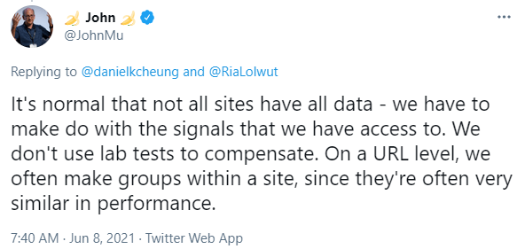
Here is an example of Field Data for a particular URL, which is CrUX data made available via Google's PageSpeed Insights tool:
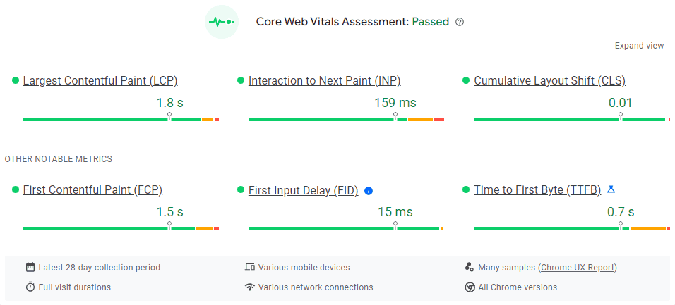
Notice there is are some additional metric displayed, these are the other ‘non-core’ Web Vitals metrics I mentioned earlier:
- First Contentful Paint (FCP) - this measures the time it takes for the first image or text block to be visible; it is meant to represent how long it takes for the user to feel like the page content has started loading.
- First Input Delay (FID) - this measures the time it takes for the page to react following a user interaction (e.g. tap on a button). It is meant to represent how long it takes for the user to feel like the page is responsive.
- Time to First Byte (TTFB) - this measures the time it takes for the web server to start returning content following a request (e.g. user opens web page on browser). It is a helpful metric for identifying when a web server is too slow to respond to requests.
There is a lot of data displayed in the image above. The green/orange/red bars represent, for each metric, the distribution of users that experienced each of the three timing bands.
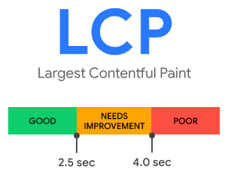
As a reminder, these are different for each metric. So for LCP we have these 3 bands:
And the field data for LCP reflects the percentage of users in each of these 3 bands:
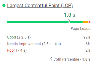
In other words:
- 92% of users had a LCP time under 2.5 seconds
- 6% of users had a LCP time between 2.5 seconds and 4.0 seconds
- 2% of users had a LCP time over 4.0 seconds
Lab data
Core Web Vitals reflect user-centric outcomes, and are measurable in the field, which is why Google are able and willing to factor them into their page experience signal. However, there are a number of other Web Vitals metrics which you can also use to understand and benchmark website performance.
Whilst all of these metrics cannot be measured in the field, they can be measured in the 'lab', which is just a pretentious word to mean they were calculated by a computer. The important thing to recognize is the difference between 'lab data' (calculated by a computer) and 'field data' (collected from real website users).
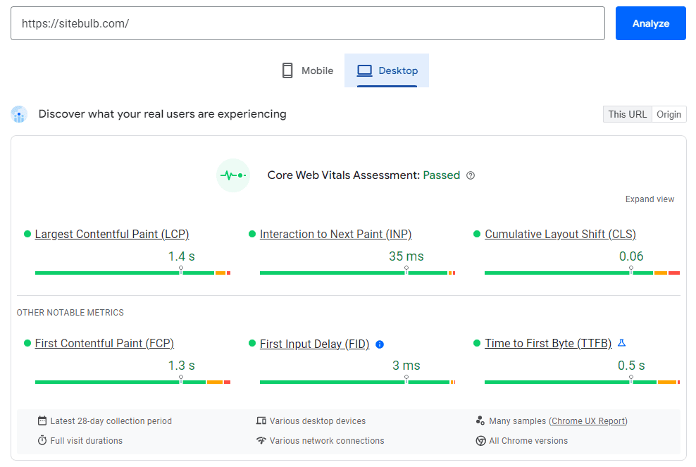
PageSpeed Insights will also show lab data for any URL you enter, calculated on the fly and presented like this:
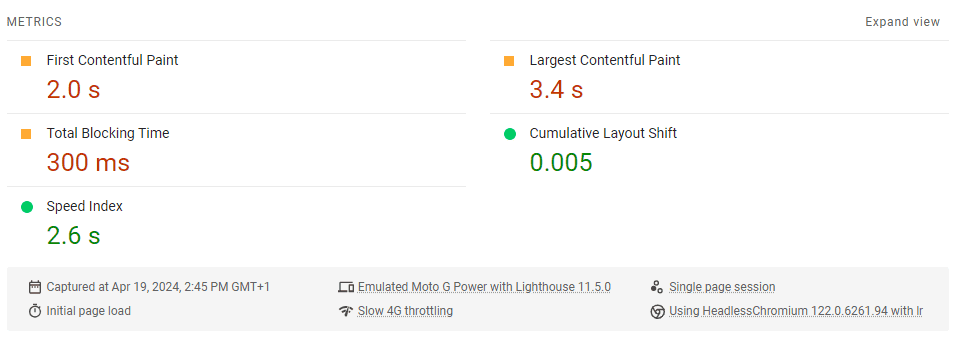
As with the Core Web Vitals, each of these is a measurement that translates to one of three bands:
- Good (Green)
- Needs improvement (Orange)
- Red (Bad)
While some of the lab data metrics are also Core Web Vitals, most of them aren't. This data can help give you a wider breadth of understanding about page performance, and the metrics themselves all line up with at least one of the central tenets of user experience:
- Loading
- Interactivity/Responsiveness
- Visual Stability
The major benefit of lab data is that it can be tested on the fly whenever you need to test it, in comparison to field data, which needs a 28 day lookback window of real user data. An obvious example of when this comes into play is with staging environments, when you literally don't have any field data to work with as no users have visited the site yet.
Field data vs lab data
Objectively, field data is 'better' than lab data, as it is based on real user data.
But there are two major problems with field data:
- It is sparse - since it is based on the Chrome User Experience Report, Google only has sufficient field data for a handful of pages on most websites.
- It is based on historical performance - if you have changed something to try and improve your metrics, you'll have to wait 28 days to find out if it worked, when the fresh data has been collected.
When it comes to the sparsity, don't get me twisted, it really is sparse. Here's a pretty popular page on the Sitebulb site, which gets thousands of visits a month:
Unfortunately, there is not enough real-world speed data for this page.
And this is why the lab tests exist, and why they are the most suitable thing to use when testing pages on your website at scale.
Google themselves agree with this methodology:
"While field tools offer more accurate data—data which actually represents what real users experience—lab tools are often better at helping you identify and fix issues."
There are of course a number of limitations when using lab data also. If you were looking at the 'mobile' data tab in PageSpeed Insights, this is meant to represent the experience of 'a slow 4G connection on a mid-tier Android device'.
But this does not mean they have a mobile phone farm in the midwest where greasy-haired youths run around from one Moto phone to another loading up your web page and sending back the results.
In reality, they are loading it in a synthetic environment, designed to emulate an 'average' mobile device, which they achieve by rate limiting the CPU. This is far from a perfectly accurate reflection of what users are seeing, but it is suitably accurate to still reveal the underlying trends.
Similarly, if you hit the same page multiple different times with PageSpeed Insights, you'll see variations in the results. This is because things like server load (e.g. number of users on the site) differ from one moment to the next, which affects page performance.
This is not a slight on PageSpeed Insights by the way, all of these issues affect literally every single tool that collects lab data. I include it here so you are aware of the limitations, and to help manage your expectations, so you are not surprised when you see small differences in the results, or differences over time even when no optimization has occurred!
Google has published some docs to help understand differences in lab and field data: Why lab and field data can be different (and what to do about it) which goes into significantly more depth on how this stuff works.
The truth is, there is no truth.
How to access Web Vitals data
Fortunately, there are a number of tools available to access both field data and lab data.
Google Search Console
Google Search Console has a 'Core Web Vitals' report in the left hand menu, which will show you field data about your pages as collected through CrUX:
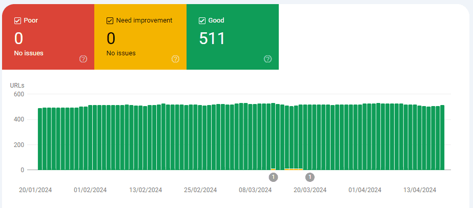
It is important to note that the source of this data is questionable. Due to the sparsity issue, and Google not wanting to show a graph with only 4 URLs on it, if they identify an issue with one page, they will lump together other 'similar URLs' based on page path:
John Mueller confirmed that Google will group similar pages together in order to make CWV assessments about more pages than they actually have proper CrUX data for:
Since a lot of performance issues are template based, this perhaps provides a helpful perspective, however the level of data they actually have is often so small that this is far from a statistically significant representation. Either way, exercise caution when looking at the GSC reports, as they are not exactly what they seem at first.
At the very least, you should be able to benchmark performance and get a feel for the website's current standing.
PageSpeed Insights
Google's PageSpeed Insights tool shows both field data (if it exists) and lab data, for both mobile and desktop.
There is actually probably too much data in PageSpeed Insights to make much sense of it:
In order, this shows:
- The field data, collected from CrUX, and a statement just above about whether the page passes the Core Web Vitals assessment or not.
- The performance score, which is based on the results of the lab data.
- The lab data, which is calculated by running Lighthouse (see further below) in a Chrome instance.
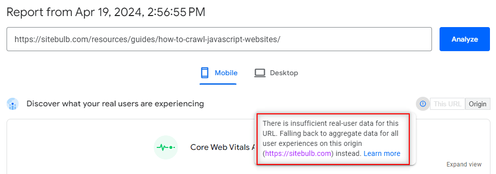
To make this even more complicated, if you have a page whereby the CrUX report does not include enough field data for the URL you are testing, they will present the 'Origin Summary' instead:
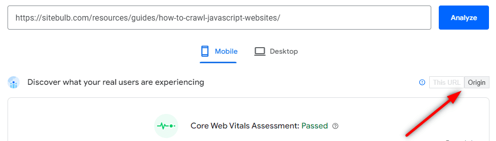
It is a bit odd that they do this silently, with no obvious message that the field data does relate to the specific page you entered (they used to show a message that made it clear: “The Chrome User Experience Report does not have sufficient real-world speed data for this page).
Anyway, the 'Origin Summary' means that they take all the other pages on your website for which they do have CrUX data, and use this to aggregate a sort of sitewide field data score. While this tells you nothing about the individual page, it does provide some directional insight into the state of the site as a whole.
Lighthouse
Lighthouse is where a lot of this stuff began, an open-source project from Google's Chrome team to help judge the quality of web pages. Using Lighthouse's 'Performance' audit, you can analyse a page and see lab data, for either mobile or desktop devices.
You can access Lighthouse by opening up the page you wish to analyse in Chrome, then opening up Lighthouse in Devtools (shortcut: F12 or Control+Shift+I on Windows or Command+Option+I on Mac ).
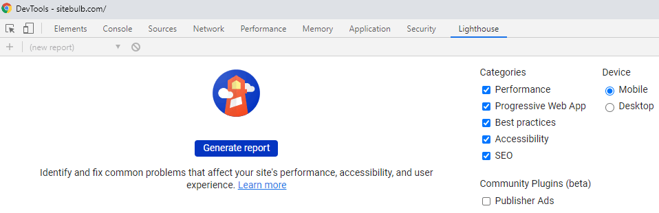
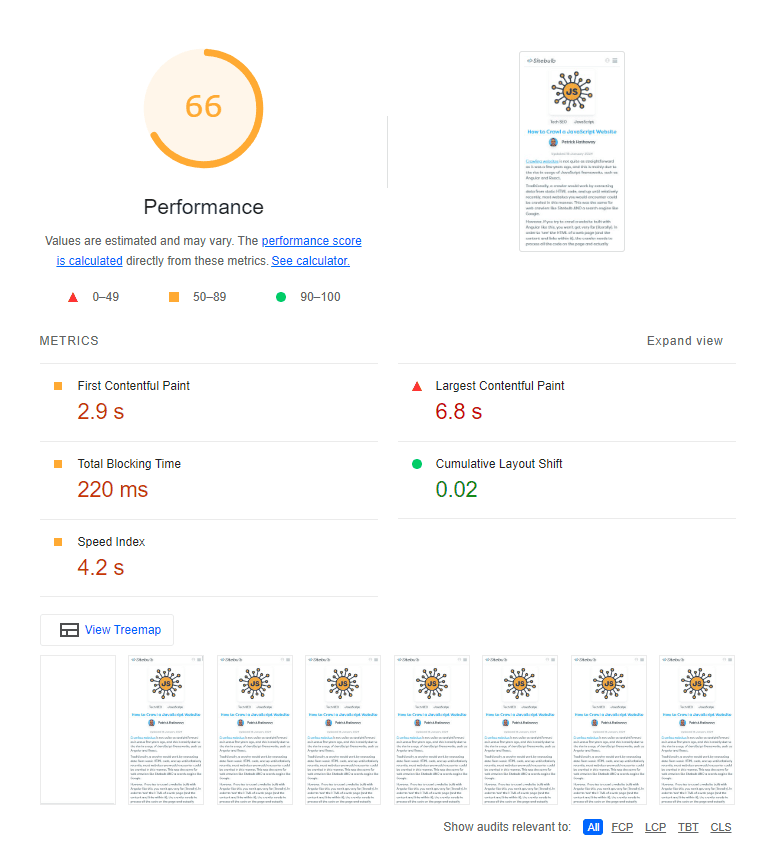
It'll take about 10-15 seconds to run the report, then you will see the overall performance score and the lab metrics that this score is based on.
Lighthouse has become a pretty standard tool for developers to use when working on page performance as they can run it in production environments and test out their changes before pushing them live.
Sitebulb
PageSpeed Insights and Lighthouse are excellent tools for analysing one page at a time, and Google Search Console can show you a sitewide view of field data, but none of these tools provide lab data at scale.
This is the kind of website performance audit that Sitebulb offers—the ability to audit lots of URLs in one go, by sampling website URLs and collecting lab data directly from Chrome, then aggregating the results.
These aggregated results are presented such that you can more easily see where potential problems may lie across the whole site (e.g. Time to Interactive in the graphs below!):
Clicking on the relevant pie chart segment will show you the URLs in question. One of the most helpful things you can look for here is URLs that share the same page template:
This allows you to build meaningful recommendations for developers as you have taken the time to identify the underlying HTML templates.
Understanding Web Vitals lab data
As an SEO, all of the above is kinda frustrating.
- We have multiple different metrics which mean kind of the same thing, but not really the same thing.
- We have field data that isn't available for most of our URLs, and lab data that relies on emulation of 'the average connection.'
- We have tools that can show one metric or the other at scale, but not both, or tools that do show us both metrics but only analyse one URL at a time!
The thing is, it doesn't really matter.
Our job as SEOs is to find issues and opportunities for improving a website. The tools we have available are more than capable of doing that, as long as we understand the limitations of the data. Core Web Vitals are not something you 'complete', so you are not looking for perfection, just enough to make a meaningful impact.

And one other thing: as an SEO, you do not need to be a performance expert.
There I said it.
It is absolutely not necessary for you to understand exactly what every metric means and which elements of the site need to be addressed in order to improve performance.
You do need to know some of it though. You need to know how to use the tools to be able to spot problem areas, and to be able to raise these as issues to be looked at by a developer.
Performance Score
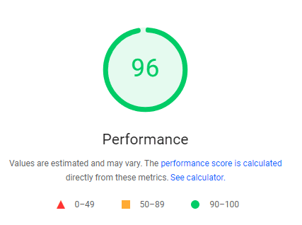
This is your starting point when tackling page performance via lab data. For any URL, the overall performance score is a score based on a weighted average of the individual Web Vitals metric scores.
This performance score is present in both Lighthouse and PageSpeed Insights for a single URL at a time, and Sitebulb will also process a performance score for every URL sampled for Web Vitals data.
For clarity, this score is based on lab data, and applies a weighting to each of the metric scores, so that some of them have a bigger impact upon the overall score.
The Lighthouse Scoring Calculator is publicly available for you to play with the different metrics and see how they affect the overall score:
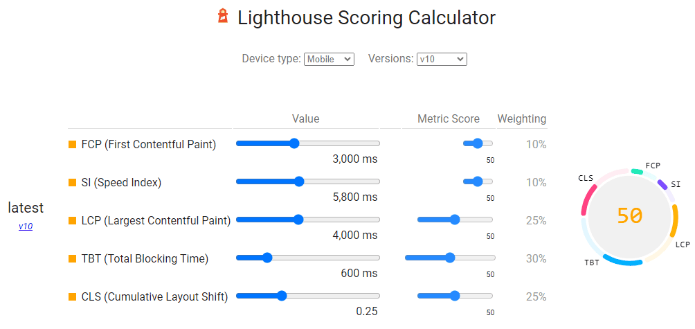
As you can see from the graphic above, Largest Contentful Paint (25%), Total Blocking Time (30%) and Cumulative Layout Shift (25%) have the most significant weighting.
As an example of how the weighted values affect the overall performance score, see the image below, which shows a really high value for FCP (as in, really bad) yet all the other metrics are really low (good); but the overall performance score is still very high.
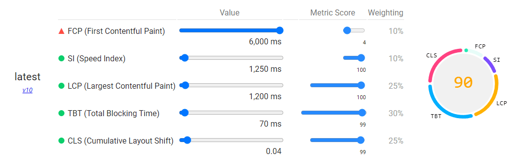
This is a fictional example, but serves to illustrate how the weighting works. It also underpins how Google thinks about the different metrics in terms of their relative importance. You can learn more about how the Lighthouse scoring model works here.
The performance score also provides a more holistic understanding of a page's performance, a 'north star metric' if you will.
This allows you to optimise for the overall score rather than getting bogged down trying to perfect every single metric. For example, you might be struggling to improve the Time to Interactive (TTI) - and if the overall score is still good, you might take the perspective that a slower TTI is something you can live with.
For SEOs, it is a valuable barometer that can be used to judge the potential efficacy of performance work. If you audit a site and all the URLs already get a 'green' performance score, it is perhaps not worth investing resources into improving it further, especially if the site has more pressing needs.
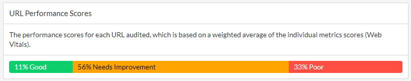
Performance scores also enable you to easily differentiate URLs that need work, versus URLs that are probably ok for now. This is where audit tools really come into their own, because they aggregate the scores, so you can instantly home in on the worst offenders:
Web Vitals metrics
The metrics themselves can be instructive in determining where development time is needed in terms of optimisation.
When working with audit data collected across a whole website, you are able to take a more holistic view of the situation, giving you better insight into the wider picture.
What follows below is my best attempt at a 'plain English' explanation of each of the metrics, so you can get a clearer understanding of how they fit alongside one another:
- First Contentful Paint (FCP)
- Speed Index (SI)
- Largest Contentful Paint (LCP)
- Time To Interactive (TTI)
- Total Blocking Time (TBT)
- Cumulative Layout Shift (CLS)
- Time To First Byte (TTFB)
First Contentful Paint (FCP)
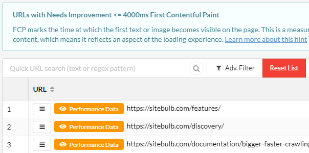
FCP marks the time at which the first text or image becomes visible on the page. This is a measurement of how long it takes the browser to render the first piece of DOM content, which means it reflects an aspect of the loading experience.
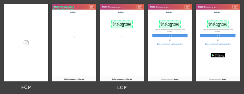
When looking at individual URLs, you are looking for the first content element that appears on screen when it loads.
In the timeline below, you can see that the Instagram logo is the first thing that loads on screen, acting as a placeholder so the user knows that more stuff is coming soon. First Contentful Paint is a measure of how long it takes for this initial element to appear.
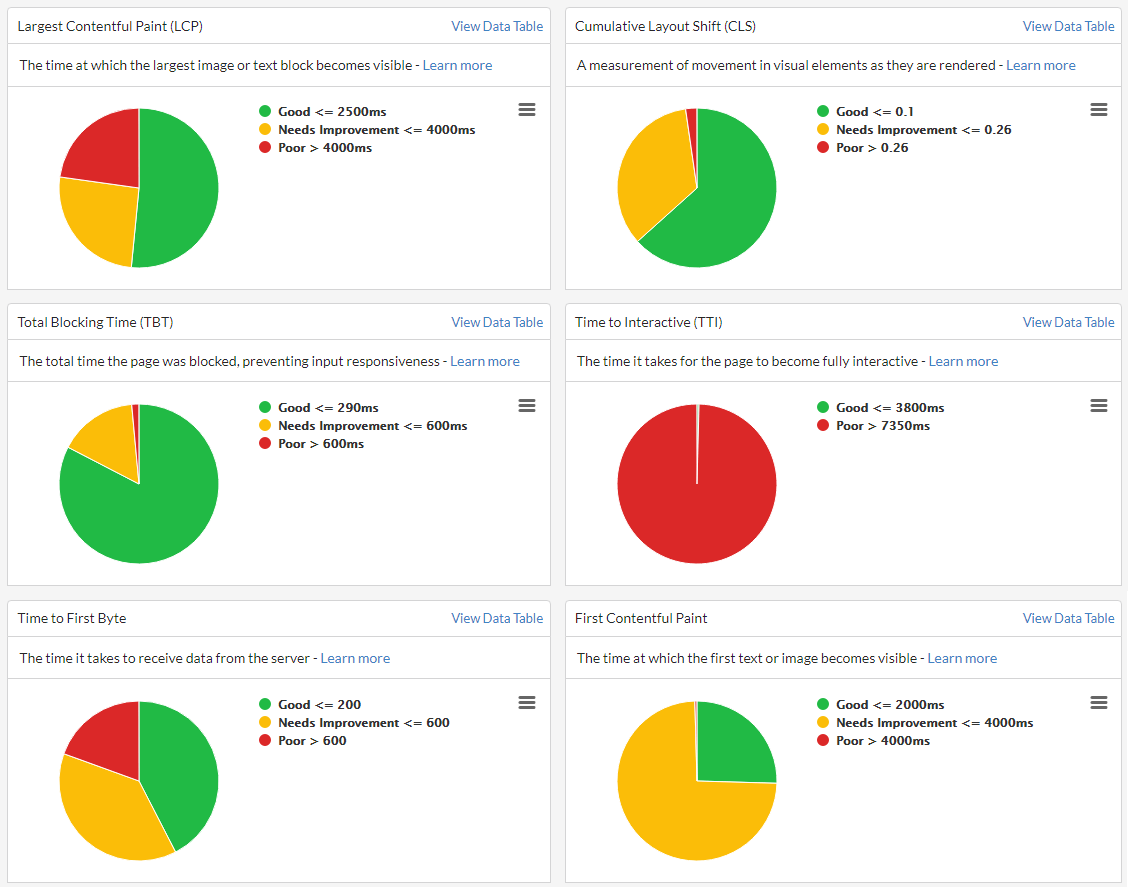
This is how to interpret the First Contentful Paint score on mobile devices:
- 0 - 1.8 seconds: Good (Green)
- 1.8 - 3 seconds: Needs improvement (Orange)
- Over 3 seconds: Red (Bad)
This metric actually has different thresholds for desktop devices, as follows:
- 0 - 0.934 seconds: Good (Green)
- 0.934 - 1.6 seconds: Needs improvement (Orange)
- Over 1.6 seconds: Red (Bad)
Tools like Sitebulb can split out pages based on their FCP score so you can home in on the particularly poor performing pages.
Speed Index (SI)
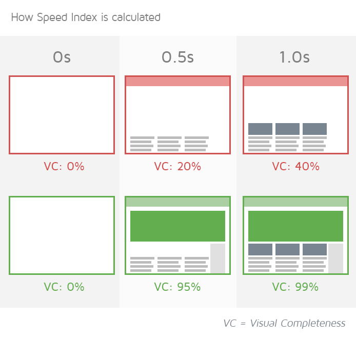
Speed Index measures how quickly content is visually displayed during page load.
This is a metric available in Lighthouse, which it calculates by capturing a video of the page loading in the browser and computing the visual progression between frames.
It is computed using visual differences in above-the-fold content as the page loads.
This is how to interpret the Speed Index score on mobile devices:
- 0 - 3.4 seconds: Good (Green)
- 3.4 - 5.8 seconds: Needs improvement (Orange)
- Over 5.8 seconds: Red (Bad)
This metric actually has different thresholds for desktop devices, as follows:
- 0 - 1.32 seconds: Good (Green)
- 1.32 - 2.32 seconds: Needs improvement (Orange)
- Over 2.32 seconds: Red (Bad)
Speed Index is not a metric that can be collected directly from Chrome in audit tools, so it is not present in Sitebulb.
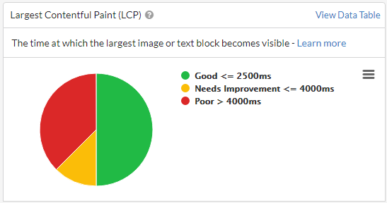
Largest Contentful Paint (LCP)
LCP is the time at which the largest image or text block becomes visible within the viewport, relative to when the page first started loading. This is a measurement of how long it takes the browser to render the main content of the page, which means it reflects an aspect of the loading experience.
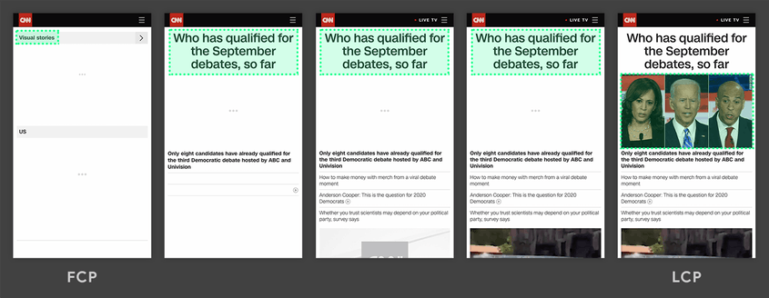
When looking at individual URLs, you are looking for the largest content element - so think hero images or videos.
In the timeline below, you can see when the LCP finally occurs on the screen in this example page from CNN. The largest element (highlighted in green) changes as content loads. Largest Contentful Paint is a measure of how long it takes for this final 'largest content element' to appear.
This is how to interpret the Largest Contentful Paint score on mobile devices:
- 0-2.5 seconds: Good (Green)
- 2.5-4 seconds: Needs improvement (Orange)
- Over 4 seconds: Red (Bad)
This metric actually has different thresholds for desktop devices, as follows:
- 0 - 1.2 seconds: Good (Green)
- 1.2 - 2.4 seconds: Needs improvement (Orange)
- Over 2.4 seconds: Red (Bad)
Tools like Sitebulb can split out pages based on their LCP score so you can home in on the particularly poor performing pages.
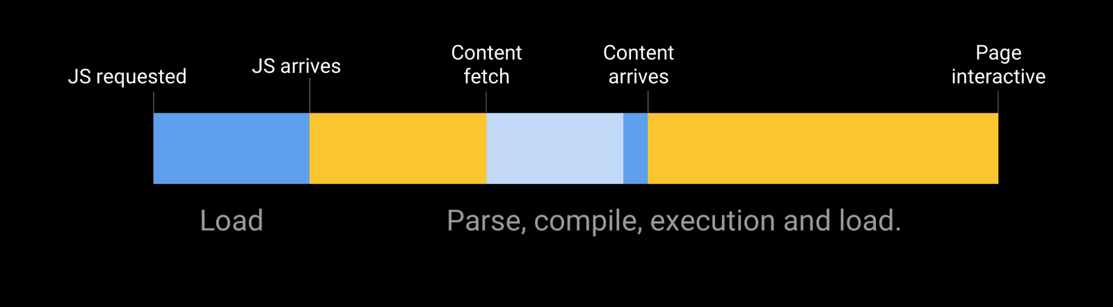
Time to Interactive (TTI)
TTI is the time it takes for the page to become fully interactive. This measures the time from which the page starts loading to when it is capable of reliably responding to user input quickly, which means it reflects an aspect of page interactivity.
What TTI measures is how long it takes for a page to become fully interactive, which is defined as the page being responsive to user interactions within 50 milliseconds (0.05 of a second). If a page takes a long time to become interactive, this is a frustrating user experience - the page appears to be ready, but when the user attempts to interact with it, nothing happens.
Time to Interactive is a measure of how long it takes for the page to appear fully interactive to the user.
Page interactivity is often heavily dependent upon JavaScript, if the browser needs to spend a long time parsing and compiling code, this can delay how soon a user can interact with the page.
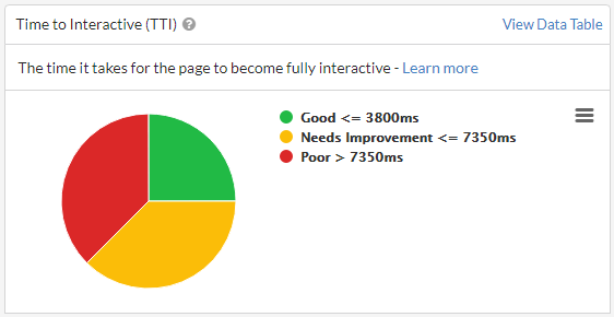
This is how to interpret the Time to Interactive score on mobile devices:
- 0-3.8 seconds: Good (Green)
- 3.8-7.35 seconds: Needs improvement (Orange)
- Over 7.35 seconds: Red (Bad)
This metric actually has different thresholds for desktop devices, as follows:
- 0 - 2.5 seconds: Good (Green)
- 2.5 - 4.5 seconds: Needs improvement (Orange)
- Over 4.5 seconds: Red (Bad)
Tools like Sitebulb can split out pages based on their TTI score so you can home in on the particularly poor performing pages.
Total Blocking Time (TBT)
TBT is the total time the page was blocked, preventing input responsiveness. It helps quantify the severity of how non-interactive a page is prior to becoming reliably interactive, which means it reflects an aspect of page interactivity.
Probably the least intuitive metric, Total Blocking Time is the lab metric that most closely simulates the Core Web Vital, 'Interaction to Next Paint' (which is only possible to measure as a field metric, as it relies on user input). It is built around the idea that the loading process can get blocked by 'long tasks', which are sufficiently long that the user would notice the delay in loading.
Long tasks are defined as taking 50ms or longer, and anything over this time is known as the 'blocking time'. 'The 'total' part of Total Blocking Time means that the metric is a measure of the addition of all the individual instances of blocking time.
For example, the diagram below shows the duration of each task for the browser's main thread in ms:
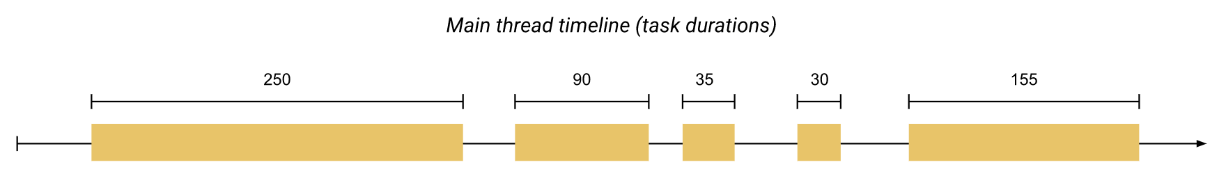
Of the five tasks, three of them have a duration over 50ms, which are the ones considered 'long tasks.' The next diagram shows the blocking time for each of these long tasks:
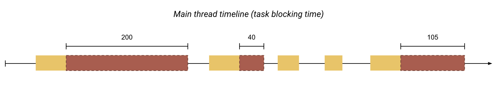
Now, adding up the red portions will give us the total blocking time (345ms).
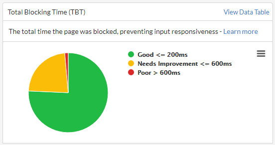
This is how to interpret the Total Blocking Time score on mobile devices:
- 0-200 milliseconds: Good (Green)
- 200-600 milliseconds: Needs improvement (Orange)
- Over 600 milliseconds: Red (Bad)
This metric actually has different thresholds for desktop devices, as follows:
- 0-150 milliseconds: Good (Green)
- 150-350 milliseconds: Needs improvement (Orange)
- Over 350 milliseconds: Red (Bad)
Tools like Sitebulb can split out pages based on their TBT score so you can home in on the particularly poor performing pages.
Cumulative Layout Shift (CLS)
CLS is a measurement of movement in visual elements as they are rendered. It helps quantify how often users experience unexpected layout shifts, which means it reflects an aspect of visual stability.
Layout shift is quite intuitive, and most of us experience it on a regular basis - when elements on the page move around unexpectedly. The example below shows how the orange button loads in after the other content, pushing the green box down the page.
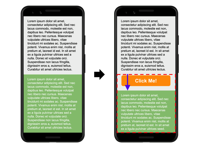
So a single layout shift like this can be quantified by how far the element is moved (distance) and how much of the viewport is affected by the change (impact). The 'cumulative' part of Cumulative Layout Shift means that the metric is a measure of the accumulation of all the little (or big!) layout shifts on the page.
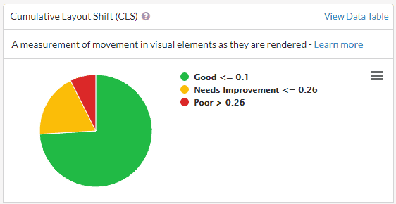
This is how to interpret the Cumulative Layout Shift score (same on mobile and desktop devices):
- 0-0.1: Good (Green)
- 0.1-0.25: Needs improvement (Orange)
- Over 0.25: Red (Bad)
Interestingly, there is no scale on this one. It is not 0.1 seconds, or 0.1 milliseconds, or 0.1 cats per square vacuum cleaner. Google just came up with a way to quantify shifting, and this is it. 0 means no content shift, and 1 means maximum content shift.
Tools like Sitebulb can split out pages based on their CLS score so you can home in on the particularly poor performing pages.
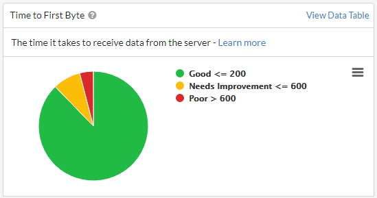
Time to First Byte (TTFB)
TTFB is the time it takes to receive data from the server. This is a measurement of how long it takes for the server to respond to the main document request, which means it reflects an aspect of the loading experience.
This metric is probably the closest to actual 'loading speed', and while it does not represent how the page 'feels' to the user in the same way as some of the other metrics, slow server response times can definitely be a factor that causes long page loads (which users do not like).
TTFB breaks down into 3 components:
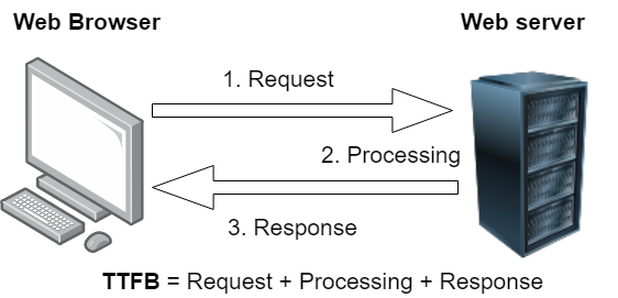
- The browser sends a HTTP request to the server, requesting the page content
- The server receives the response, builds the page and sends it back
- The response is routed back to the browser
Time to First Byte is how long it takes for the very first byte of data to arrive back with the browser.
This is how to interpret the Time to First Byte score (same on mobile and desktop devices):
- 0-200 milliseconds: Good (Green)
- 200-600 milliseconds: Needs improvement (Orange)
- Over 600 milliseconds: Red (Bad)
Tools like Sitebulb can split out pages based on their TTFB score so you can home in on the particularly poor performing pages.
Taking the metrics all together
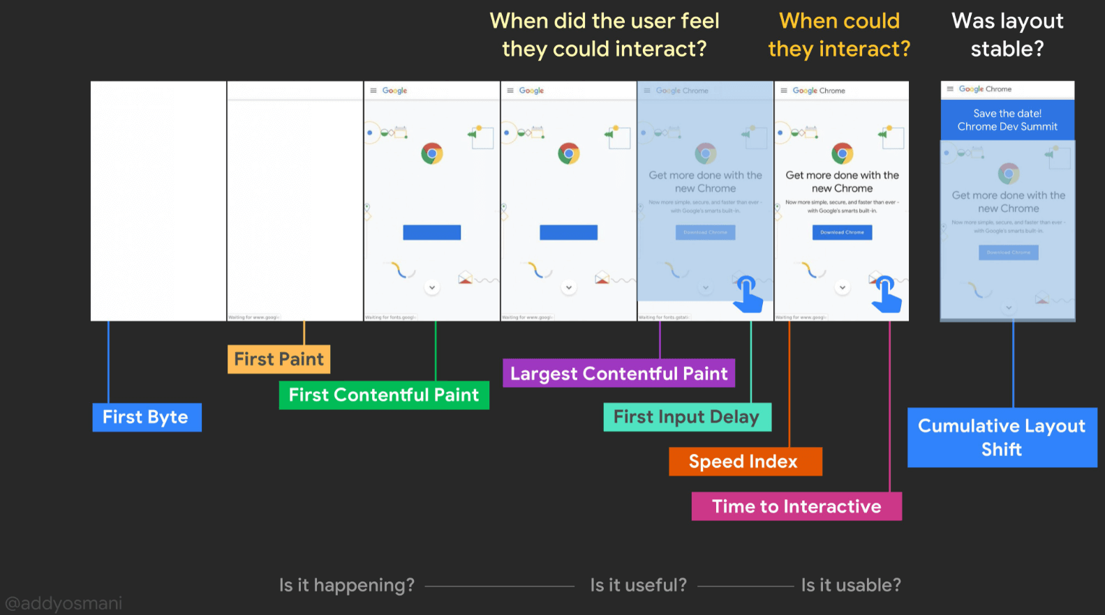
Individually, each of the Web Vitals metrics are designed to measure one small milestone in the user journey. To get a feel for how they interrelate, it can also be useful to see how the metrics work together.
Addy Osmani, a Chrome engineer, put together this graphic which shows how the different metrics map out over time, and how they relate to the user experience. Bear in mind that it’s now Interaction to Next Paint instead of First Input Delay in the graphic below.
Understanding Opportunities and Diagnostics
In the section above, I have focused on explaining what the metrics are and how you can make sense of them. I have not covered how you actually improve them, and the reasons for that are twofold:
- This stuff is waaaay beyond the scope of what an SEO should be responsible for fixing. This is developer work (see the next section).
- Improving the metrics is non-trivial, and does not directly relate to any one thing.
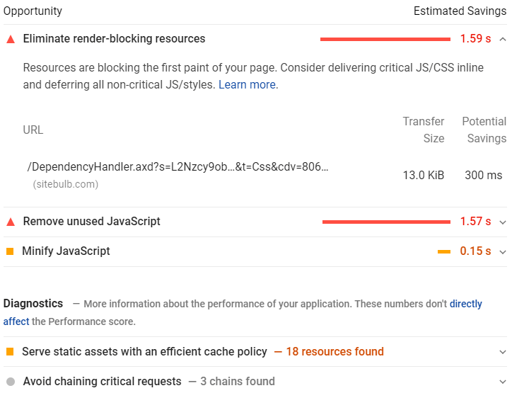
All that being said, there are of course things you can do to improve Web Vitals (and therefore the overall performance score too). Tools like Lighthouse present recommendations for things to improve, split into two categories:
- Opportunities, which present optimization opportunities that can help you speed up your site and improve performance, such as reducing server response time.
- Diagnostics, which flag specific problems on your site that need to be addressed, such as pages with enormous payloads.
By working through these suggestions, you can make changes that will improve the core experience for most users, and will be reflected in improved metrics scores also.
Since suggestions are prioritized by estimated savings (in terms of load speed), this allows you to identify specific actions that should have the biggest impact for any one page.
Website audit tools like Sitebulb allow you to see this sort of analysis, in bulk, across every page of the website:
As with the Web Vitals testing, the benefit in using an audit tool is that you can scale the analysis and look for patterns in the data that affect lots of similar URLs.
Unlike the collection of Web Vitals metrics themselves, there is no reason to sample, which means you can get meaningful data about things you can improve for every single page on your website.
This bulk testing and aggregation of issues is a massive help in terms of prioritization:
- It allows you to see how widespread a problem is - does it affect every page on the site or only a few?
- It gives you a top-down view of the site as a whole, making it much easier to spot patterns in the data.
- It allows you to drill down into the URLs affected and determine which page templates need optimizing.
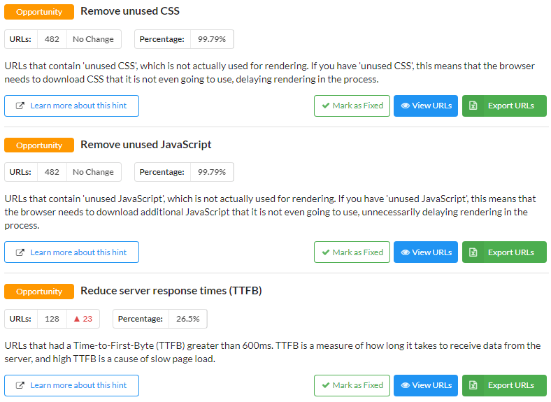
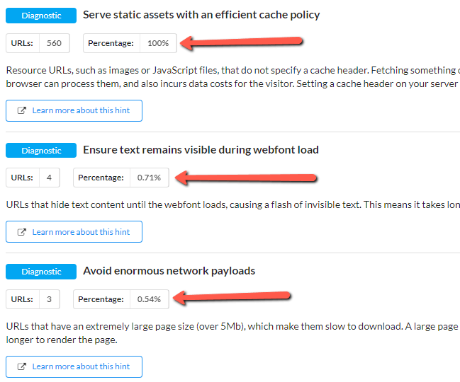
Consider the example below, which shows 3 'Diagnostics' fired in this website audit. The caching issue affects every single page on the site, whereas the other two affect less than 1% of all pages. The sitewide analysis makes it much easier to pick out the optimizations with higher impact potential.
Digging into issues and analysing URLs in bulk can also lead to deeper understanding of issues. In the example below, examining the URLs flagged by a Hint leads us to the very rapid conclusion that we have one rogue stylesheet on our website that could do with cleaning up:
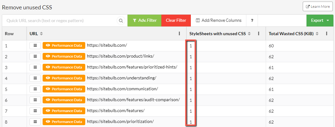
Fixing that one issue will improve every single page on the website. This is exactly the kind of recommendation we want to be giving clients!
Working with developers to improve Web Vitals
The intention of this article is to give you a framework to identify and understand issues, so you are able to communicate effectively with developers about potential implementation improvements. Once you have identified some areas for potential optimization, you should be seeking the opportunity to sit down with the developer to discuss your finding and what to do about them next.
The crux (pun intended) of the matter is that optimizing Web Vitals is developer work, not SEO work.
Most developers are familiar with tools like Lighthouse, which allow them to analyse and debug one page at a time, but they do not have access to tools like Sitebulb, which aggregate issues and allow the testing of a large sample of pages.
Use your audit/report as a means to show them what you have found, then encourage them to use their tools to determine how straightforward a fix would be, and even if a fix is possible at all (which it absolutely might not be, without damaging some core functionality of the page).
Further, by digging into lists of URLs affected and identifying templates, you are speaking a language that developers understand, providing better clarity on what the problems are, and making their task feel more manageable.
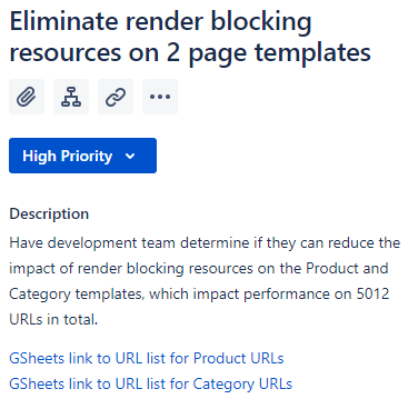
It is the difference between tickets like this:
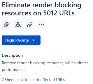
And tickets like this:
If you are able to actually (heaven forbid) speak with the developers, they can help you understand how much tech resource would be required to resolve the issues raised.
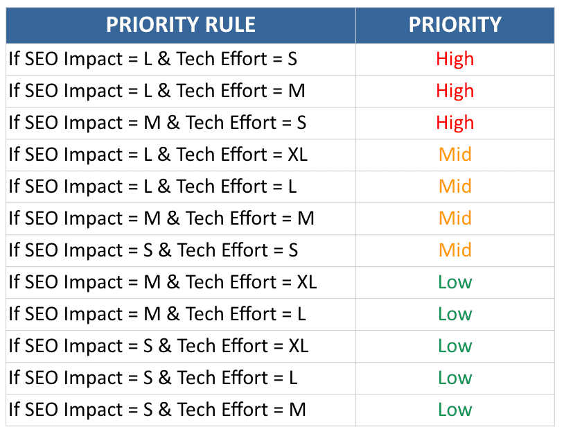
When it comes to prioritisation, I like the simplicity of effort determined as t-shirt sizes (S, M, L or XL), where S is a simple task, and XL is a long or complicated one. With dev feedback, you can prioritise based both on potential impact and tech effort, allowing you to put together a simple prioritisation matrix like the one described by the awesome Areej AbuAli, in her article on Getting Tech SEO Implemented:
Further reading & resources
- How to Audit Performance & Web Vitals
- The Ultimate Guide to Page Experience
- Advanced Core Web Vitals: A Technical SEO Guide
- Core Web Vitals Audit: 35-Step Checklist With Fixes, Examples, And More
- A Technical SEO Guide to Lighthouse Performance Metrics
- Optimizing Web Vitals using Lighthouse
- Demystifying User Experience in 2021
- Getting Started with Page Experience (Google Video Series)

Patrick spends most of his time trying to keep the documentation up to speed with Gareth's non-stop development. When he's not doing that, he can usually be found abusing Sitebulb customers in his beloved release notes.
Related Articles
 SEO & UX: Organic Growth via “The Retention Ladder”


 AI Search, RAG, Agents and Crawl Bots: A Plain-English Guide to What They Mean

 What AI Agents See: The Accessibility Tree Is an SEO Surface
 Sitebulb Desktop
Find, fix and communicate technical issues with easy visuals, in-depth insights, & prioritized recommendations across 300+ SEO issues.
- Ideal for SEO professionals, consultants & marketing agencies.
 Sitebulb Cloud
Get all the capability of Sitebulb Desktop, accessible via your web browser. Crawl at scale without project, crawl credit, or machine limits.
- Perfect for collaboration, remote teams & extreme scale.